A FASHION FORWARD NEW INTERIOR DESIGN PROJECT IN CHELSEA FOR THE NEW FALL SEASON

I love talking about some of my favorite interior design projects.  I just completed a new one in Chelsea, a lovely,  storied NYC neighborhood with a decent amount of newly constructed or adapted modern residences, like this one. What makes this one different from most is that the elevator opens right into the apartment. This fun project for a fantastic client took about a year from start to finish.

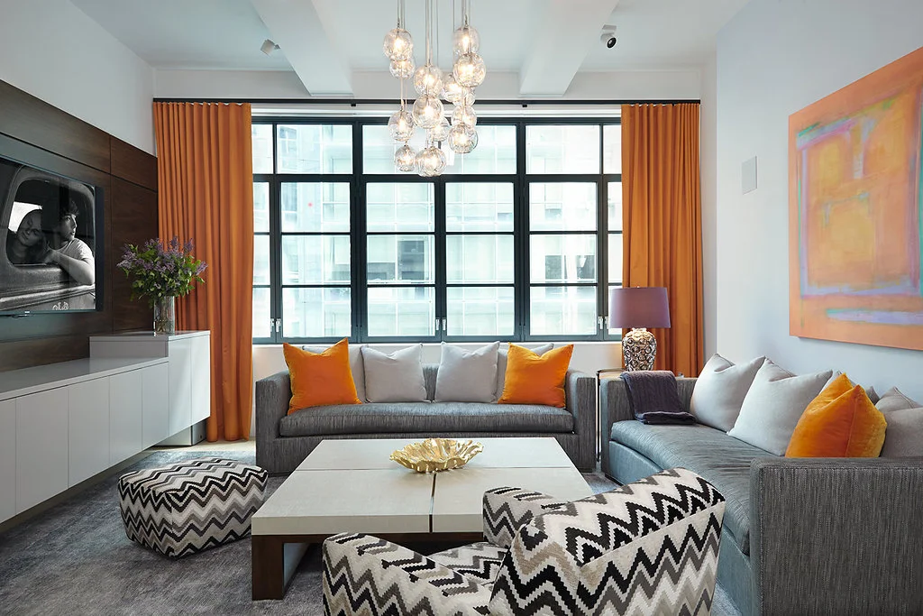
This space was conceived for a family with two young children. The only initial directives were to design a welcoming entry with a "wow factor" to set the tone and to transform what was a somewhat boring living / dining room into a cool, colorful, and comfortable space for the whole family and guests to enjoy. 

There are a lot of musicians in this family, the custom wall unit was built to house 5 guitars in addition to a television and bar. In the end, the piano was the only piece left over from the old space. I'm thrilled that this charming musical family is as happy as I am with the outcome of their new open living area! 

The elevator entrance opens to a warm welcome. Lush, textural eggplant hued suede wallcovering was applied to the main entry wall to make the sconces and painting pop. An impossibly soft faux fur covered custom New York Interior Design bench provide…

The elevator entrance opens to a warm welcome. Lush, textural eggplant hued suede wallcovering was applied to the main entry wall to make the sconces and painting pop. An impossibly soft faux fur covered custom New York Interior Design bench provides the posh perch to take off snow boots or put on a pair of perfect pumps. 

A custom designed glass tile mosaic at the end of the hallway makes this entry sparkle and feel visually larger.

A custom designed glass tile mosaic at the end of the hallway makes this entry sparkle and feel visually larger.

Everything in this living/dining area was designed with the clients in mind. From the bold floral wallpaper (which inspired the entire space) to soft mohair seating and inviting ombre stripes, color & geometric shapes abound. 

Everything in this living/dining area was designed with the clients in mind. From the bold floral wallpaper (which inspired the entire space) to soft mohair seating and inviting ombre stripes, color & geometric shapes abound. 

With an iridescent pendant chandelier lighting the way with bold pattern and color , dinners will never be boring! 

With an iridescent pendant chandelier lighting the way with bold pattern and color , dinners will never be boring! 

This wall unit was custom built to fit some amazing musical instruments. We included a mirrored bar to house family heirloom glassware and some antiques from travels around the globe. 

This wall unit was custom built to fit some amazing musical instruments. We included a mirrored bar to house family heirloom glassware and some antiques from travels around the globe. 

Precious Heirlooms and favorite drinks sparkle against these glass shelves. Hammered metal pulls add the finishing touch .

Precious Heirlooms and favorite drinks sparkle against these glass shelves. Hammered metal pulls add the finishing touch .

Color, pattern and metal tones are repeated around the room. Different shapes and scale are used to keep the visual momentum going. 

Color, pattern and metal tones are repeated around the room. Different shapes and scale are used to keep the visual momentum going. 

This snake skin and metal vintage glass side table along with fresh crabtree branches add color and texture.  

This snake skin and metal vintage glass side table along with fresh crabtree branches add color and texture.  

There is nothing like fresh Dahlias to bring color and life to a room. These beauties pull in tones from the floral wallpaper.

There is nothing like fresh Dahlias to bring color and life to a room. These beauties pull in tones from the floral wallpaper.


Designing In Stages For a Growing Family

 
F 252 7th Ave_Benatar_112217_-104.jpg

This NYC Penthouse apartment in the Chelsea Mercantile building was renovated and decorated over a few years time.  My clients wanted a beautiful space to raise their two small children.  The apartment had to be practical for this young family and their dog. The caveat? They still wanted a cool downtown vibe. 

F_WINDOW2527thAve_Benatar_112217_-134.jpg

THE OPEN LIVING + DINING AREA

The first order of business was redesigning the lighting scheme in the living room and updating and redecorating the existing open living room and dining area. We revamped the lighting by employing two lighting fixtures as the main focal points - a huge contemporary chandelier in the main living room and one simple, yet sophisticated, pendant over the dining table. Then we added cove lighting around the perimeter of the room. We sheathed the walls in a very textural metallic grasscloth. The fireplace mantle was custom designed by New York Interior Design and completely reconstructed utilizing a Carrara marble. The drapery panels add a finishing touch to the space,  rich color and pattern, and a frame around the incredible view.

The dining area came next. We custom made the marble slab dining table. Then we added visual dimension and reflection of the view with an asymmetrical mirror.

F_LIVINGV_2527thAve_Benatar_112217_-217.jpg

THE MASTER BEDROOM

The most challenging aspect of this project came when the new baby was on its way, and we reconfigured a tiny nursery out of a pretty large master bedroom closet. The master bedroom itself was redesigned to be an urban sanctuary that's just a bit sexy. Mixing lush textiles, contemporary patterns, and a soothing palette created the perfect vibe - playful and inviting, yet all grown up. Carefully designed built-ins lining the master bedroom maximized space and gave my clients back their closet. Keeping with the glamorous feel, the floor to ceiling built-ins were topped with dramatic crown moulding and jewelry-like hardware.

F_11X14_MASTER2527thAve_Benatar_112217_-16.jpg
F_HEADBOARD22527thAve_Benatar_112217_-126.jpg
FN_HEADBOARD2527thAve_Benatar_112217_-180.jpg

THE BATH

The following year it was time for a gut renovation of the bathroom. This bathroom is for both the kids and guests. The bathtub was banished in favor of a custom shower. The huge faux carrara marble tiles (a dream to maintain) coordinate and lend continuity with the other marbles in the apartment. We gave the clients a flexible, family-friendly bath with a clean modern look and the luxe glam sensibility they wanted. 
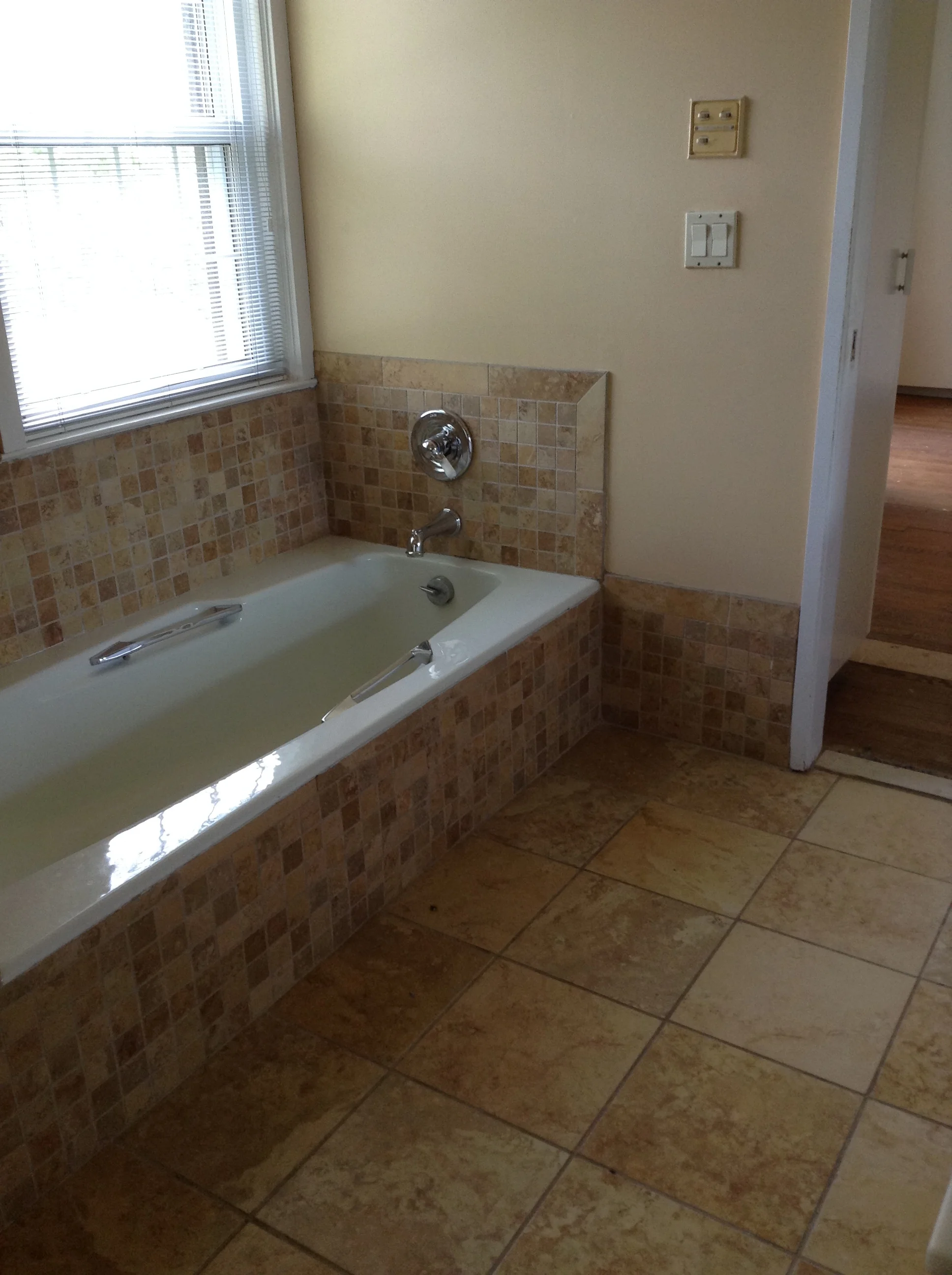
F_BATHROOM2527thAve_Benatar_112217_-145.jpg

THE KITCHEN

Lastly, it was time for the major gut renovation of the kitchen. This new eat-in kitchen design was all about the gorgeous Arabescato Vagli marble, as well as the new tufted custom banquette. The cabinets were custom designed in a charcoal gray color to both enhance and compliment the marble. The crystal lighting on the banquette wall was meant to give the room a little bling. Beyond the beauty, optimizing storage and work space is always a must in NYC kitchens, and this one was designed for the challenges of a busy urban family. Now both children and parents are comfortable and happy in their newly redesigned apartment in the sky! 

F_2527thAve_Benatar_112217_-199-2.jpg
F_2527thAve_Benatar_112217_-23.jpg

Photo Credit: Beckerman Photography

FALL INTO FASHION 2017

Fall is slowly but surely creeping up on us! Even though we are sad to see the summer go, I must admit, the excitement for fall fashion has taken over... The fashion world and Interior design world are always connected. They come hand in hand, season by season. Take a look at our two shopping days, one in the fashion market and the other in the interior design market, for early fall trends.. same styles...same trends...Fall 2017!!!


Neiman Marcus- Fall 2017

Neiman Marcus- Fall 2017

Jiun Ho Showroom - 200 Lex - Fall 2017

Jiun Ho Showroom - 200 Lex - Fall 2017

Neiman Marcus - Fall 2017

Neiman Marcus - Fall 2017

Juin Ho Showroom - 200 Lex- Fall 2017

Juin Ho Showroom - 200 Lex- Fall 2017

Profiles Showroom - 200 Lex - Fall 2017

Profiles Showroom - 200 Lex - Fall 2017

Neiman Marcus - Fall 2017

Neiman Marcus - Fall 2017

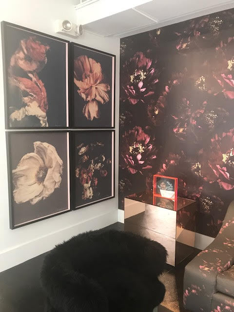
Brett Design Wallpaper @ Bradley Showroom - 200 Lex

Brett Design Wallpaper @ Bradley Showroom - 200 Lex

Neiman Marcus - Fall 2017

Neiman Marcus - Fall 2017

Kelly Wearstler Showroom - 200 Lex - fall 2017

Kelly Wearstler Showroom - 200 Lex - fall 2017

Neiman Marcus - Fall 2017

Neiman Marcus - Fall 2017

Brett Fabric @ Bradley Showroom - 200 Lex - Fall 2017

Brett Fabric @ Bradley Showroom - 200 Lex - Fall 2017

A TASTE OF SUMMER....

Finally, summer is here!!!  Every New Yorker seems happier! Not only are we feeling it on this beautiful day in New York but we are feeling it in the New York Design Center too #nydc . Vibrant fabric colors filling the showrooms on sofas and chairs, new combinations are here to stay.. Colors are HOT and sultry or pastel and soft... Let's all have a fun and exciting summer ....

Color is an essential aspect of Interior Design

PINK CURVED SOFA AT BRADLEY SHOWROOM - 200 LEX

PINK CURVED SOFA AT BRADLEY SHOWROOM - 200 LEX

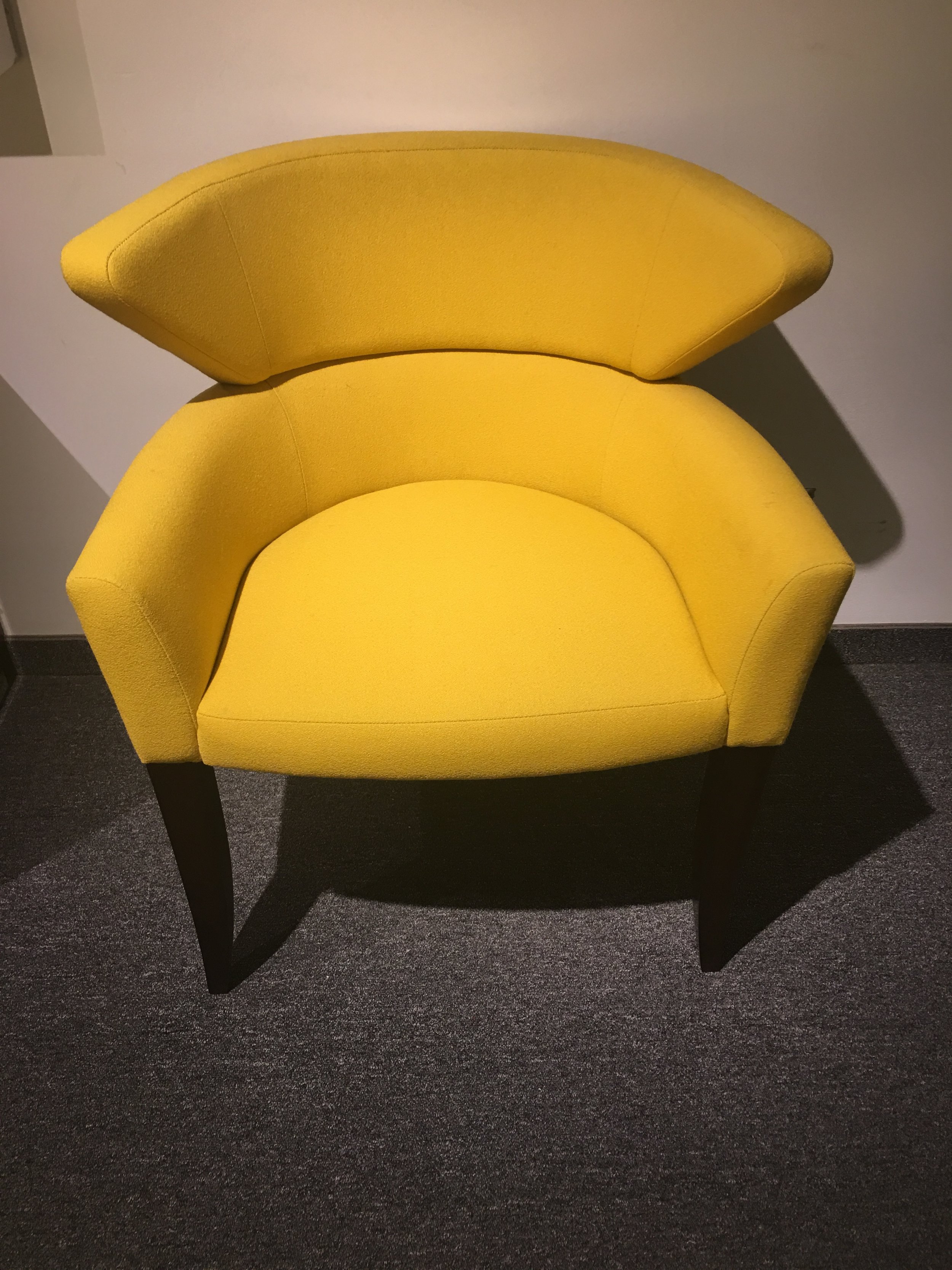
BRIGHT YELLOW CHAIR AT BRUETON SHOWROOM  - 200 LEX

BRIGHT YELLOW CHAIR AT BRUETON SHOWROOM  - 200 LEX

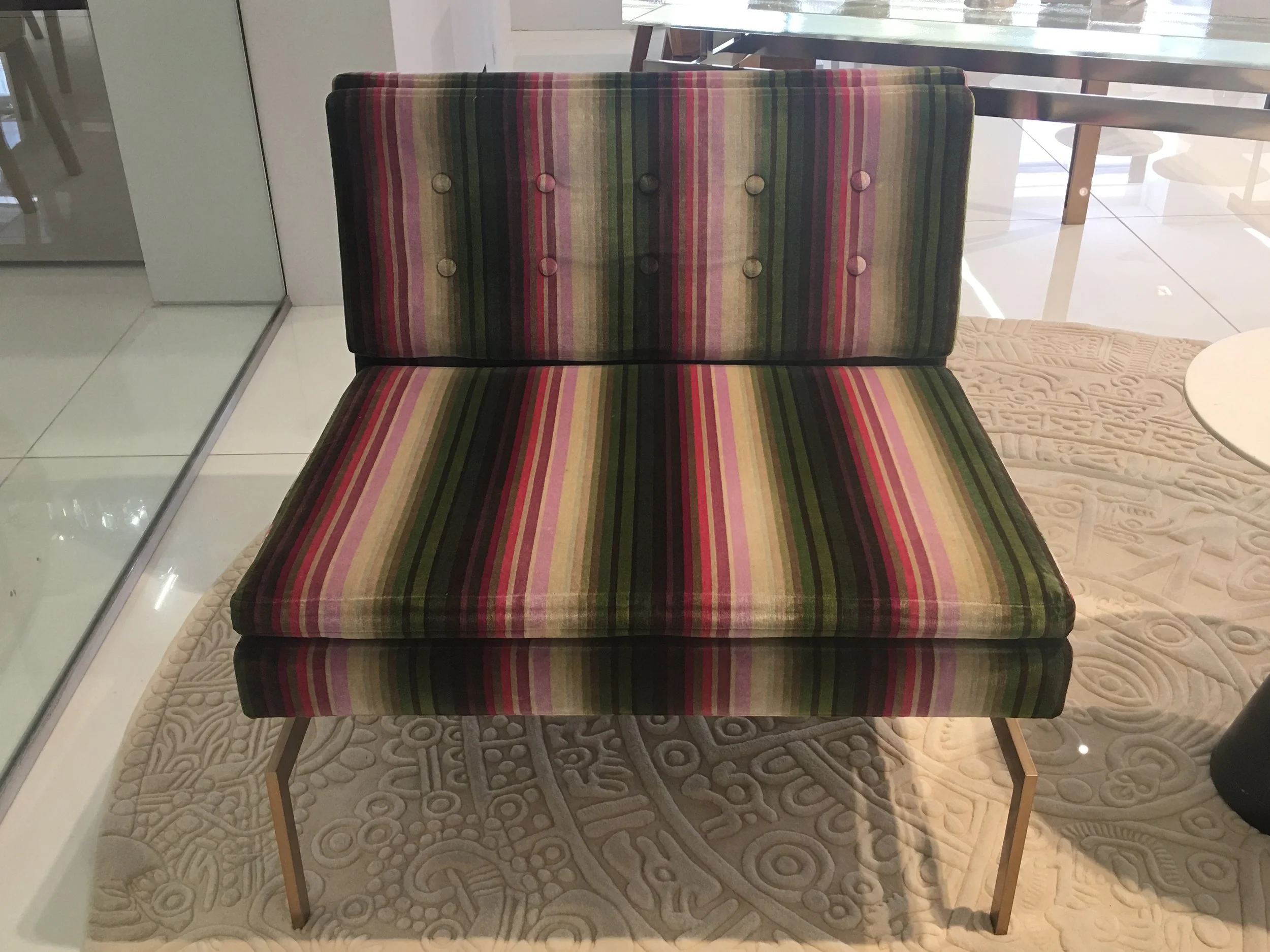
STRIPED CHAIR AT KGBL SHOWROOM - 200 LEX

STRIPED CHAIR AT KGBL SHOWROOM - 200 LEX

FUSCHIA CHAISE AT KGBL SHOWROOM- 200 LEX

FUSCHIA CHAISE AT KGBL SHOWROOM- 200 LEX

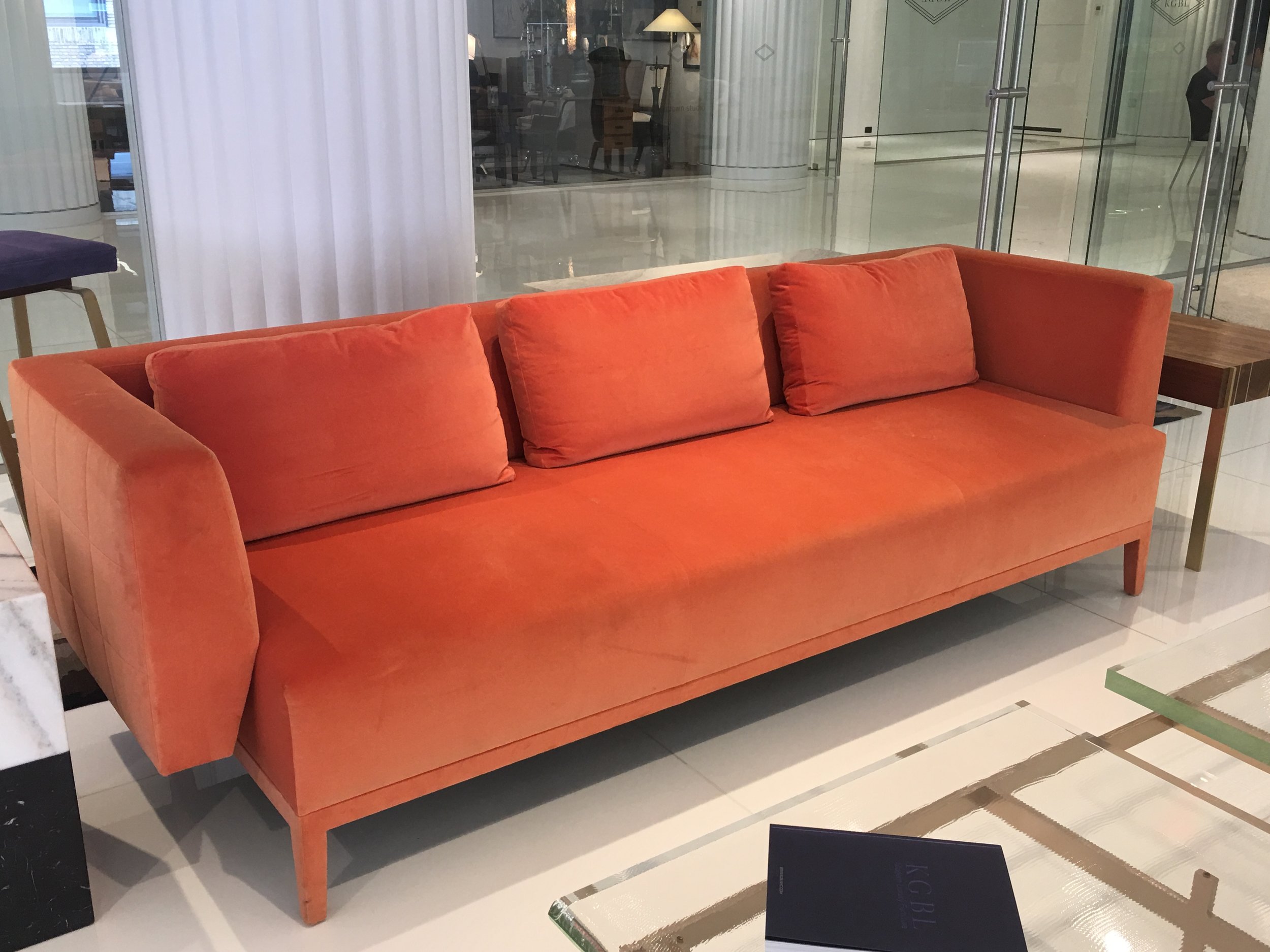
CORAL SOFA AT KGBL SHOWROOM- 200 LEX

CORAL SOFA AT KGBL SHOWROOM- 200 LEX

PURPLE STOOL AT KGBL SHOWROOM - 200 LEX

PURPLE STOOL AT KGBL SHOWROOM - 200 LEX

GREEN SOFA AT KGBL SHOWROOM - 200 LEX

GREEN SOFA AT KGBL SHOWROOM - 200 LEX

NEW PROJECT FOR A NEW SEASON

Once in awhile, I am lucky enough to be asked to design a space in a NYC building that I adore. Huys is just such a building.  Located in the heart of NoMad , on Park Ave South, Huys is a neoclassical building dating from 1917.  This building underwent a huge conversion from commercial offices to 58 luxurious and elegantly detailed condominiums .  It was designed by the world-renowned Piet Boon . This charming apartment is a pied a terre for a lovely couple that actually live upstate NY. I am very proud of how it turned out. I very much enjoyed designing the interiors, I hope you enjoy seeing the results! 

Soft tones in this  comfy living room accentuate the view 

Soft tones in this  comfy living room accentuate the view 

The walls of the dining room are covered in  textured squares..

The walls of the dining room are covered in  textured squares..

Drama in the powder room is evoked with this wallcovering that seems almost 3D 

Drama in the powder room is evoked with this wallcovering that seems almost 3D 

A Master Bedroom Dream 

A Master Bedroom Dream 

A soft serene place to relax 

A soft serene place to relax 

It's all in the details, soft gray suede walls envelope the master bedroom like a cocoon... 

It's all in the details, soft gray suede walls envelope the master bedroom like a cocoon... 

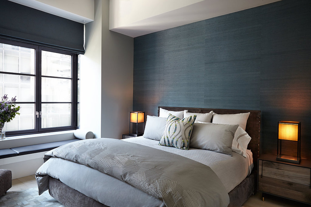
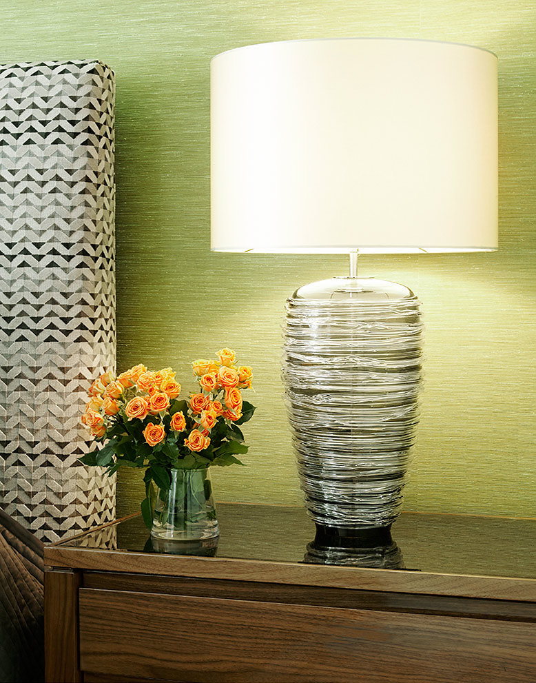
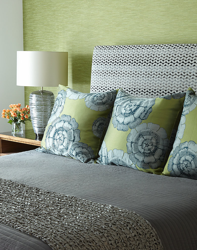
 Grasscloth walls , leather headboard  hide rug and distressed night stands all mix for high drama in this relaxing guest room..

 Grasscloth walls , leather headboard  hide rug and distressed night stands all mix for high drama in this relaxing guest room..

NEW PROJECT IN NOMAD, HUYS BUILDING

Located in the heart of NoMad , on Park Ave South, Huys is a neoclassical building dating from 1917, with neighboring stately mansions from NYC's Gilded Age. This building underwent a huge conversion from commercial offices to 58 luxurious and elegantly detailed condominiums . Developed by the prestigious Dutch Kroonenberg Groep, designed by the world-renowned Piet Boon and renovated by the well-established construction management firm Sciame. Huys is one of the my favorite buildings. This is one of the incredible apartments I was asked to design. The amazing iron windows and light brushed oak floors were already in place.  Photo Credit: Beckerman Photograpy


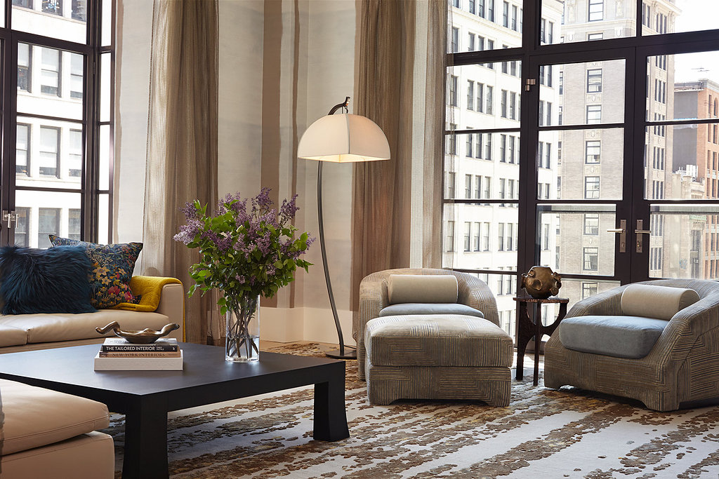
Color filled Living Room

Color filled Living Room

Master Bedroom with Grasscloth headboard wall 

Master Bedroom with Grasscloth headboard wall 

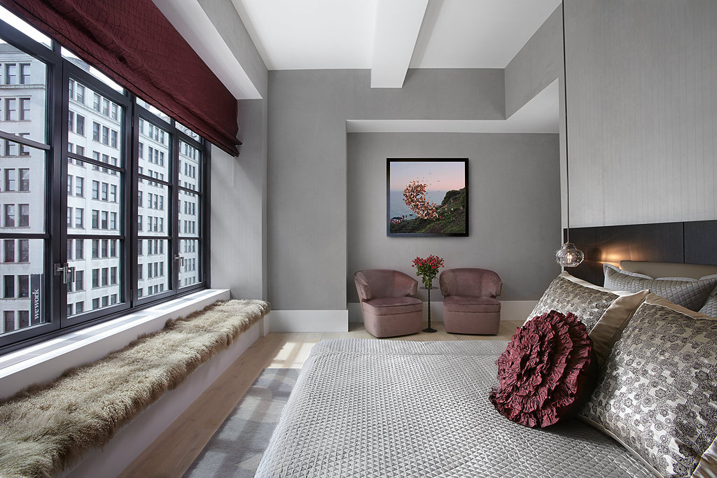
Close up of Master Bedroom 

Close up of Master Bedroom 

Sumptuous bedding is everything!  

Sumptuous bedding is everything!  

It's all in the details 

It's all in the details 

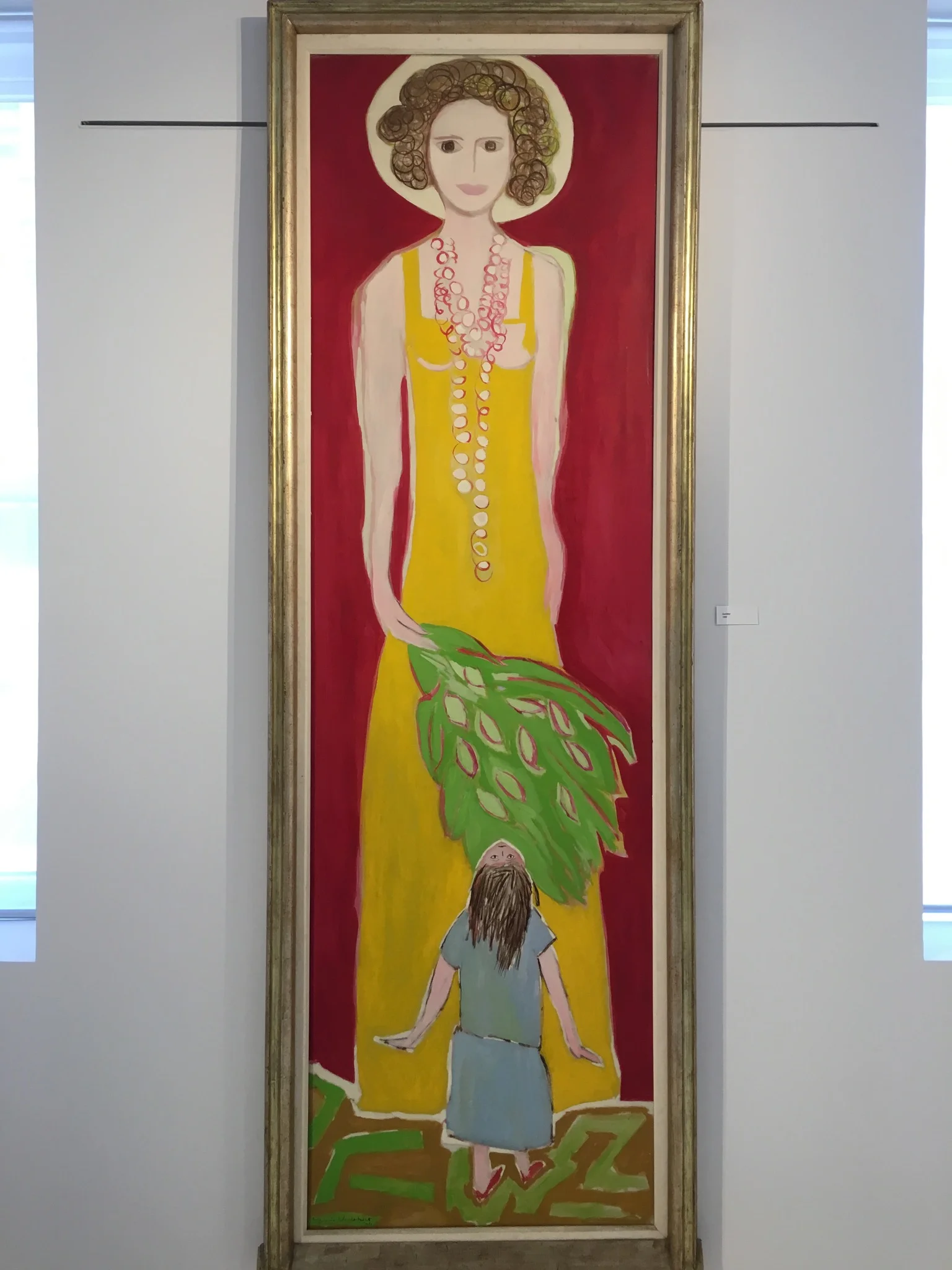
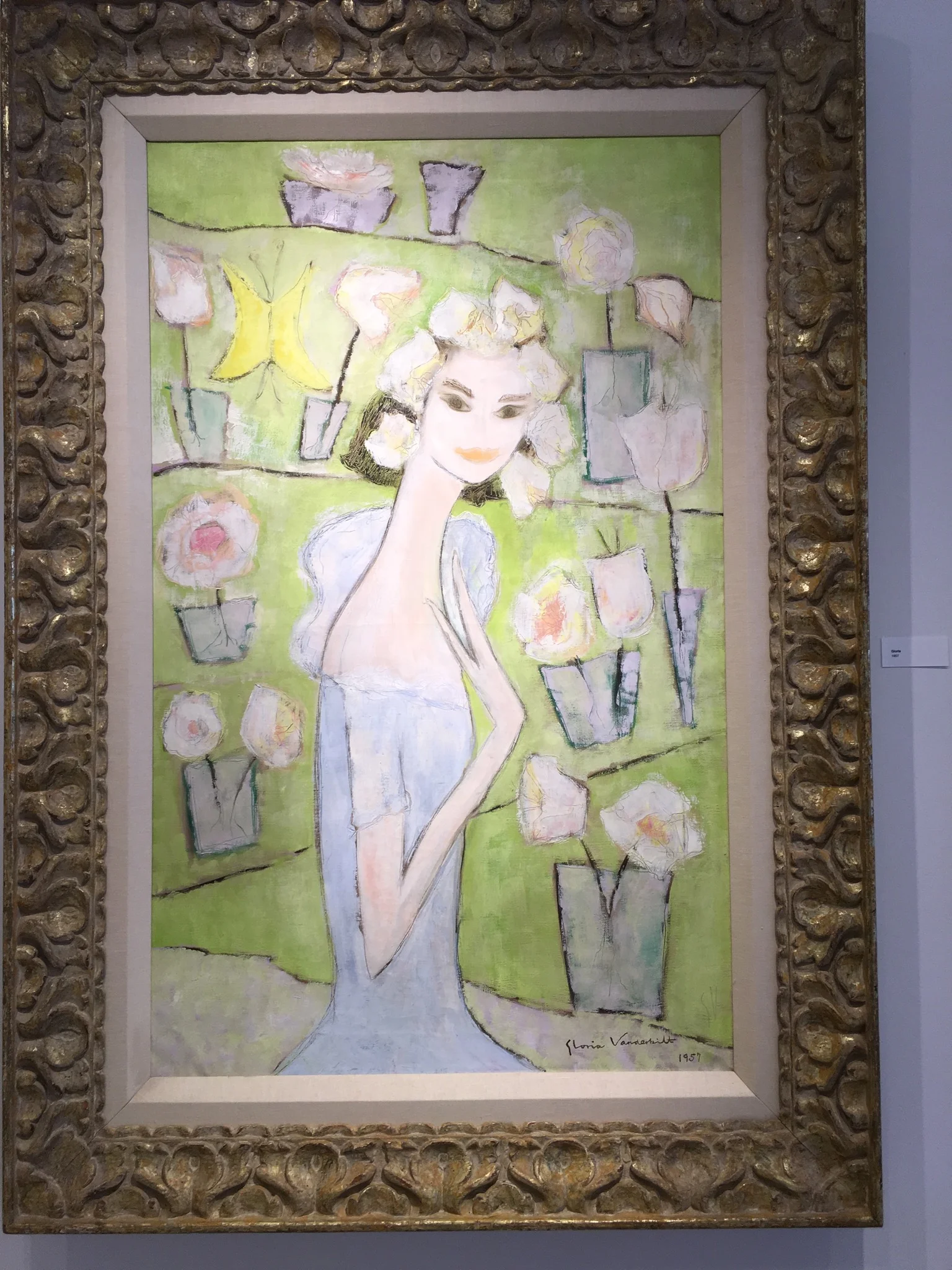
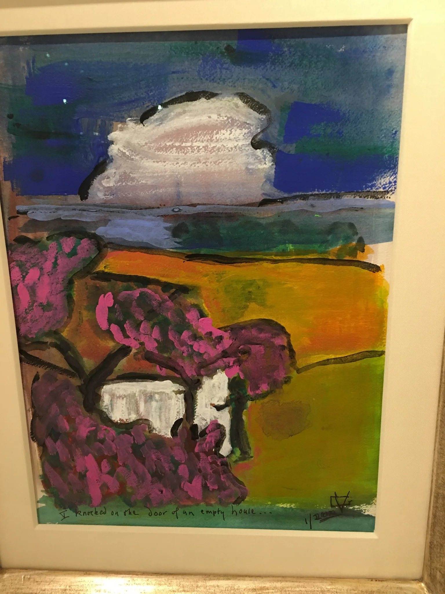
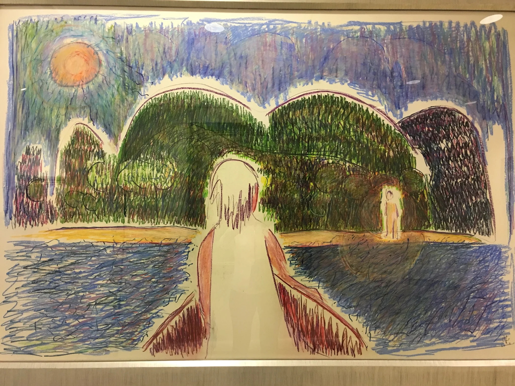
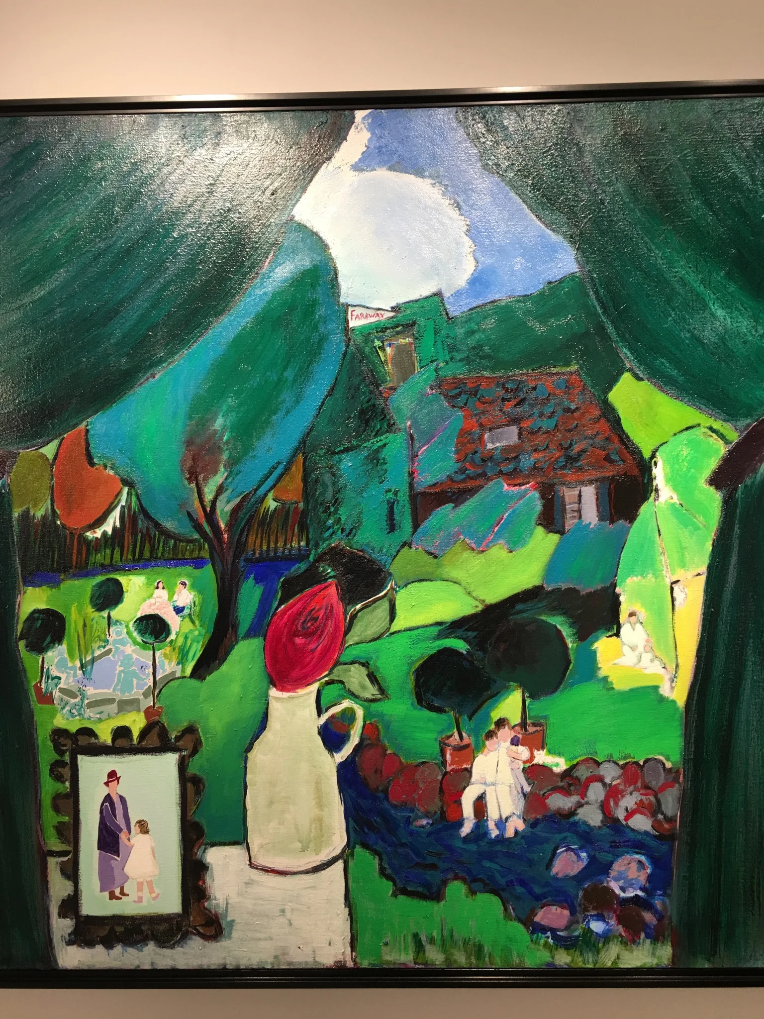
GLORIA VANDERBILT "A RETROSPECTIVE"

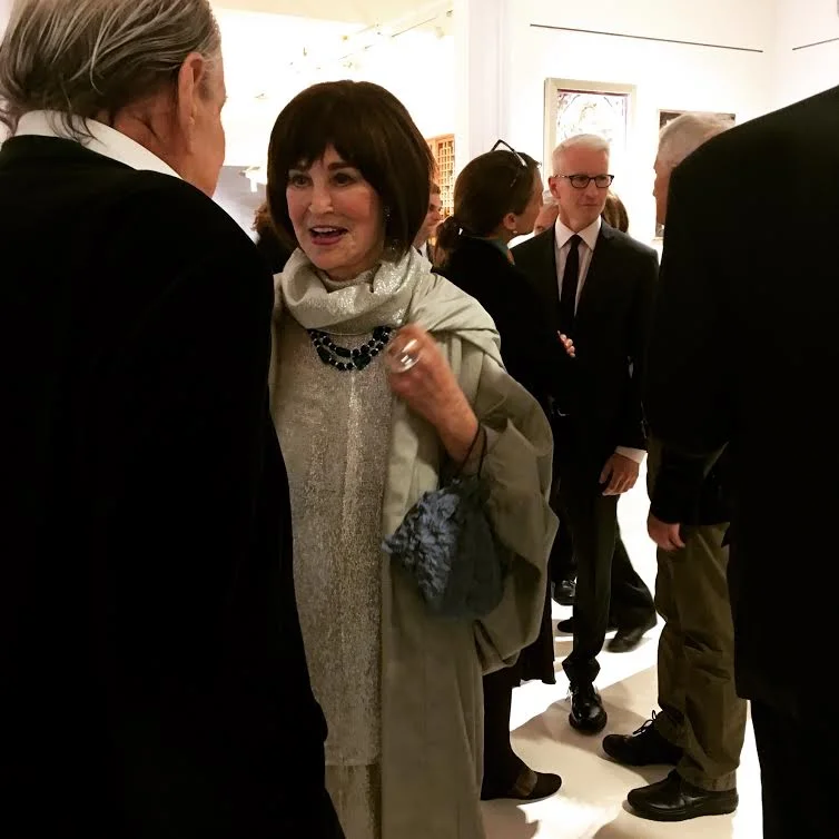
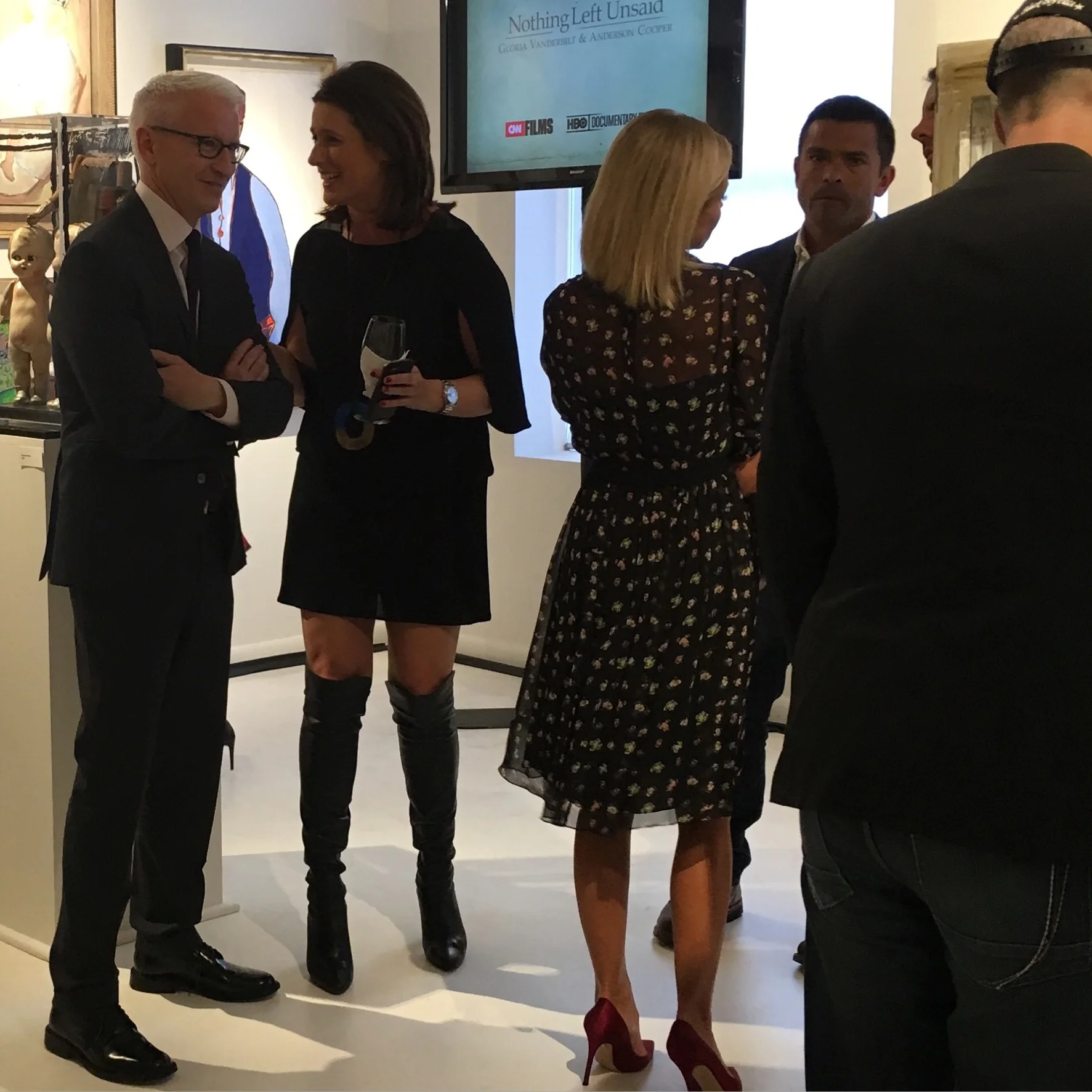
Last night was the gallery opening of the Vanderbilt exhibit. It was a very festive ,fun evening at The NYDC, 200 Lex. What I liked best about the art was that it told the story of Vanderbilt's life.  She was animated and beautiful last night. It was very exciting to see Anderson Cooper, Kelly Ripa and all the other celebrities! Vanderbilt has led a VERY interesting life. I can't wait to read her new book "The Rainbow Comes and Goes" ...

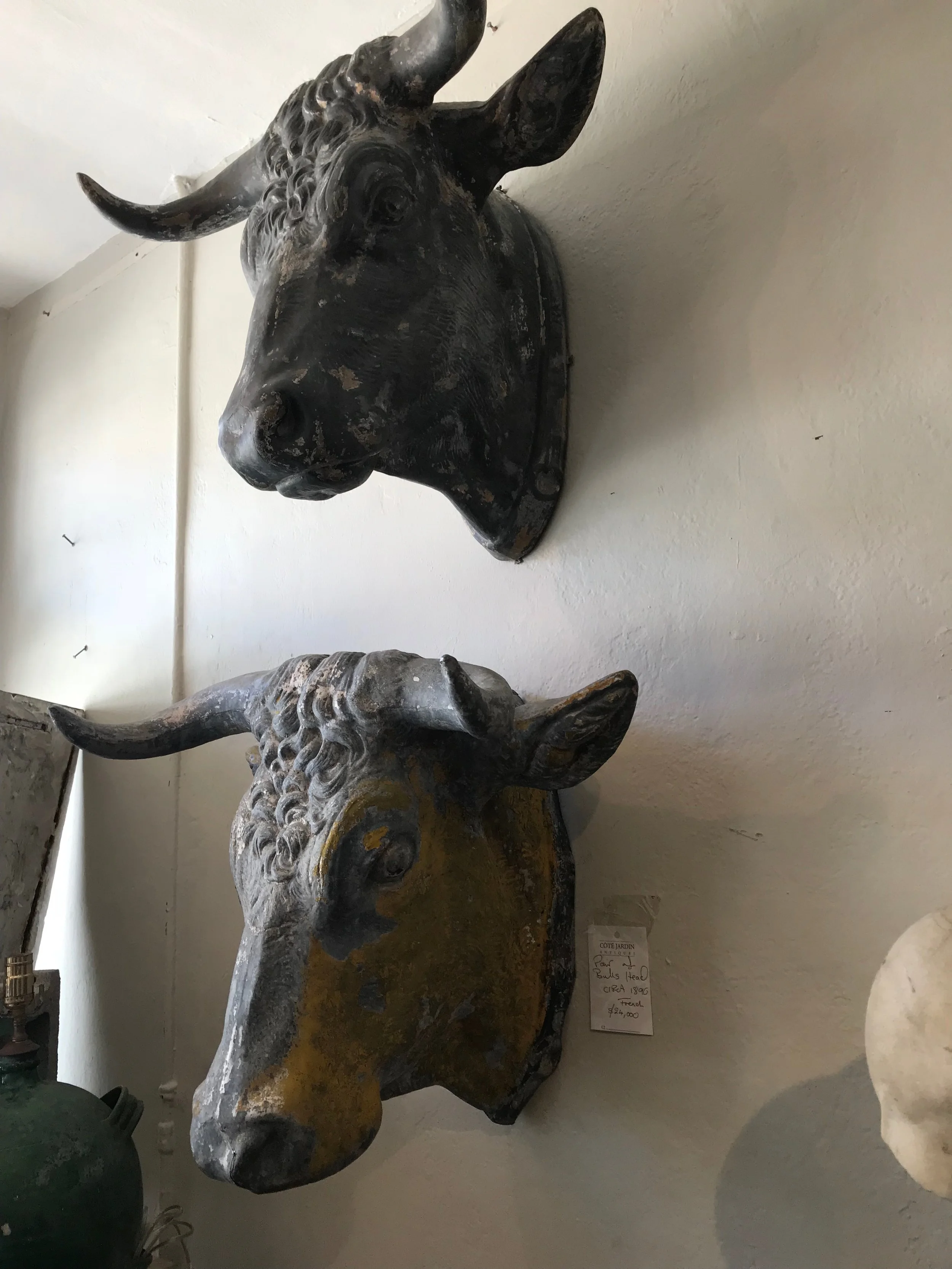
RAVISHING ANTIQUE / VINTAGE EYE CANDY

One of the real bonuses of working in this field is watching the clever, creative, gifted  people (I happen to know) come up with incredible new ideas. One such idea was the first brick and mortar space for the online giant 1stdibs. Jim Druckman was the genius behind it! 

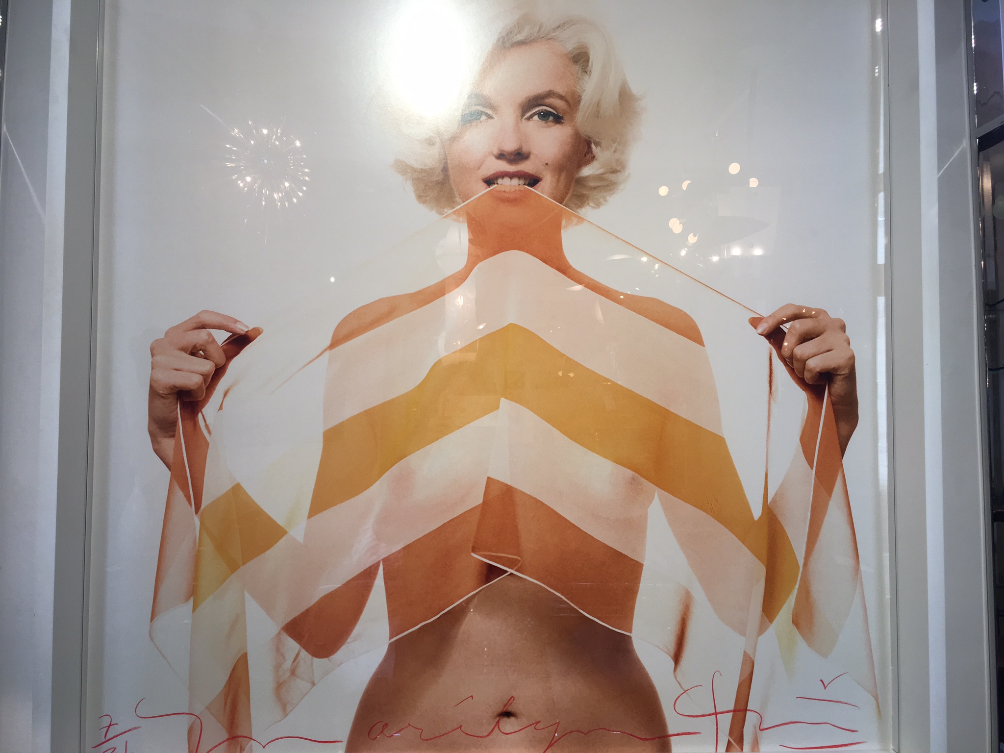
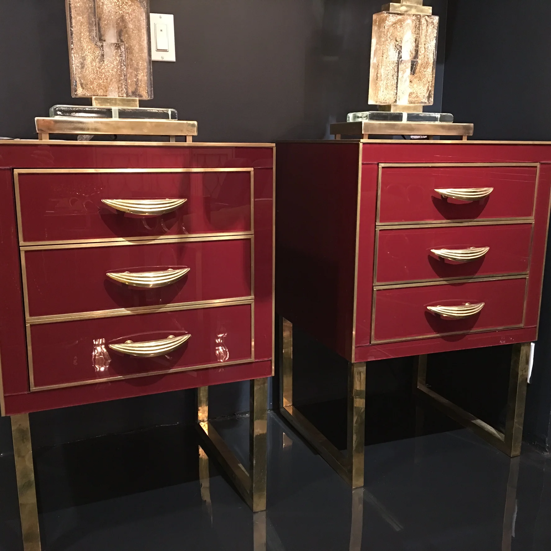
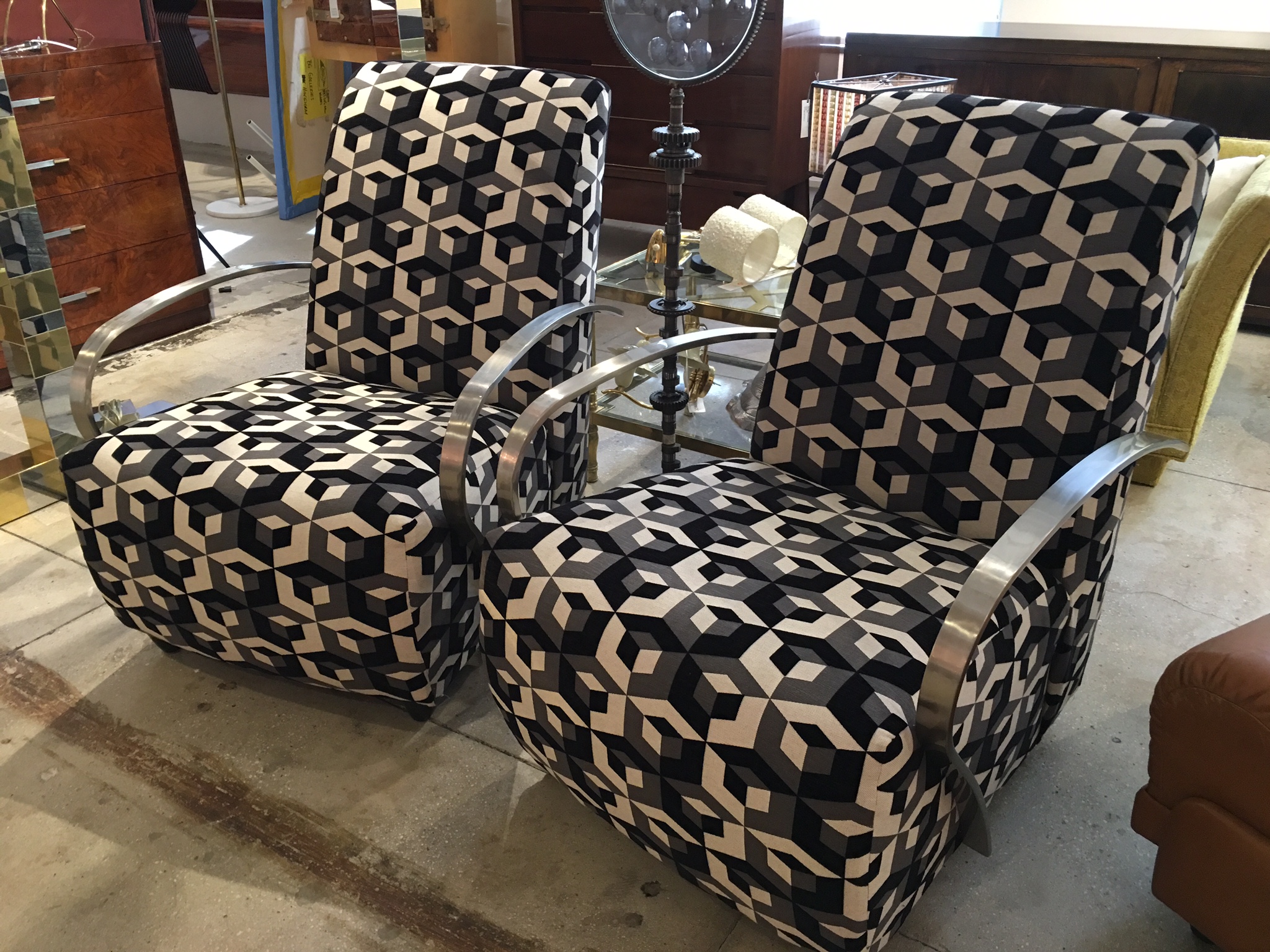
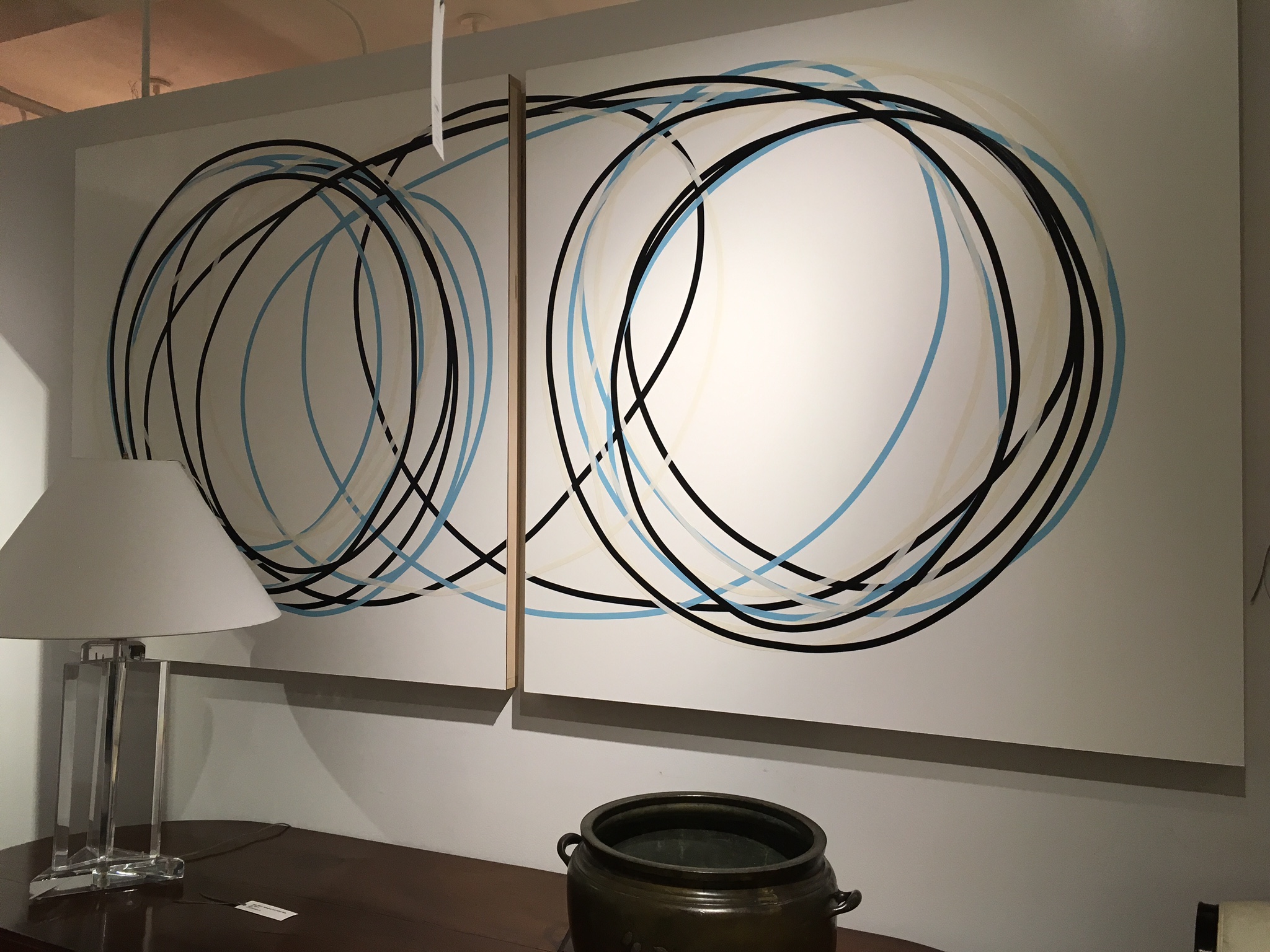
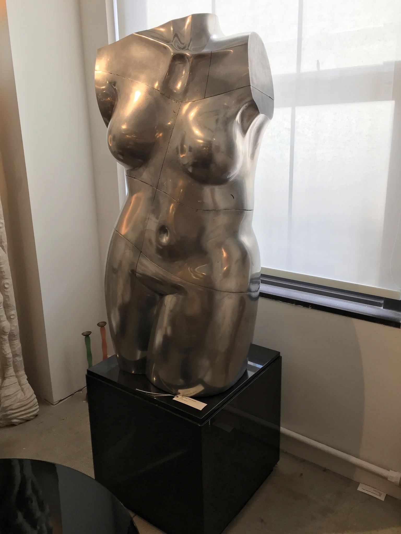
This all took place years ago. 1stdibs is now a destination for many designers and collectors alike. It is an eclectic mix of over 54 different dealers from around the country and world that occupy the entire 10th floor of 200 Lex  in 33,000 sq feet of space. It is one of my special,  wonderful secrets. There is ALWAYS something new and exciting here!!!!  The following are just a few of my latest favorite things....

IMG_6059.JPG
IMG_6054.JPG

RENOVATION, MODERNIZATION, RESTORATION...

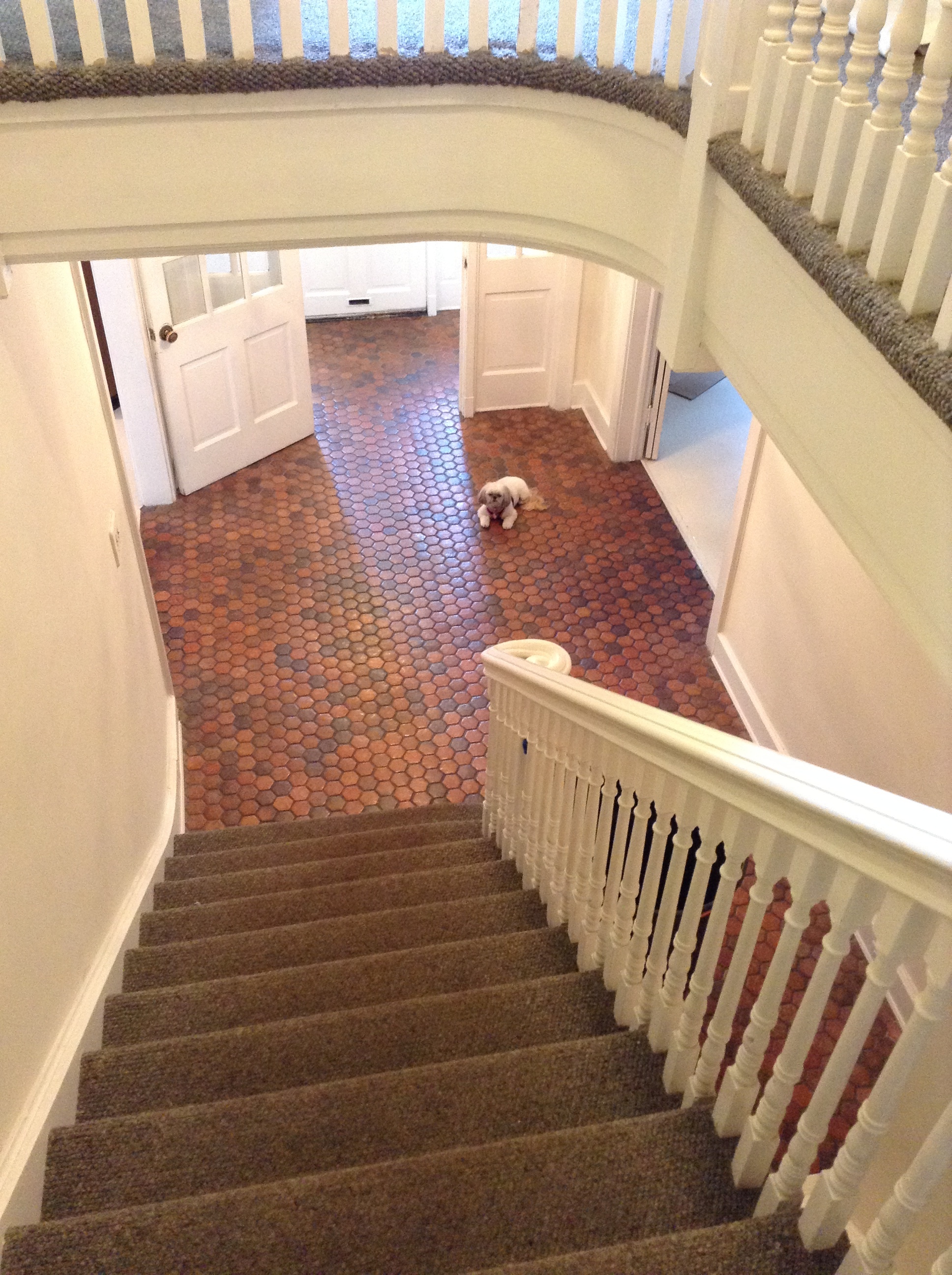
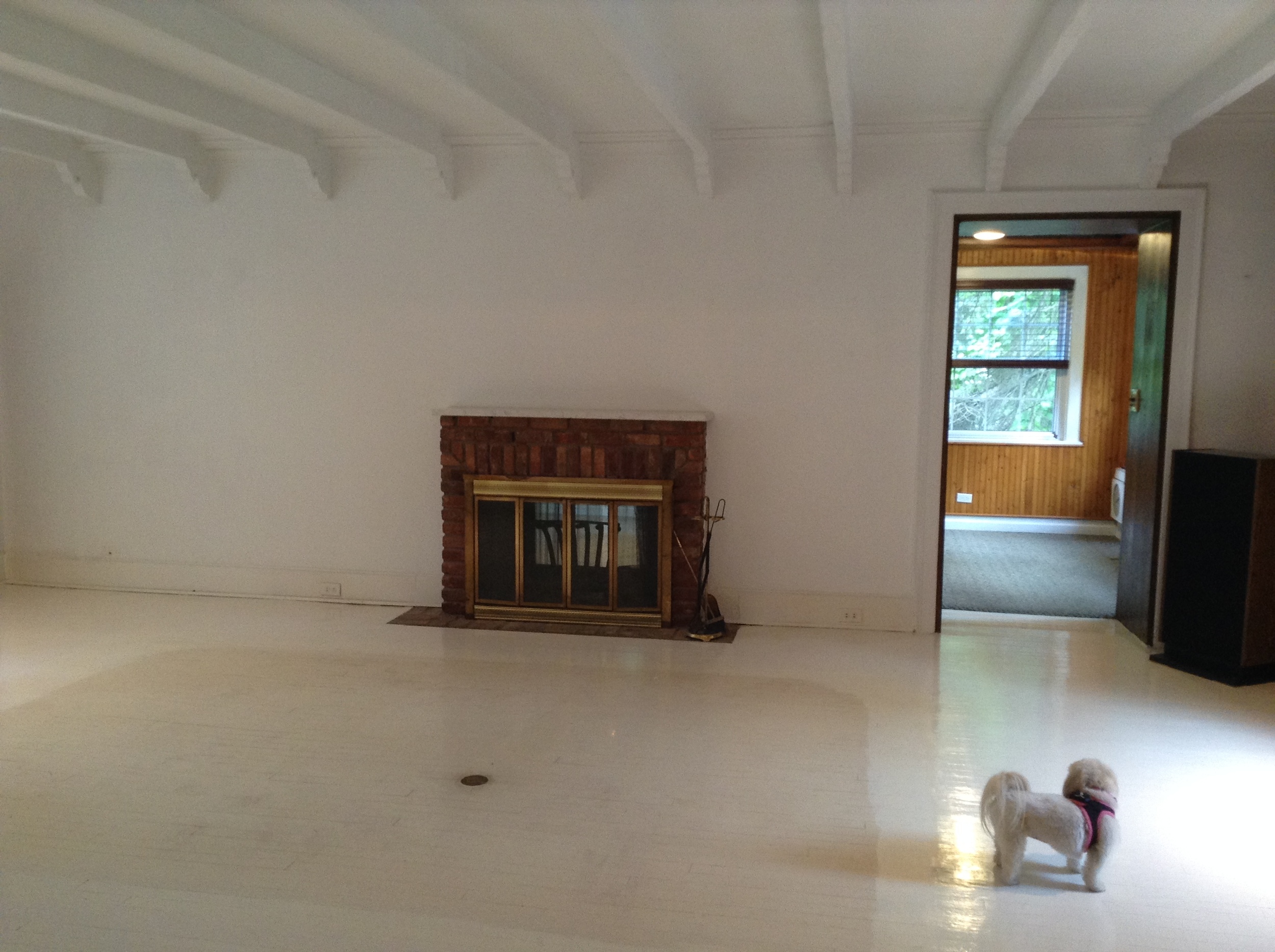
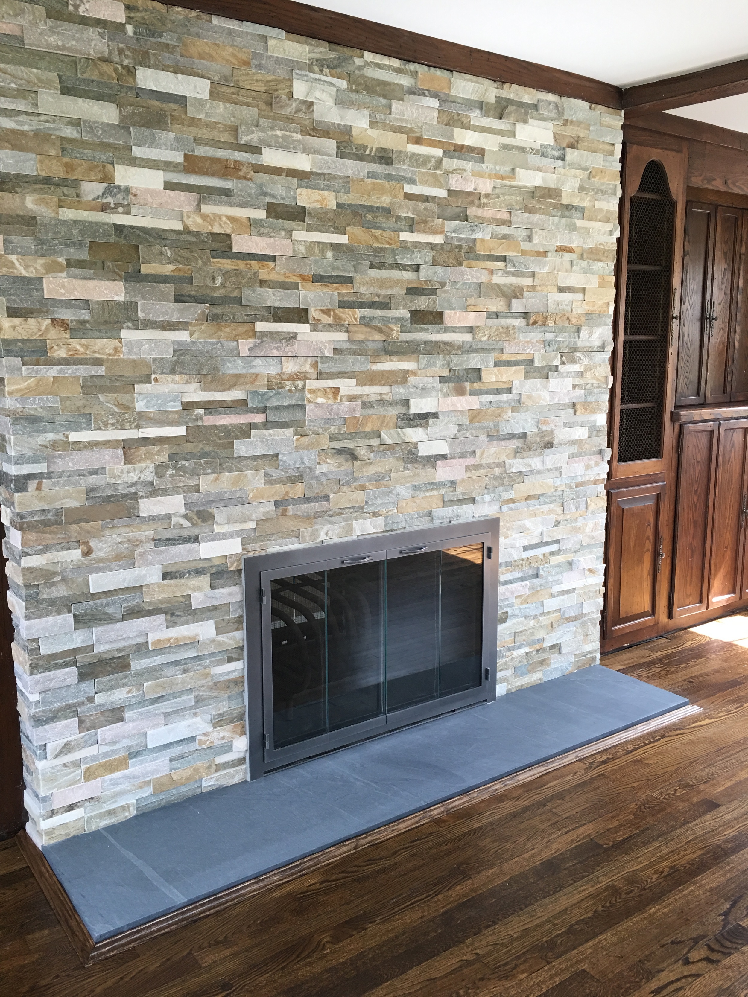
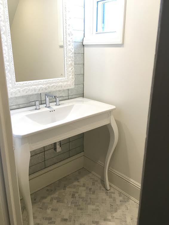
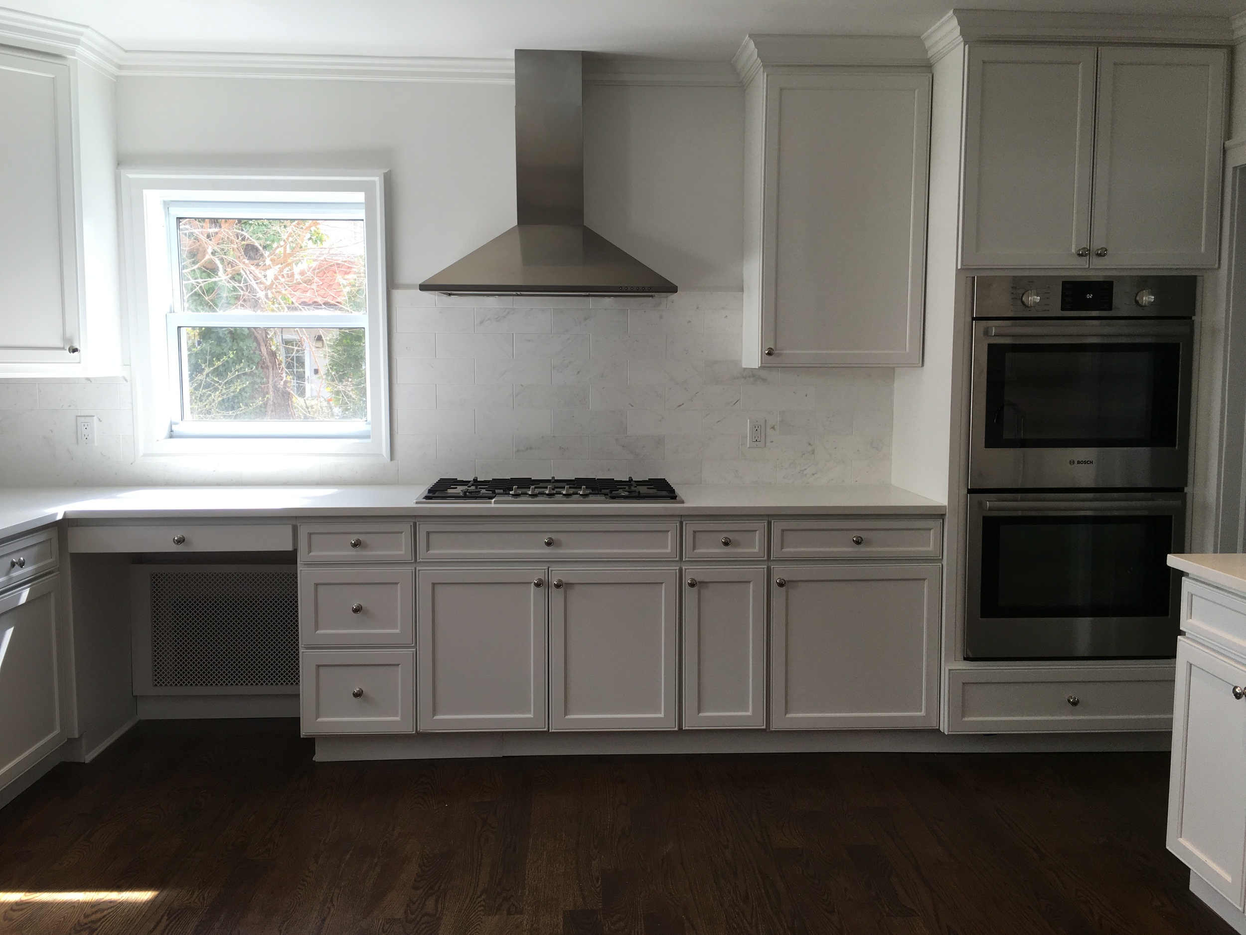
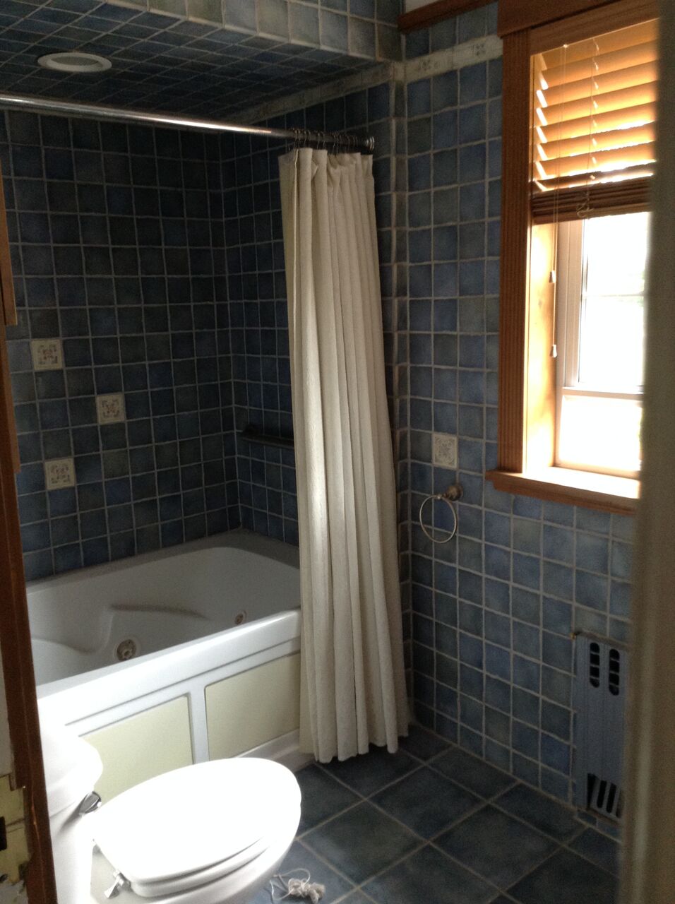
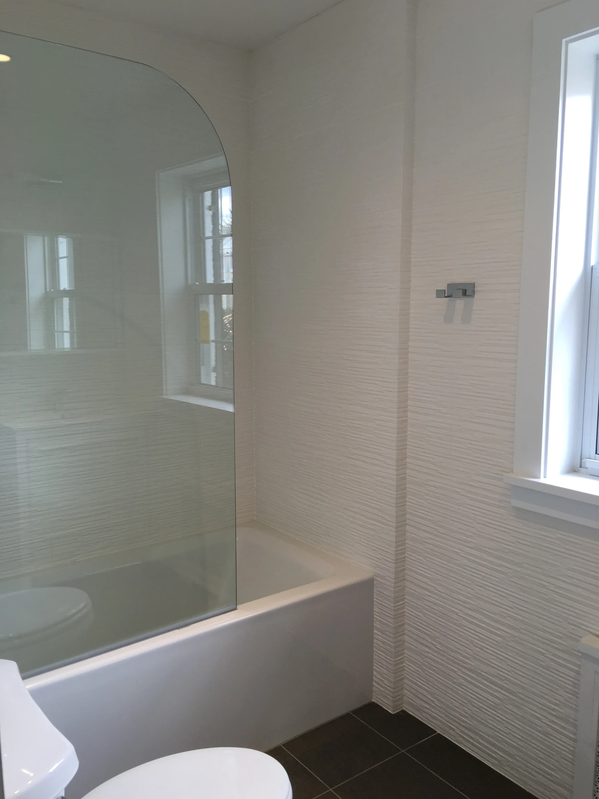
 I recently was lucky enough to be asked to help renovate a house built 100 years ago in the town of Kensington, Great Neck, NY. The complete renovation consisted of 2 fireplaces, all wood floors, the powder room, main staircase, kitchen , master bath, a kids bathroom and an attic bath.  This project took 8 months to complete. I am happy to report that the homeowner is over joyed with the finished product ! Please see some amazing before and after photos... 

BEFORE

BEFORE

AFTER

AFTER

BEFORE

BEFORE

AFTER

AFTER

BEFORE

BEFORE

AFTER

AFTER

BEFORE

BEFORE

AFTER

AFTER

BEFORE

BEFORE

AFTER

AFTER

BEFORE

BEFORE

AFTER

AFTER

BEFORE

BEFORE

BEFORE

BEFORE

AFTER

AFTER

BEFORE

BEFORE

AFTER

AFTER

BEFORE

BEFORE

AFTER

AFTER

BEFORE

BEFORE

AFTER

AFTER

PAINT THE TOWN RED!

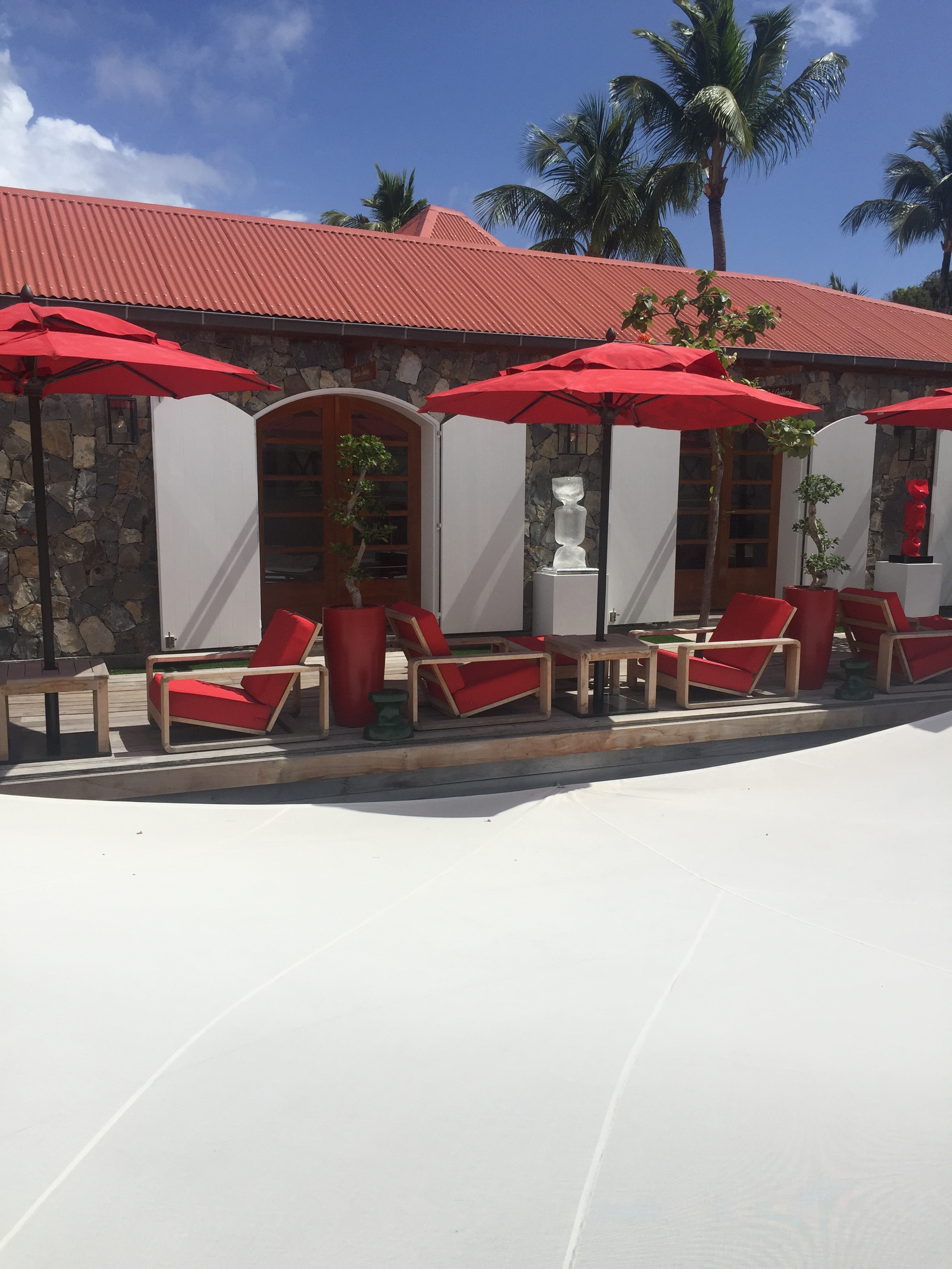
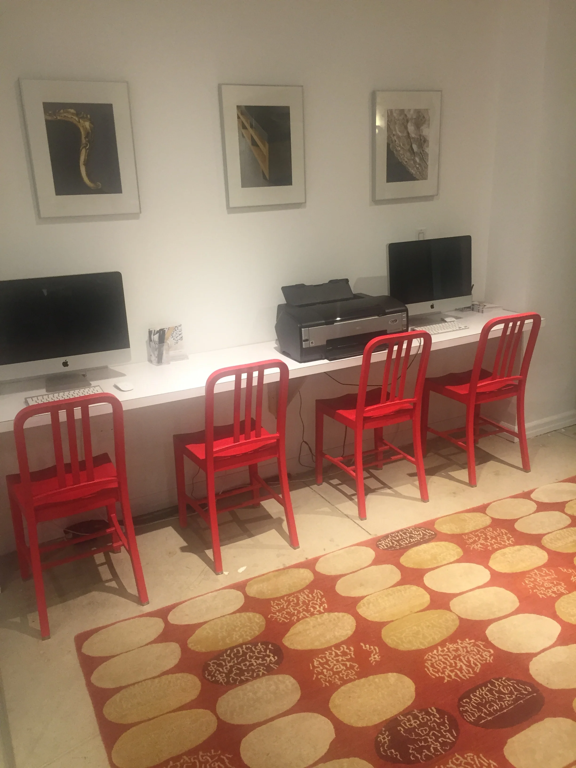
I am just back from a gorgeous Valentine's weekend in St. Barths and I just can't get the color red out of my mind! This incredible Island is covered in hints of red everywhere you go. From the rooftops to the flowers, this beautiful color made me giddy with joy. Red is a great color to bring into the home as well. Wether it is just a touch in a corner or covering a whole wall, this elegant, rich color will brighten up your day! 

St Barths

St Barths

Red Roofs in St Barths

Red Roofs in St Barths

Eden Rock Hotel

Front door to Eden Rock Villas

Front door to Eden Rock Villas

The Bright Group- Red Velvet Chair

The Bright Group- Red Velvet Chair

Global Views Tufted Bench

Global Views Tufted Bench

New Traditionalists Bar

New Traditionalists Bar

Access To Design Office- 200 Lex

Access To Design Office- 200 Lex

*Note: The images contained in this blog are not property nor work of New York Interior Design, Inc. They are strictly images acquired for inspiration and admiration of the industry's talent. New York Interior Design, Inc. does not claim rights to any of the works pictured above. All photos in the portfolio section of nyinteriordesign.com are the work and designs of New York Interior Design, Inc.

FLATIRON GLAM

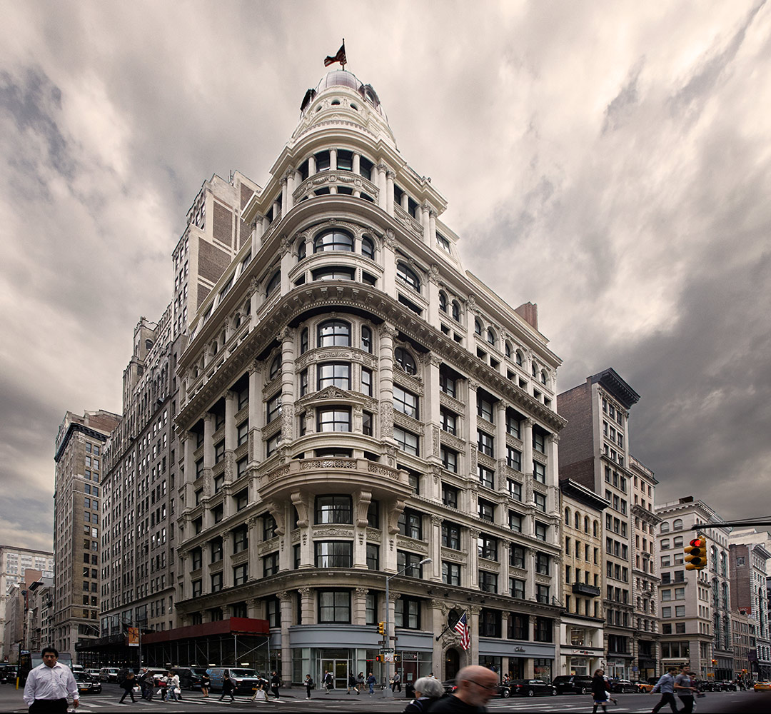
Once in awhile as a designer you come across that perfect project. The space, the location and the client are all very interesting and exciting.  That was the way I felt about this  beauty in the center of the Flatiron District. The apartment is in a Landmark building on very desirable Fifth Avenue with oversized windows and 10.5-foot ceilings allowing light to flood the apartment. The highest level of finishes complement this fully restored 1897 Beaux Arts building. Located in a very cool area surrounded by new interior design shopping destinations and incredible restaurants,  This building is one of downtowns finest new conversions . It was renovated with a more traditional style in mind and the highest level of finishes. The cherry on the cake is the  fully restored copper cupola and curved plate glass windows... 

Doing the interior of a space like this comes very easily, it was conceived of totally with my client in mind and the way she lives her life.. exciting, adventurous ,colorful and worldly... Photo credit : Beckerman Photography

1897 Beaux Arts 

1897 Beaux Arts 

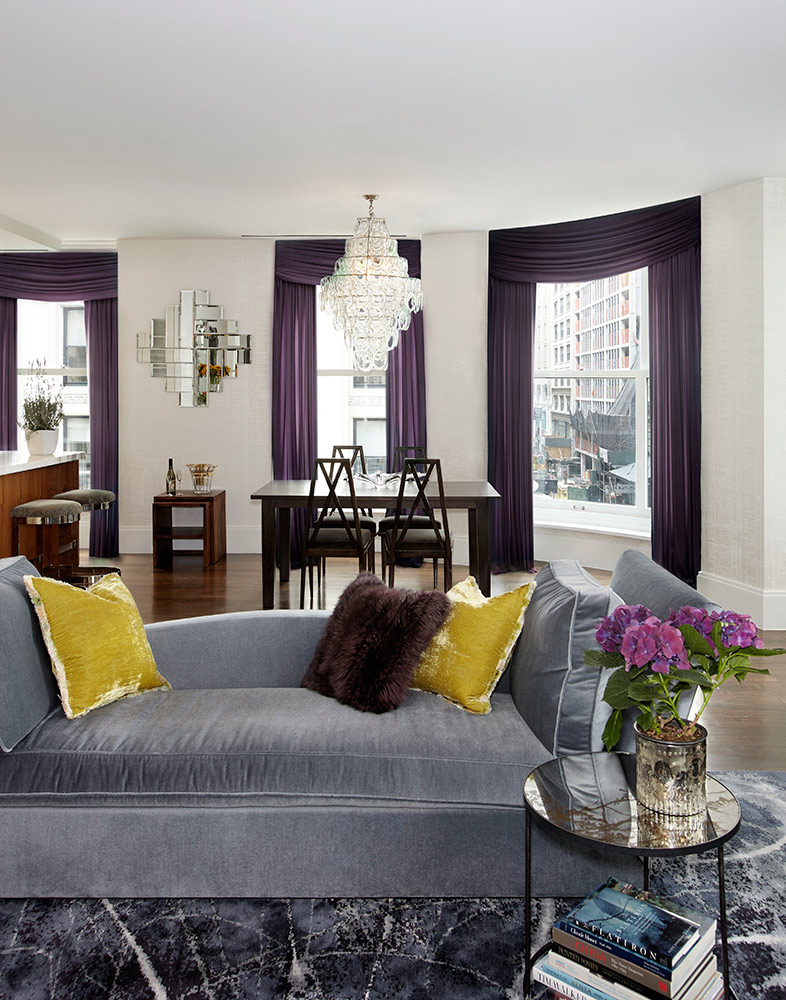
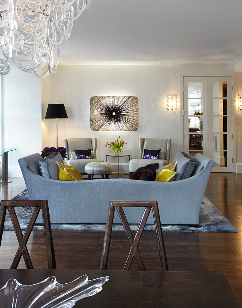
The rug started it all.. Fort Street Studio in a round motif to mimic the round windows... Walls Maya Romanoff white paper..

The rug started it all.. Fort Street Studio in a round motif to mimic the round windows... Walls Maya Romanoff white paper..

We utilized one of my favorite lights as wall sculpture by: Aqua in purple silk. Dining chairs: High Style Deco 

We utilized one of my favorite lights as wall sculpture by: Aqua in purple silk. Dining chairs: High Style Deco 

The whole back wall was custom built to incorporate wood paneling, headboard, floating nightstands and base...

The whole back wall was custom built to incorporate wood paneling, headboard, floating nightstands and base...

Closeup of another fav of mine metal Stephanie Odegard dresser...

Closeup of another fav of mine metal Stephanie Odegard dresser...

1970's fur topped Stools were found at 1St Dibs 

1970's fur topped Stools were found at 1St Dibs 

This sexy den incorporates black velvet drapes with a textured black wallcovering 

This sexy den incorporates black velvet drapes with a textured black wallcovering 

Powder room wallcovering/ bronze Crocodile 

Powder room wallcovering/ bronze Crocodile