A SURPRISE BOCA PROJECT RIGHT ON THE OCEAN

What made this project unique was the story behind it. – My client a gentleman of refined taste, wanted to surprise his wife of over four decades with a stunning condominium right on the ocean.

The project involved a gut renovation encompassing the kitchen, two bedrooms, two bathrooms, floors, and lighting. Every detail was meticulously curated, from the installation of furniture, lighting, and vintage antiques to the careful placement of art and accessories. The entire transformation unfolded over the course of a year.

The grand reveal marked the culmination of many months of hard work, and it was on this day that I had the pleasure of meeting the client's charming wife. The joyous occasion was met with enthusiasm as she expressed her love for every aspect of the project. It was truly a delightful conclusion to a year-long journey, resulting in a project that surpassed expectations.

The new kitchen with Calacutta Verde marble countertops and an ocean view!

A close-up of this new modern kitchen with glass cabinets and stunning ocean views.

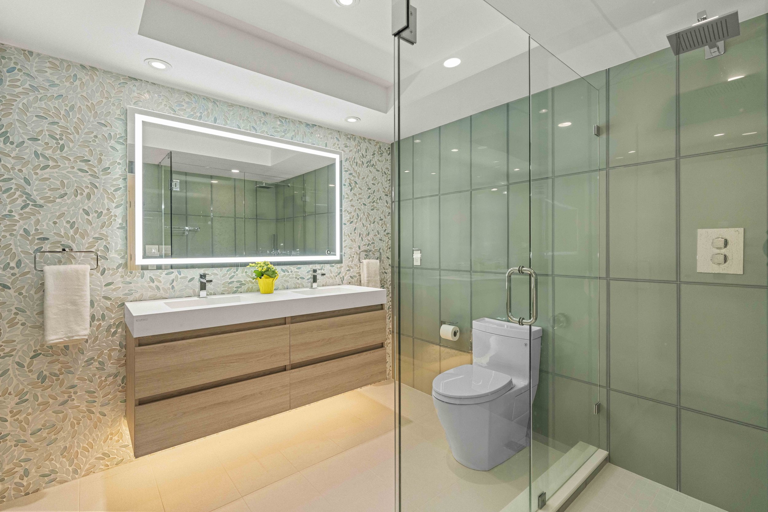
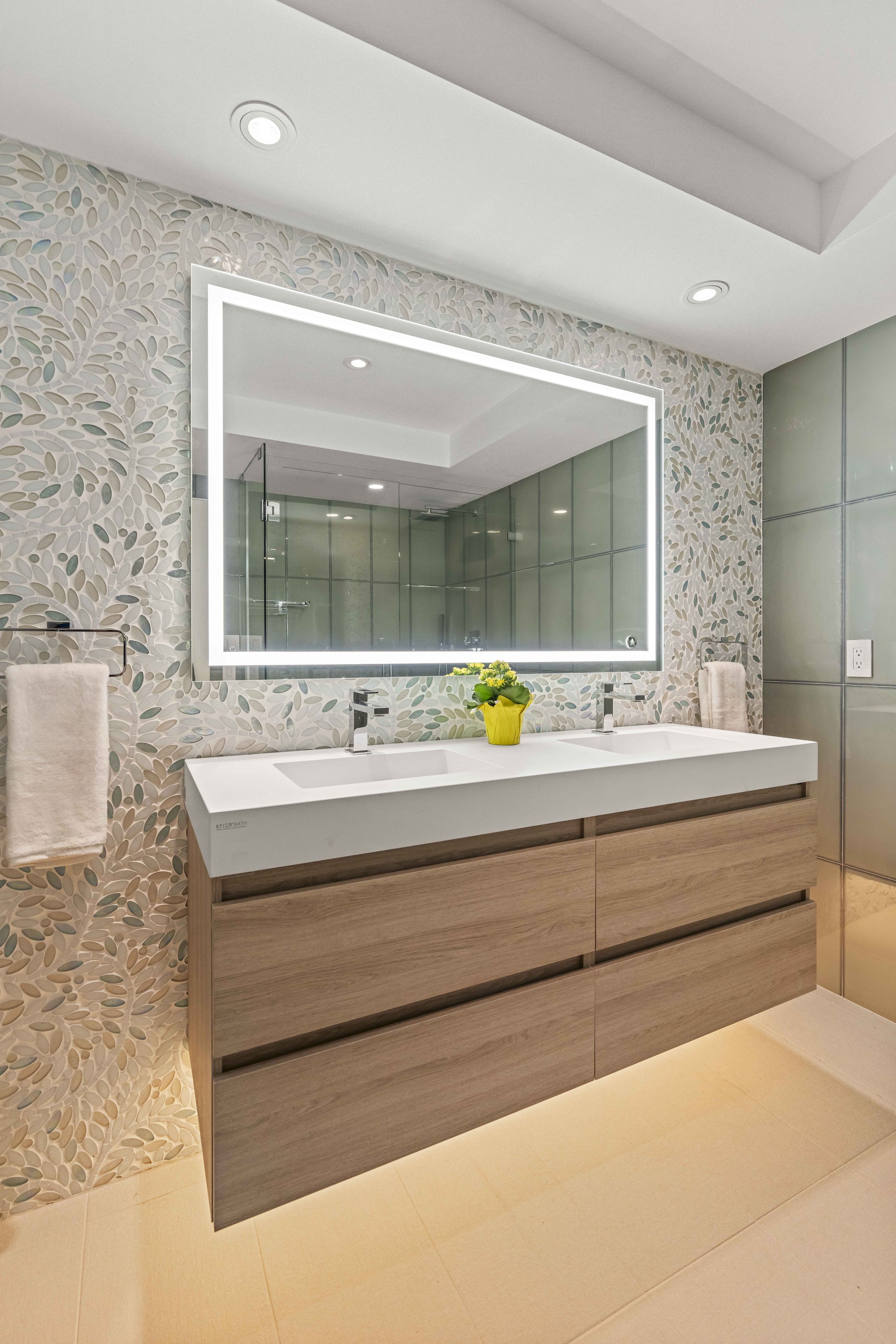
The primary bathroom with a mosaic feature wall .

The primary bathroom featuring a leaf mosaic wall.

Lighting plays a big part in every project!

CONTEMPORARY TRADITIONAL CONDO

Once in a while I get to design a new project that I find really exciting. This was one of them. Usually I work with homeowners that want a very modern sleek approach to design, which is great. However, when I get to do something new and out of the ordinary, I find it exciting and refreshing. This lovely lady wanted a bright, colorful and more traditional space. I was able to implement some of my favorite things - color, pattern, texture, and layering. The result is a condo in the sky that I think turned out quite lovely! It is light filled, fun, airy and happy. And my client feels the same exact way!

Photography by Jonathan Beckerman

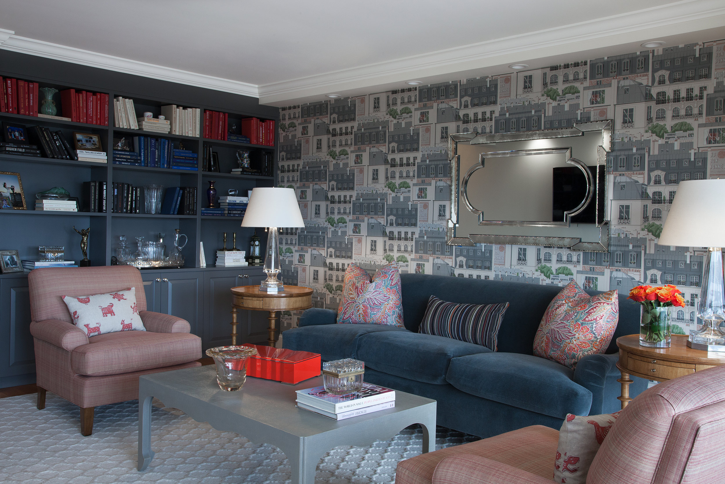
In the living room we utilized a fun Paris themed wallpaper, a custom mohair covered traditional sofa , and lots of layered patterns and color. We also incorporated many vintage and antique accessories.

In the living room we utilized a fun Paris themed wallpaper, a custom mohair covered traditional sofa , and lots of layered patterns and color. We also incorporated many vintage and antique accessories.

We filled the built-in bookcase with books, personal items and antiques, and styled the books according to color. The vintage mirror brings character and more light to the room.

We filled the built-in bookcase with books, personal items and antiques, and styled the books according to color. The vintage mirror brings character and more light to the room.

This rug was the starting point for the room. The geometric pattern plays off of the strie fabric on the club chairs and the linen wrapped parsons coffee table. The Mongolian wool stool brings a fun touch of contrasting texture to the room.

This rug was the starting point for the room. The geometric pattern plays off of the strie fabric on the club chairs and the linen wrapped parsons coffee table. The Mongolian wool stool brings a fun touch of contrasting texture to the room.

A playful Paris city scene wallpaper contrasts the colorful floral pillows. Crystal table lamps bring a sparkle to the room.

A playful Paris city scene wallpaper contrasts the colorful floral pillows. Crystal table lamps bring a sparkle to the room.

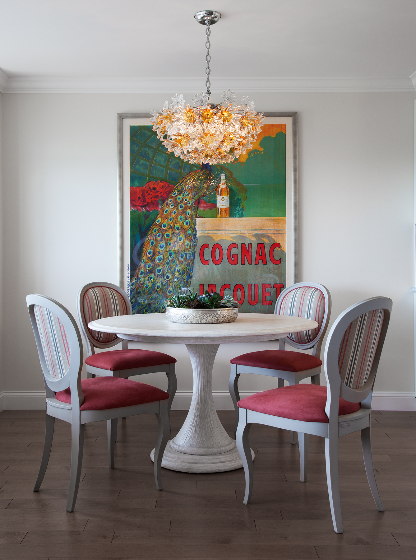
Pattern, stripes and bright color make the dining area sing!

Pattern, stripes and bright color make the dining area sing!

A mid-century modern chandelier casts a warm glow over this intimate dining area.

A mid-century modern chandelier casts a warm glow over this intimate dining area.

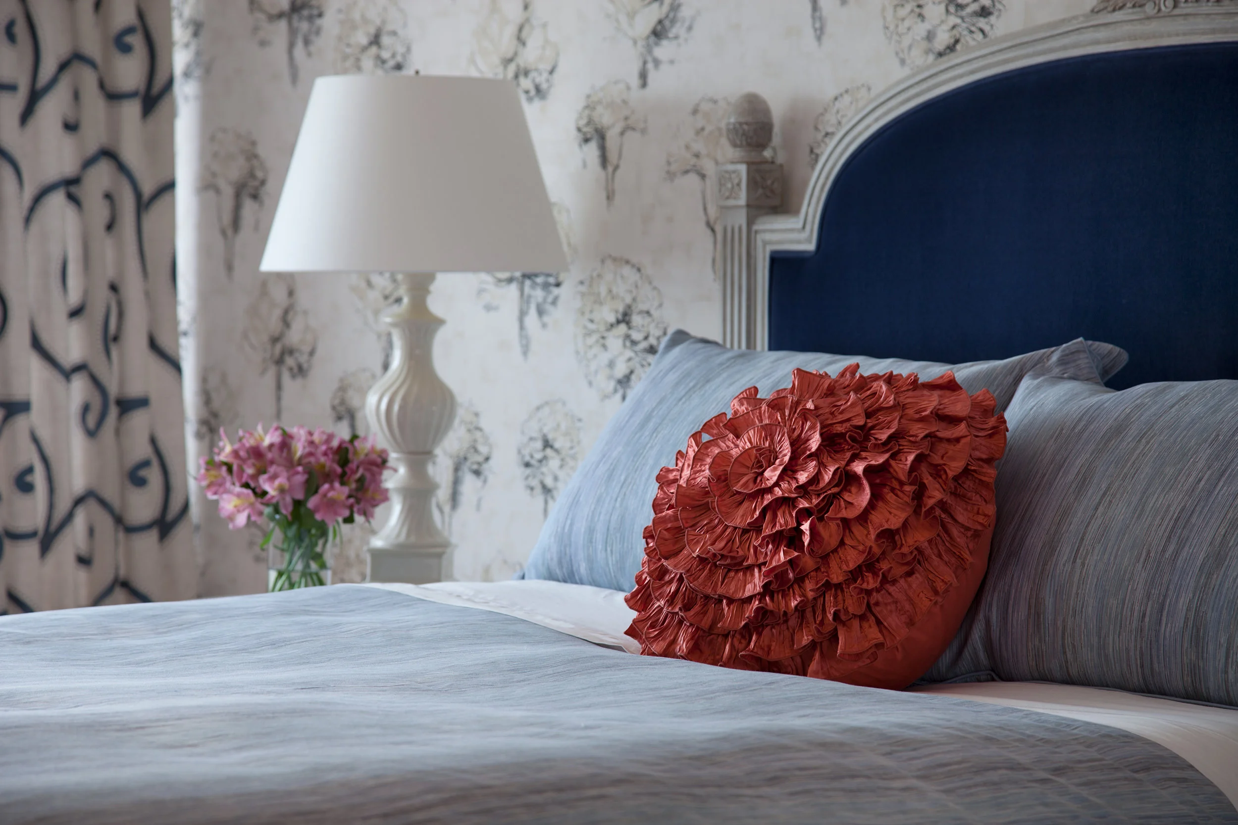
In the bedroom, the request was to make it light filled, happy and colorful.

In the bedroom, the request was to make it light filled, happy and colorful.

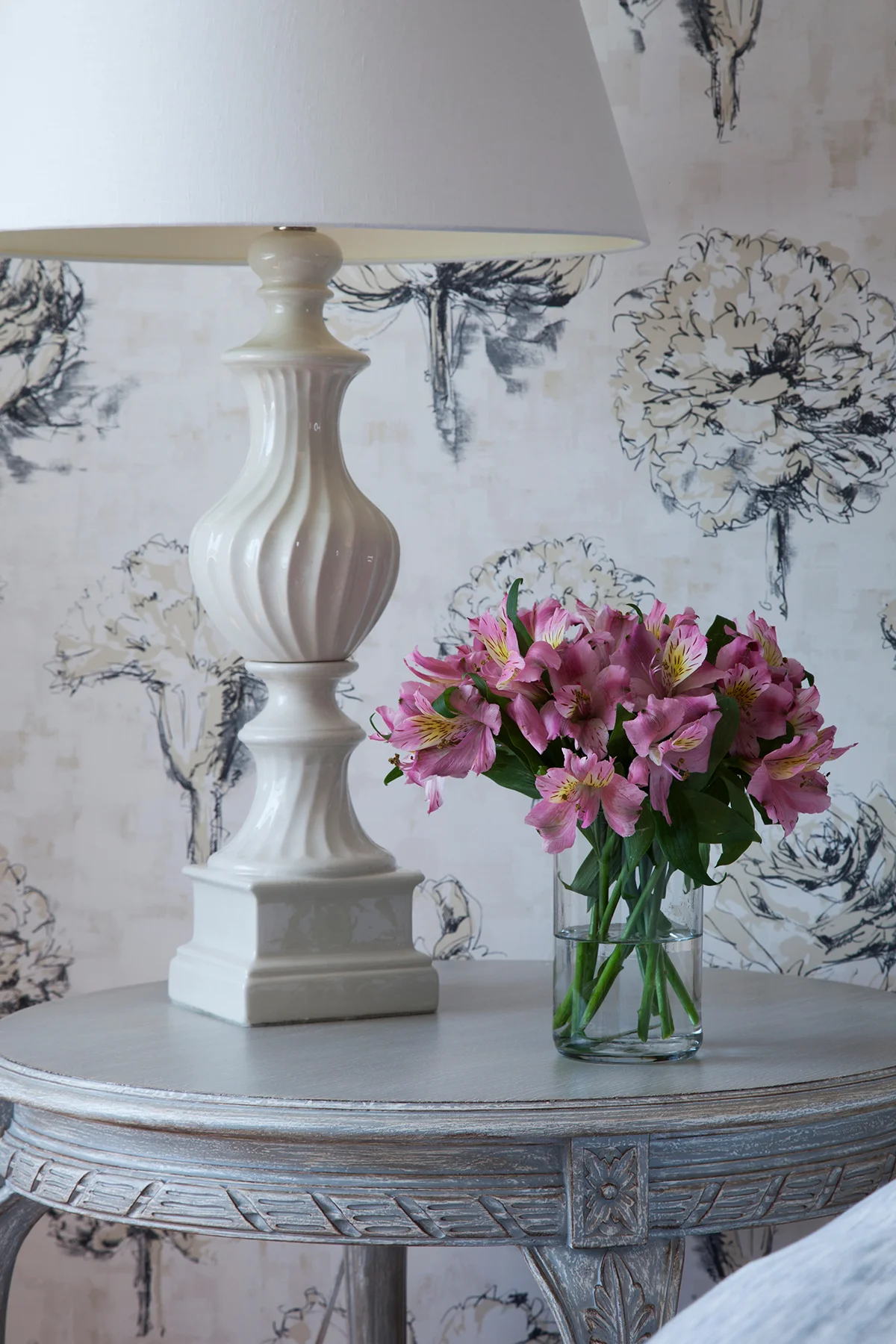
French flowers on the wallpaper play against the patterns on the rug, drapery and chair. It’s all about mixing color and pattern. Antique and vintage pieces always add character.

French flowers on the wallpaper play against the patterns on the rug, drapery and chair. It’s all about mixing color and pattern. Antique and vintage pieces always add character.

A pop of color draws the eye!

A pop of color draws the eye!

Flowers, flowers everywhere…

Flowers, flowers everywhere…

It’s all in the details.

It’s all in the details.

A FASHION FORWARD NEW INTERIOR DESIGN PROJECT IN CHELSEA FOR THE NEW FALL SEASON

I love talking about some of my favorite interior design projects.  I just completed a new one in Chelsea, a lovely,  storied NYC neighborhood with a decent amount of newly constructed or adapted modern residences, like this one. What makes this one different from most is that the elevator opens right into the apartment. This fun project for a fantastic client took about a year from start to finish.

This space was conceived for a family with two young children. The only initial directives were to design a welcoming entry with a "wow factor" to set the tone and to transform what was a somewhat boring living / dining room into a cool, colorful, and comfortable space for the whole family and guests to enjoy. 

There are a lot of musicians in this family, the custom wall unit was built to house 5 guitars in addition to a television and bar. In the end, the piano was the only piece left over from the old space. I'm thrilled that this charming musical family is as happy as I am with the outcome of their new open living area! 

The elevator entrance opens to a warm welcome. Lush, textural eggplant hued suede wallcovering was applied to the main entry wall to make the sconces and painting pop. An impossibly soft faux fur covered custom New York Interior Design bench provide…

The elevator entrance opens to a warm welcome. Lush, textural eggplant hued suede wallcovering was applied to the main entry wall to make the sconces and painting pop. An impossibly soft faux fur covered custom New York Interior Design bench provides the posh perch to take off snow boots or put on a pair of perfect pumps. 

A custom designed glass tile mosaic at the end of the hallway makes this entry sparkle and feel visually larger.

A custom designed glass tile mosaic at the end of the hallway makes this entry sparkle and feel visually larger.

Everything in this living/dining area was designed with the clients in mind. From the bold floral wallpaper (which inspired the entire space) to soft mohair seating and inviting ombre stripes, color & geometric shapes abound. 

Everything in this living/dining area was designed with the clients in mind. From the bold floral wallpaper (which inspired the entire space) to soft mohair seating and inviting ombre stripes, color & geometric shapes abound. 

With an iridescent pendant chandelier lighting the way with bold pattern and color , dinners will never be boring! 

With an iridescent pendant chandelier lighting the way with bold pattern and color , dinners will never be boring! 

This wall unit was custom built to fit some amazing musical instruments. We included a mirrored bar to house family heirloom glassware and some antiques from travels around the globe. 

This wall unit was custom built to fit some amazing musical instruments. We included a mirrored bar to house family heirloom glassware and some antiques from travels around the globe. 

Precious Heirlooms and favorite drinks sparkle against these glass shelves. Hammered metal pulls add the finishing touch .

Precious Heirlooms and favorite drinks sparkle against these glass shelves. Hammered metal pulls add the finishing touch .

Color, pattern and metal tones are repeated around the room. Different shapes and scale are used to keep the visual momentum going. 

Color, pattern and metal tones are repeated around the room. Different shapes and scale are used to keep the visual momentum going. 

This snake skin and metal vintage glass side table along with fresh crabtree branches add color and texture.  

This snake skin and metal vintage glass side table along with fresh crabtree branches add color and texture.  

There is nothing like fresh Dahlias to bring color and life to a room. These beauties pull in tones from the floral wallpaper.

There is nothing like fresh Dahlias to bring color and life to a room. These beauties pull in tones from the floral wallpaper.


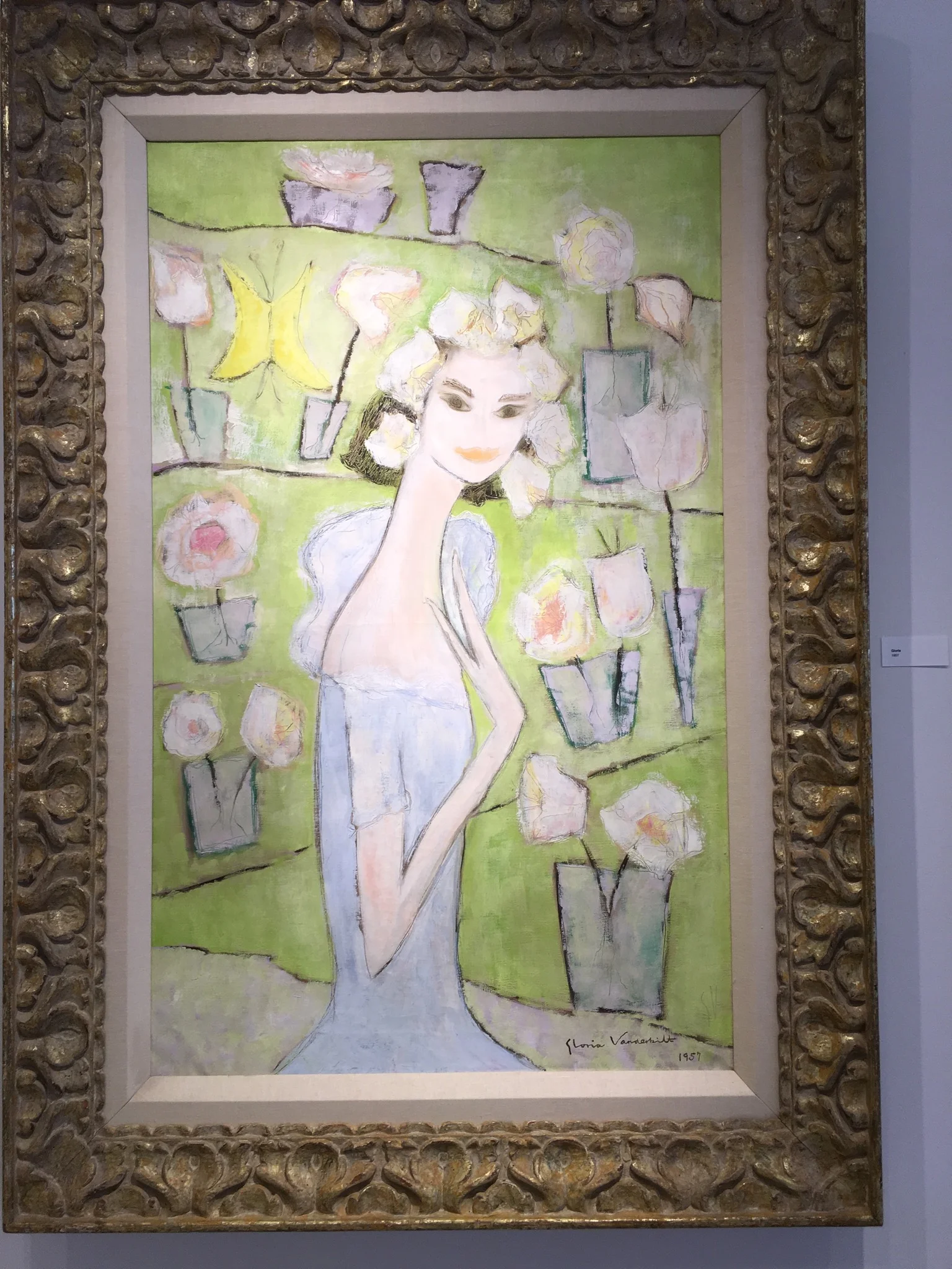
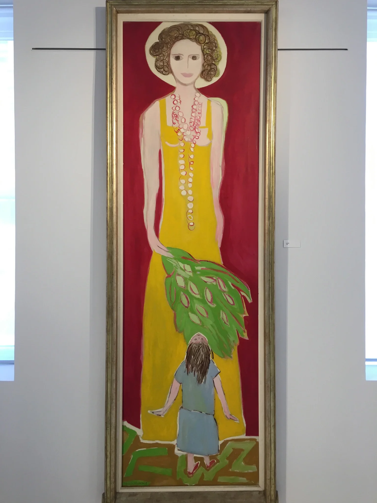
GLORIA VANDERBILT "A RETROSPECTIVE"

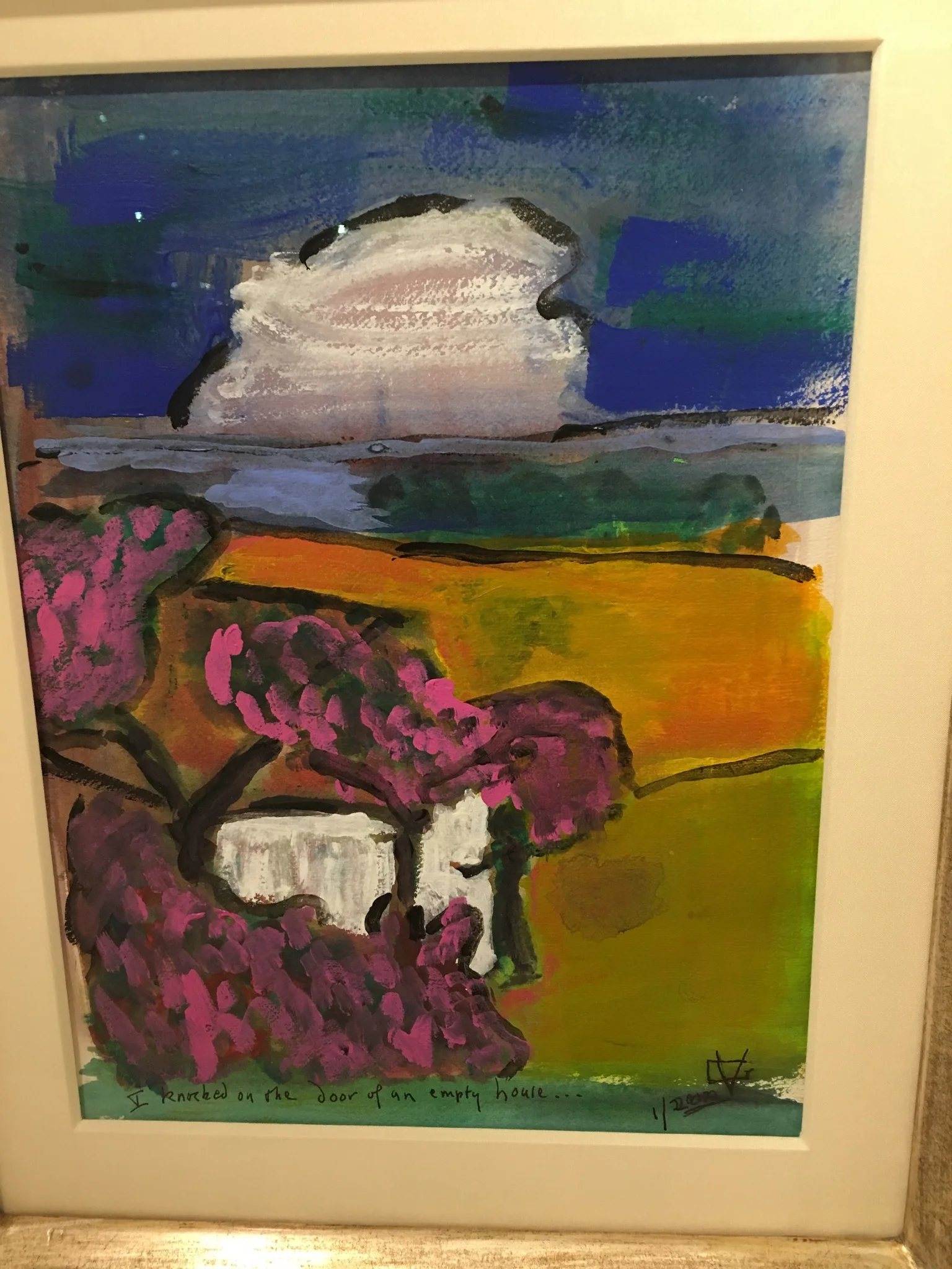
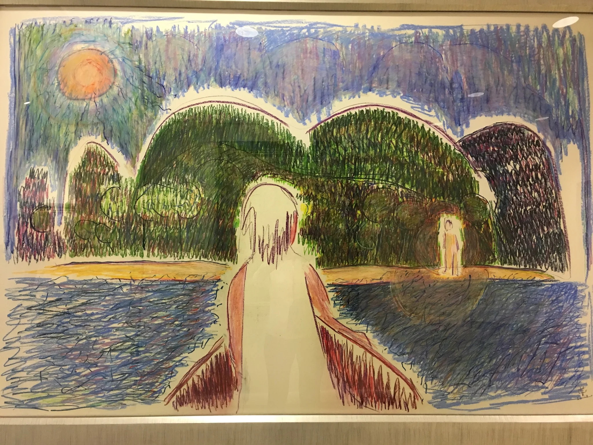
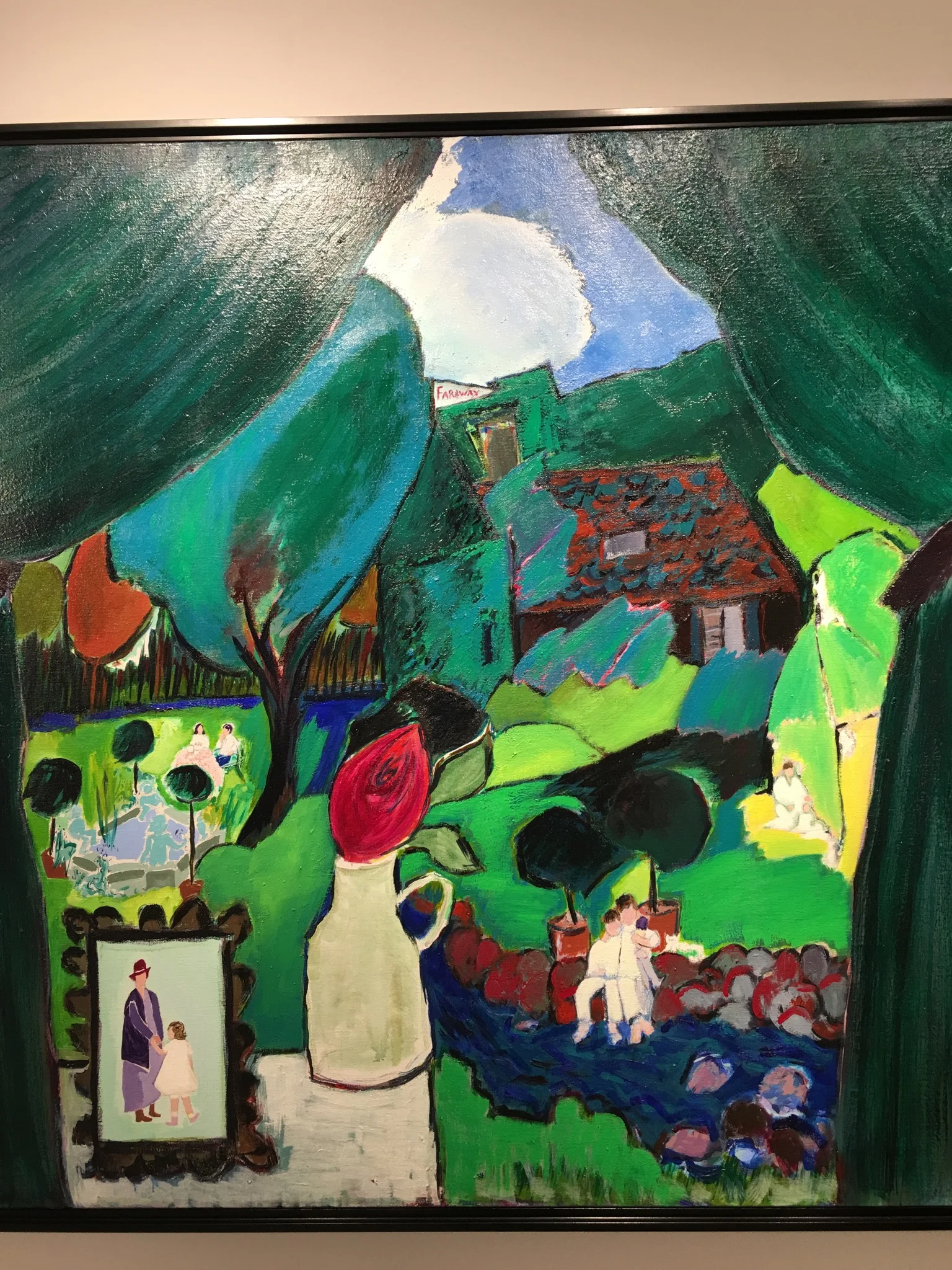
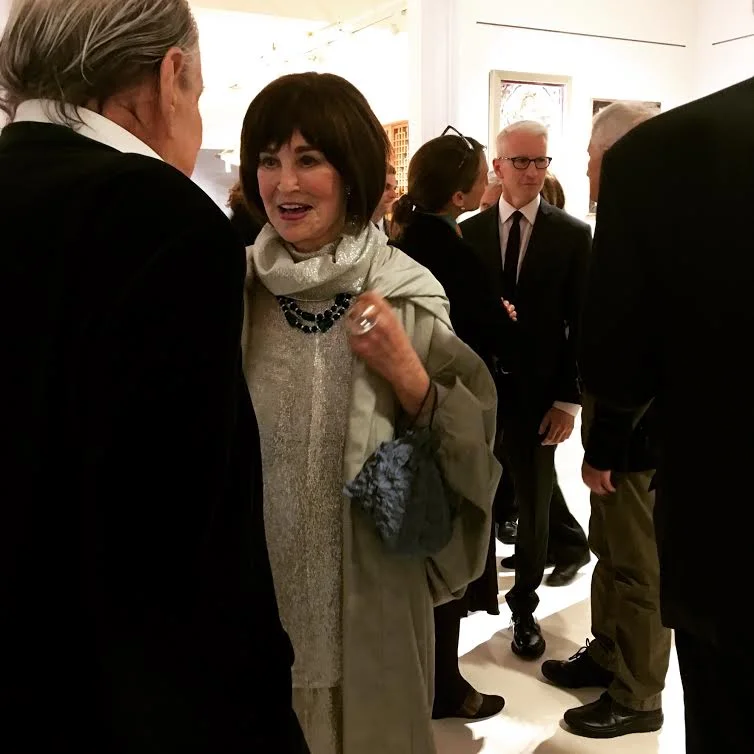
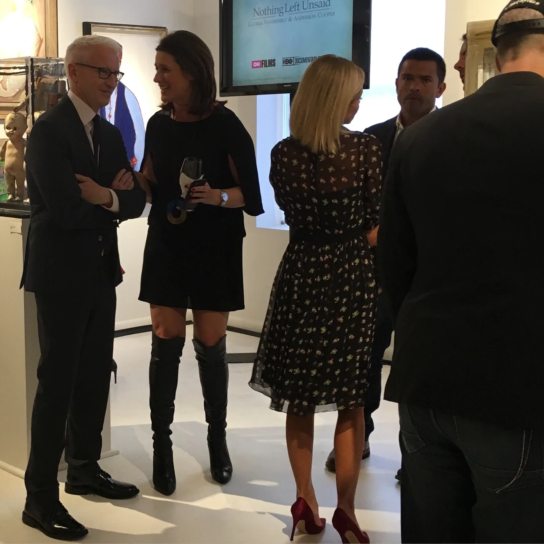
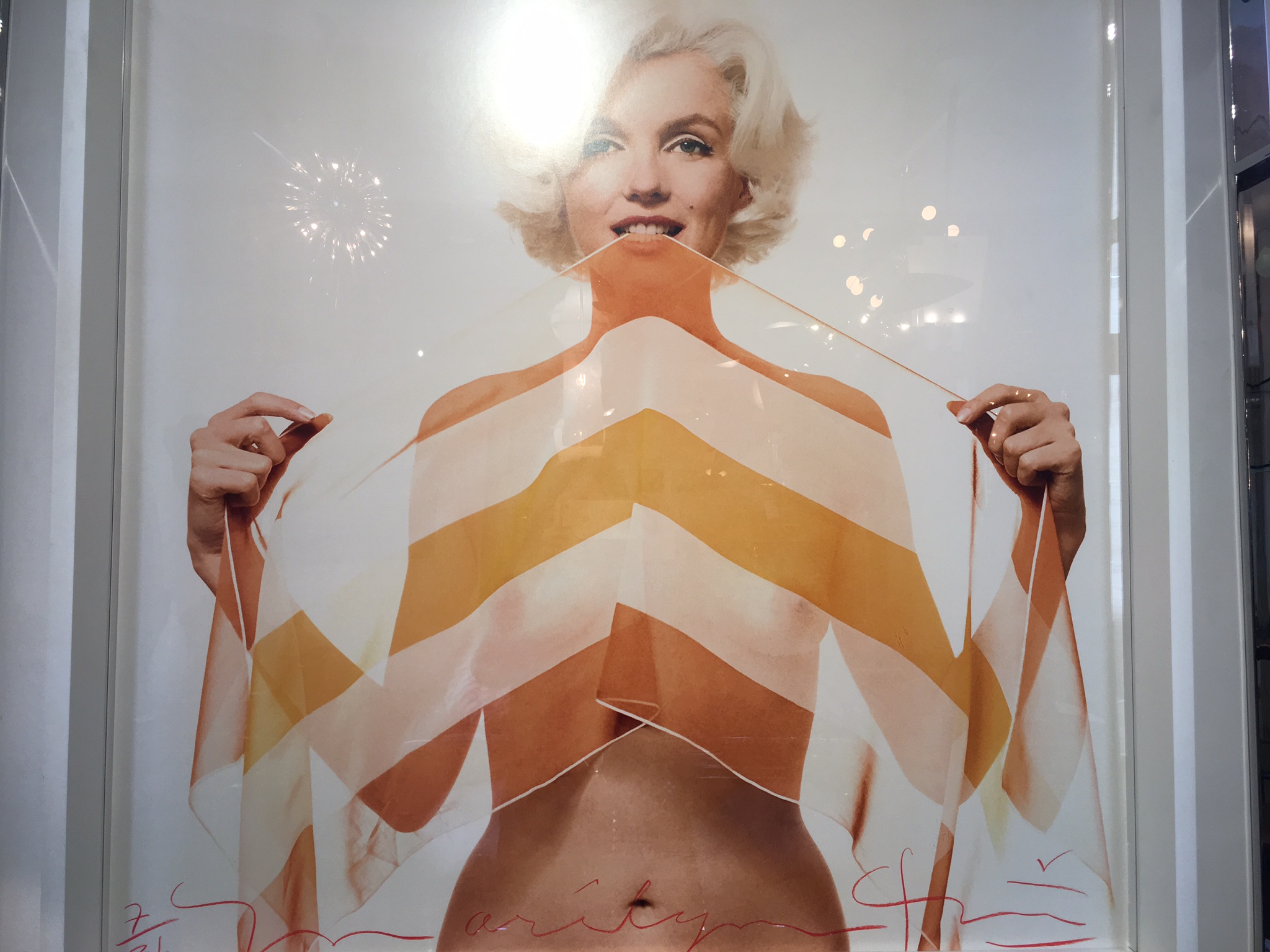
Last night was the gallery opening of the Vanderbilt exhibit. It was a very festive ,fun evening at The NYDC, 200 Lex. What I liked best about the art was that it told the story of Vanderbilt's life.  She was animated and beautiful last night. It was very exciting to see Anderson Cooper, Kelly Ripa and all the other celebrities! Vanderbilt has led a VERY interesting life. I can't wait to read her new book "The Rainbow Comes and Goes" ...

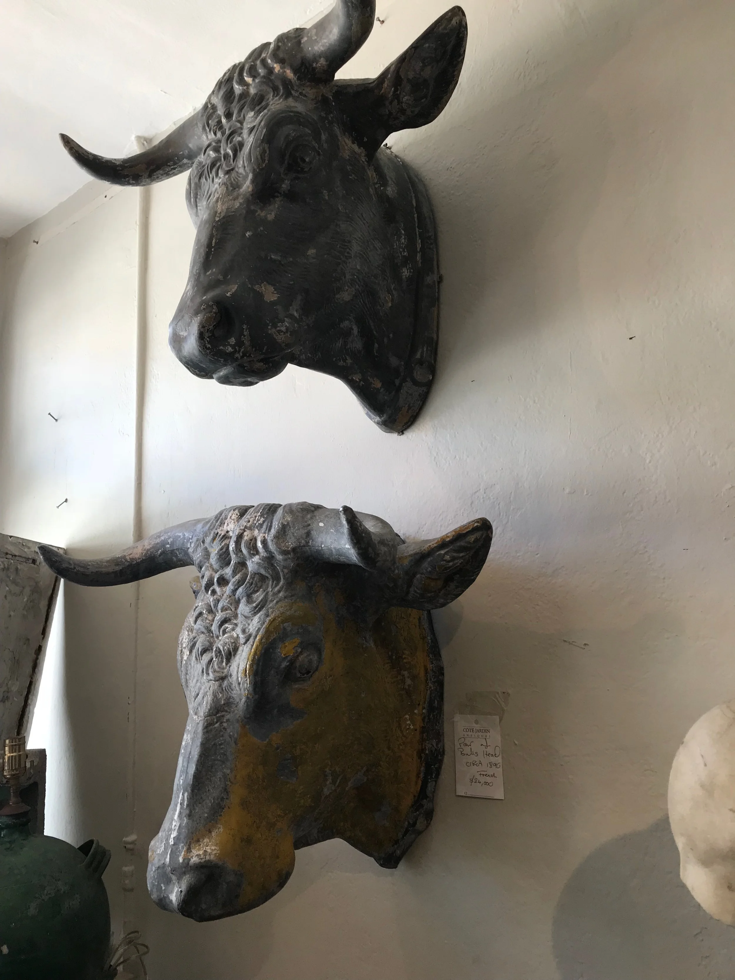
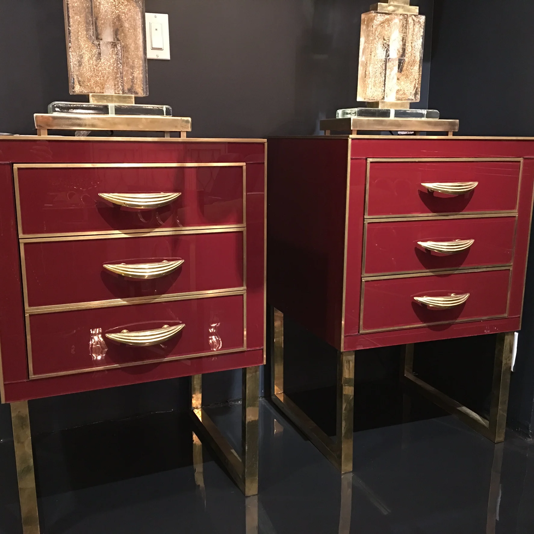
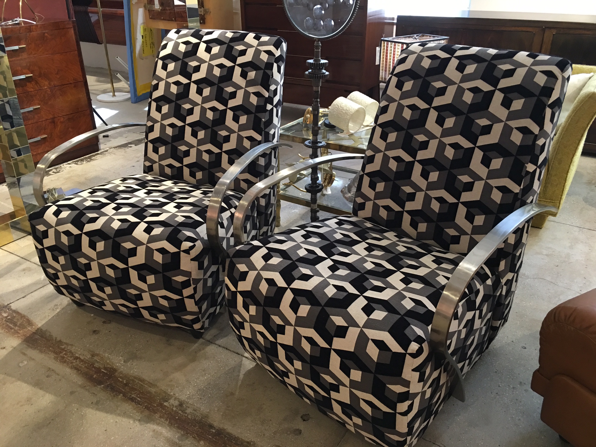
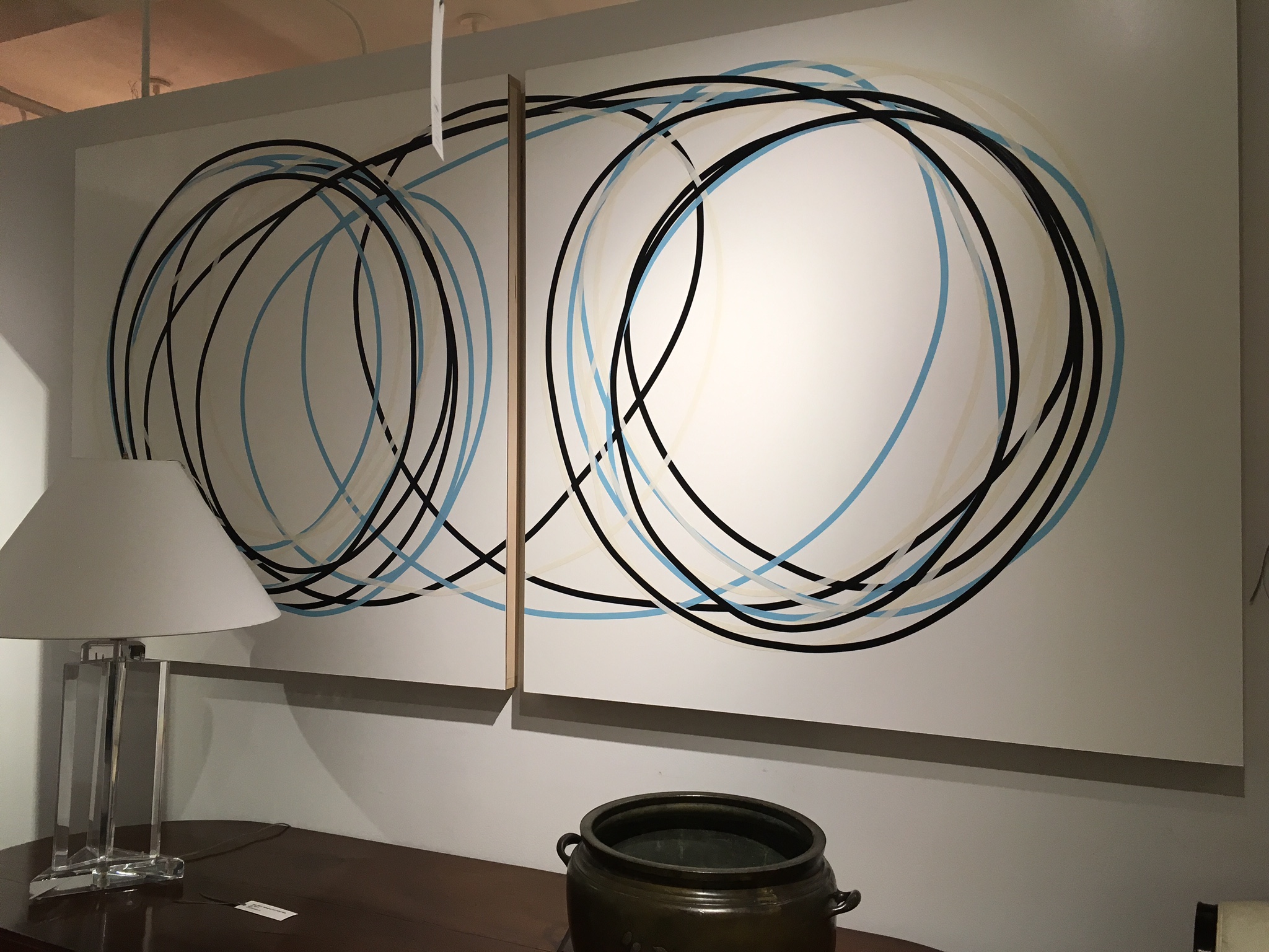
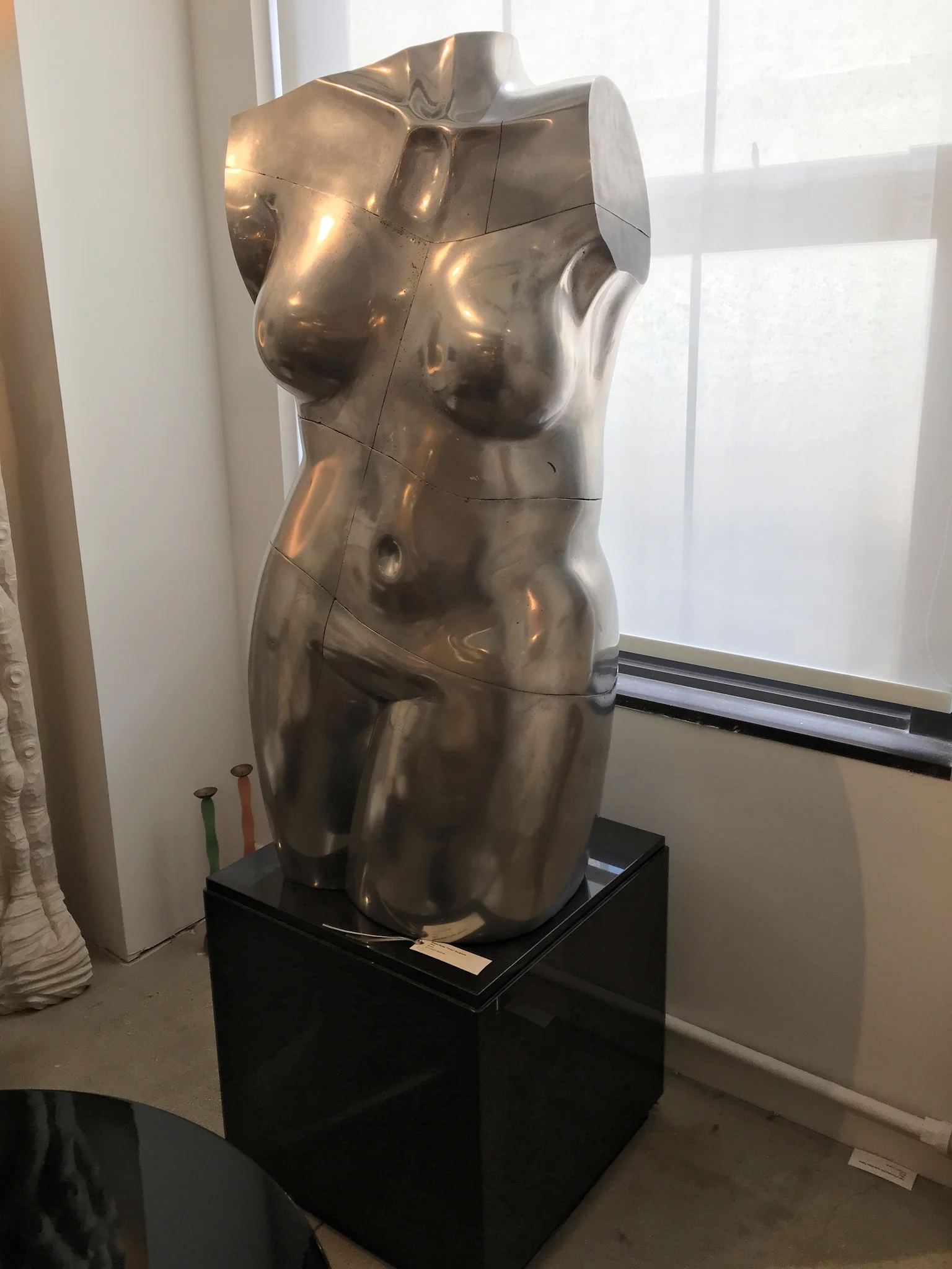
RAVISHING ANTIQUE / VINTAGE EYE CANDY

One of the real bonuses of working in this field is watching the clever, creative, gifted  people (I happen to know) come up with incredible new ideas. One such idea was the first brick and mortar space for the online giant 1stdibs. Jim Druckman was the genius behind it! 

This all took place years ago. 1stdibs is now a destination for many designers and collectors alike. It is an eclectic mix of over 54 different dealers from around the country and world that occupy the entire 10th floor of 200 Lex  in 33,000 sq feet of space. It is one of my special,  wonderful secrets. There is ALWAYS something new and exciting here!!!!  The following are just a few of my latest favorite things....
IMG_6059.JPG
IMG_6054.JPG