WHEN THINGS GO TERRIBLY WRONG TO EXCEPTIONAL CLIENTS!

One of the undeniable truths about construction, renovations, and decorating is that something unexpected always happens. How these surprises are handled depends on the contractor, the designer, and the client’s reactions. While you can’t change the reality of things going wrong, you can control how you react. This is the true story of wonderful lifetime clients who waited over 20 years to finally build the kitchen of their dreams.

Initially, everything went smoothly with the renovation, which included bumping out walls and floors. The new electrical, plumbing, flooring, and walls were completed. Appliances and cabinets were installed, paint was applied to the walls, furniture arrived, and artwork and accessories were put in place. Everyone was thrilled!

But then, one tile cracked. Three months later, another followed. We knew something was terribly wrong. Although these were large 48”x48” tiles, properly installed, they should never have cracked.

Thank goodness these clients hired an upstanding, honest contractor who stood by his work. We found new tiles, and the entire floor will be ripped up and the new tiles installed correctly this time. Yes, it’s a significant inconvenience, but fortunately, these clients are very grounded. They understand that much worse things could happen and are taking it in stride. I hope to always be this lucky to work with such level-headed and amazing clients!

THE BENEFITS OF INCLUDING A BUILT-IN WALL UNIT TO YOUR DESIGN

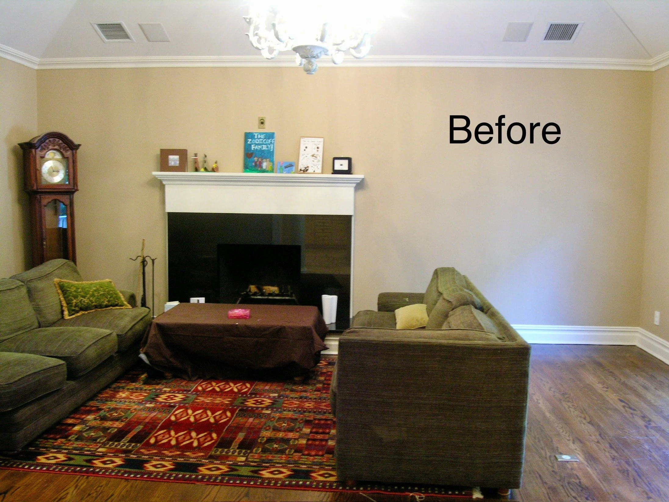
Over the years, I've often been invited into living rooms or family rooms that lack a focal point. While these spaces may look fine, they often feel directionless and unbalanced. That's where a built-in wall unit can work wonders! I've designed many wall units, ranging from simple bookshelves to those that accommodate flat-screen TVs or even feature elegant mirrored bars. Wall units have the power to truly transform a room, and I believe they are well worth the investment. Take a look at some of the stunning transformations below!

AFTER

BEFORE

BEFORE

After

SANDS POINT DREAM HOUSE RENOVATION

When one of our wonderful repeat clients called and said they just bought this 1950’s mid-century modern house, we were very excited to get started on the gut renovation

This home sits high on a hill overlooking the Long Island Sound with water views from every room of this 4 Br, 5 Bath retreat on over 2 acres of land In The Heart Of Sands Point.

We came up with a new 21st century modern luxurious architectural plan, updating every room in the house. We worked to make it a forever home with smart technology, energy efficiency, and zen beauty.

We also incorporated a new landscaping plan. and an infinity pool…. What we never expected was building this home in the middle of a pandemic, with all kinds of shutdowns and delays…

After three and a half long years these are the photos of the new house. We might have to wait a couple of more years until all the interior decorating is finalized. So for now, enjoy these photos showing all of our design choices for flooring, moldings, fireplaces, bathrooms, primary closets, and an amazing chef’s kitchen. As they say… “it’s all in the details! “

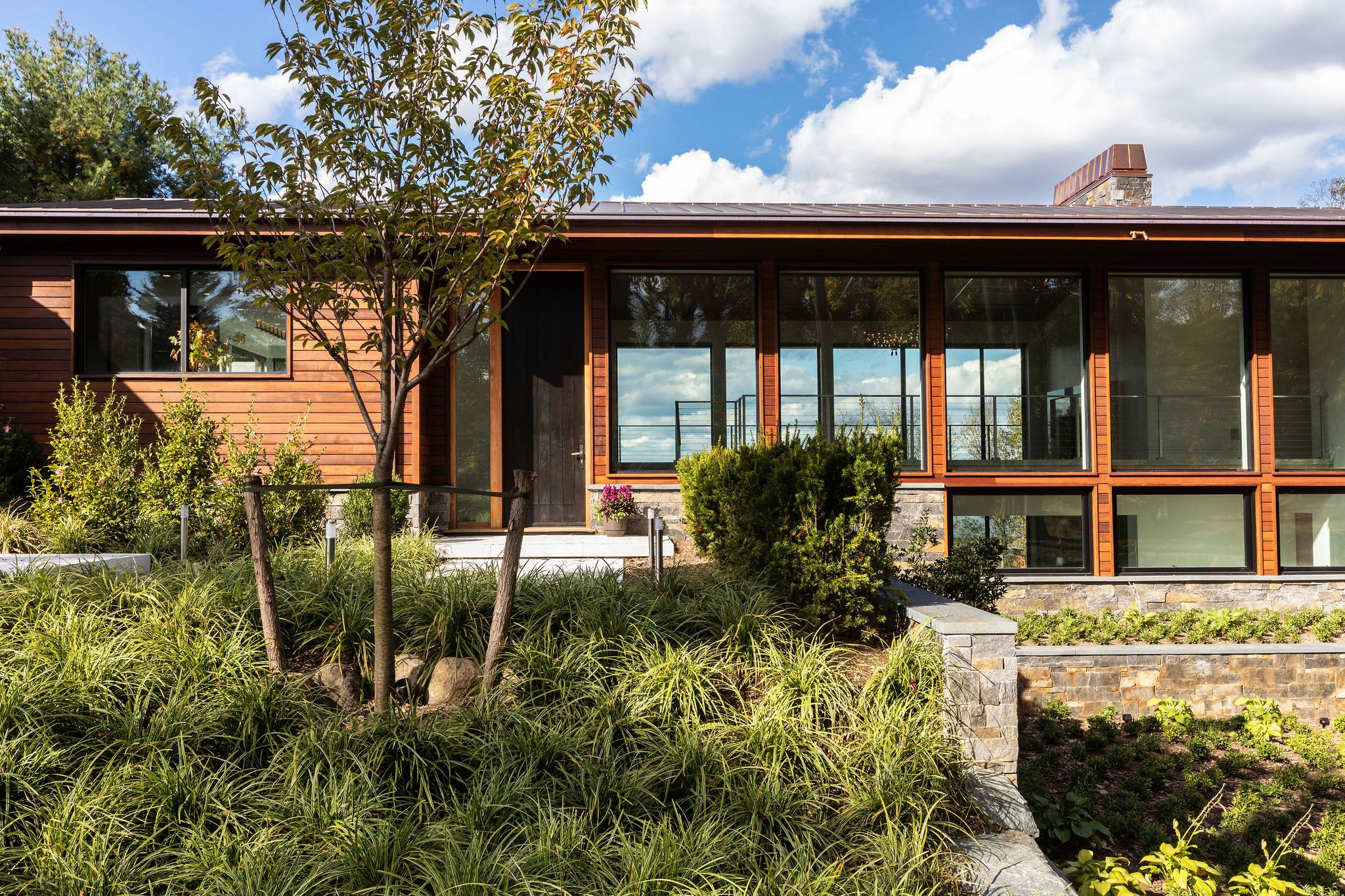
This house was designed with harmony and tranquility in mind incorporating the beautiful outdoors.

Blackened steel windows, huge stone multi-colored walls, wood siding and copper details were all designed to give this house a sense of 21st century modernism.

The new huge front door is stained a dark blackened brown color , giving a sense of excitement to what lays ahead…

New poured concrete floors, a stainless steel staircase and white oak shiplap ceilings (punctuated with steel) were all part of this modern gut renovation. It’s all in the details!

Poured concrete floors with a blazing fire welcome you into the new living room. We designed this home with a Zen sensibility marrying the inside with the outdoors.

This Arabescato marble fireplace sets the welcoming tone to the living room. The chandelier references the Zen simplicity of the house and the leaves outside.

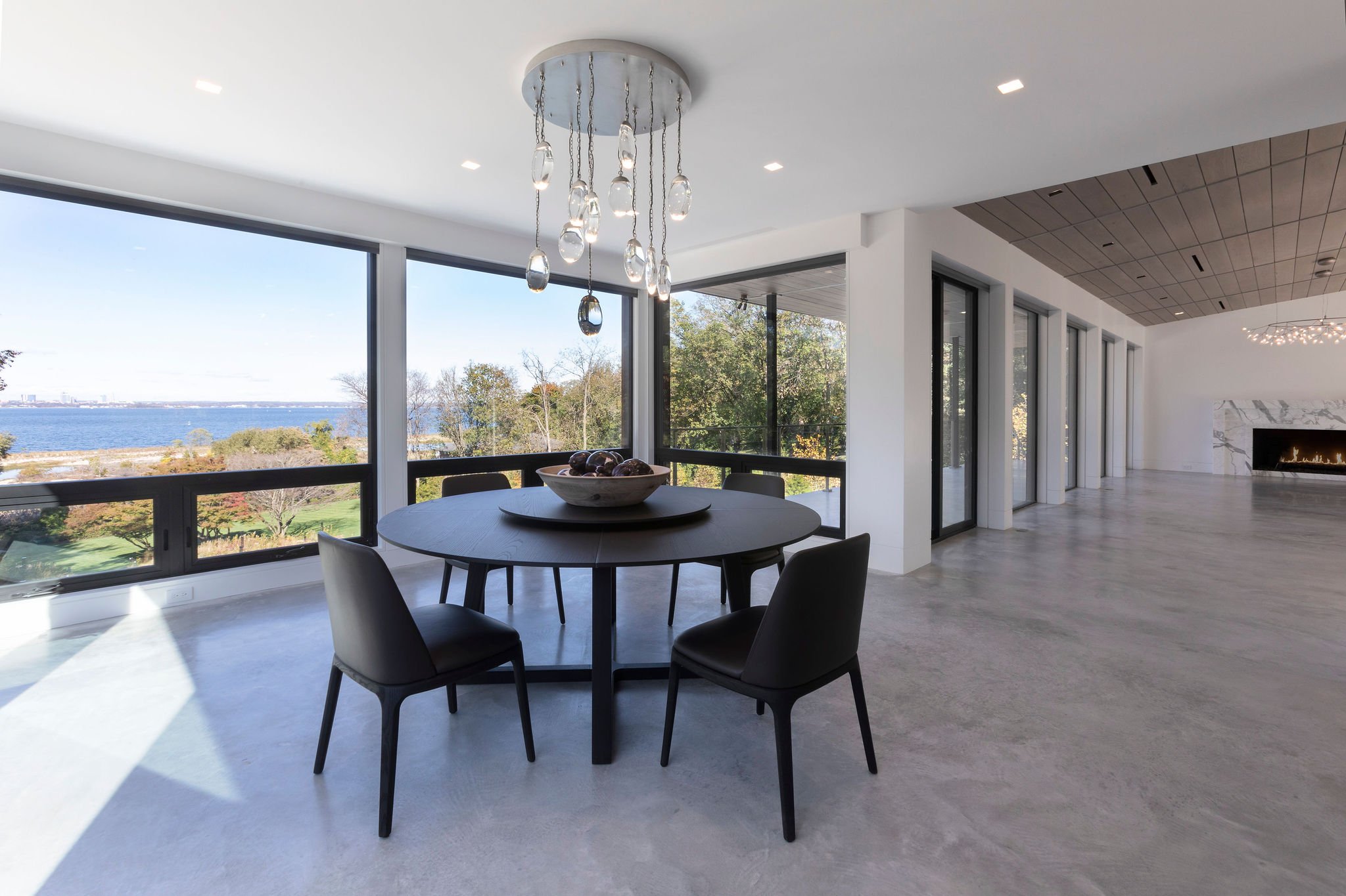
The round dining room table and comfy leather chairs are conducive to great conversation, the crystal drops on the chandelier reference the water view.

What can be more beautiful than this view overlooking the Long Island Sound over any meal in this house?

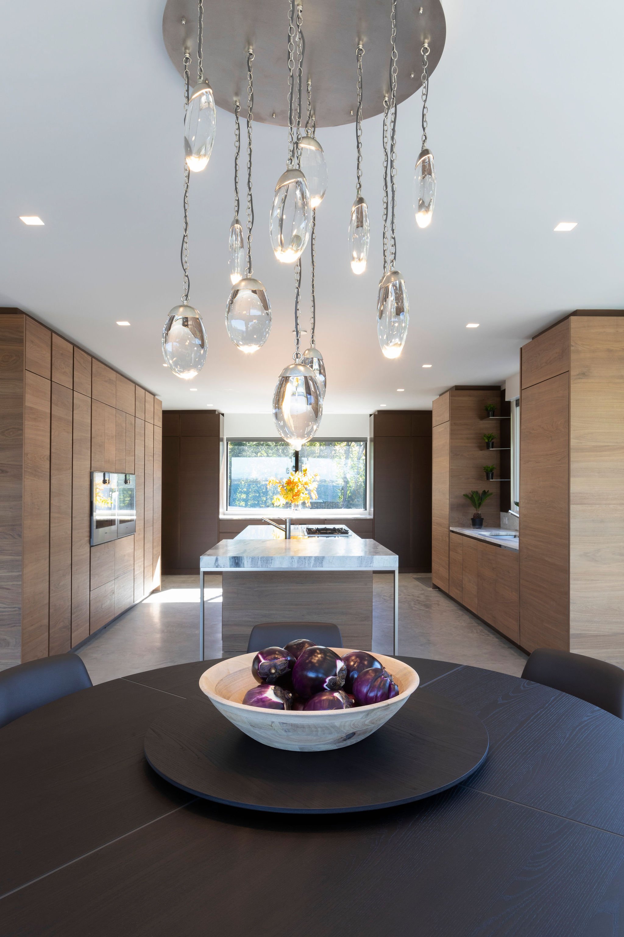
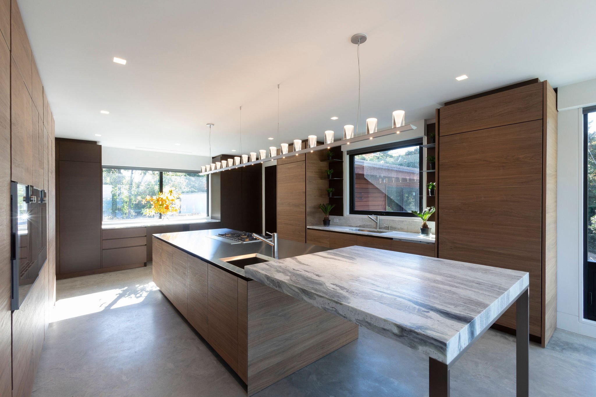
This Chef’s kitchen has it all. Italian Walnut hand planed cabinetry, and a stainless and a leather Python marble countertop! Let the cooking begin!

Wall ovens are flanked by hand-planed walnut cabinets that light up all interior shelves. The suspension lights over the island mimic candles when lit in the evening.

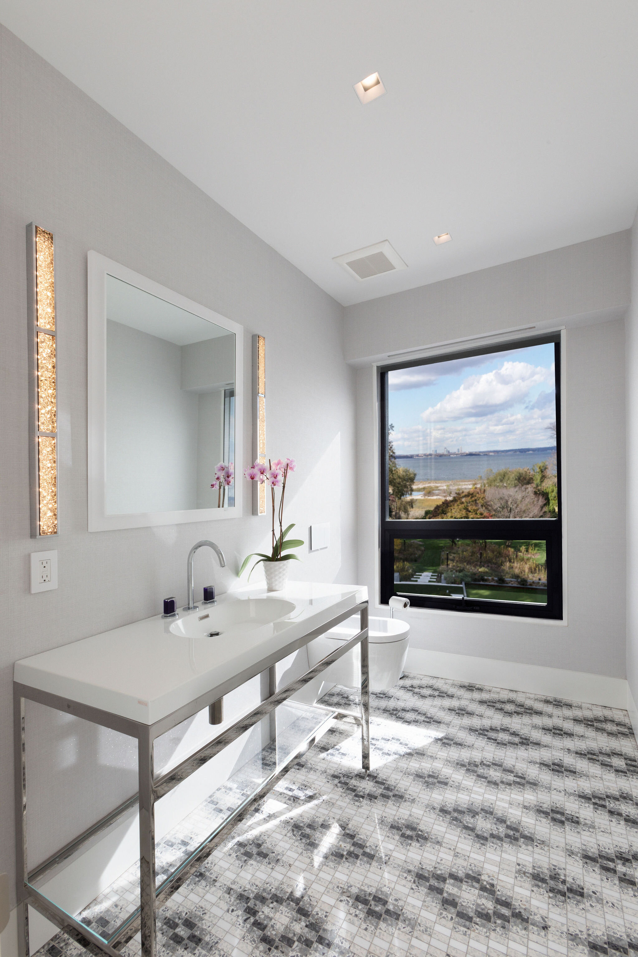
The mosaic terrazzo floor was custom made to fit perfectly, The sapphire blue faucet handles and rock crystal sconces add a little bling to the Powder Room!

The new fireplace separates and defines the two distinct areas, the bedroom, and the huge closet. The floors are white oak planks, the bed and nightstands float giving the space a sense of lightness and simplicity.

We carved out a niche for the Primary bed and clad the head board with a sumptuous blush colored leather.

Wonderful bedside table lamps and art and soft sheer window panels will complete this space.

We designed this closet with luxury in mind. The window seat and ottoman are covered in a soft textured blush fabric to keep the area light and airy.

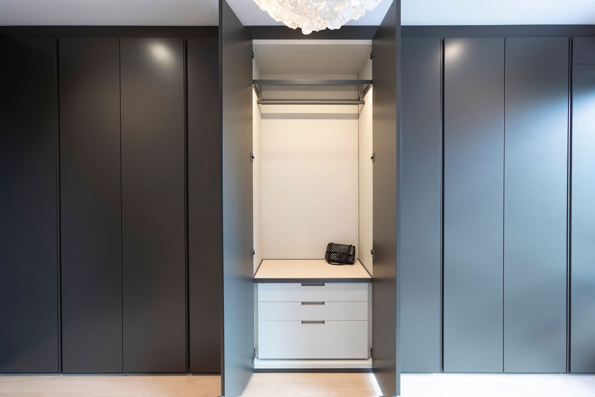
Each closet opens up to lit leather interiors .

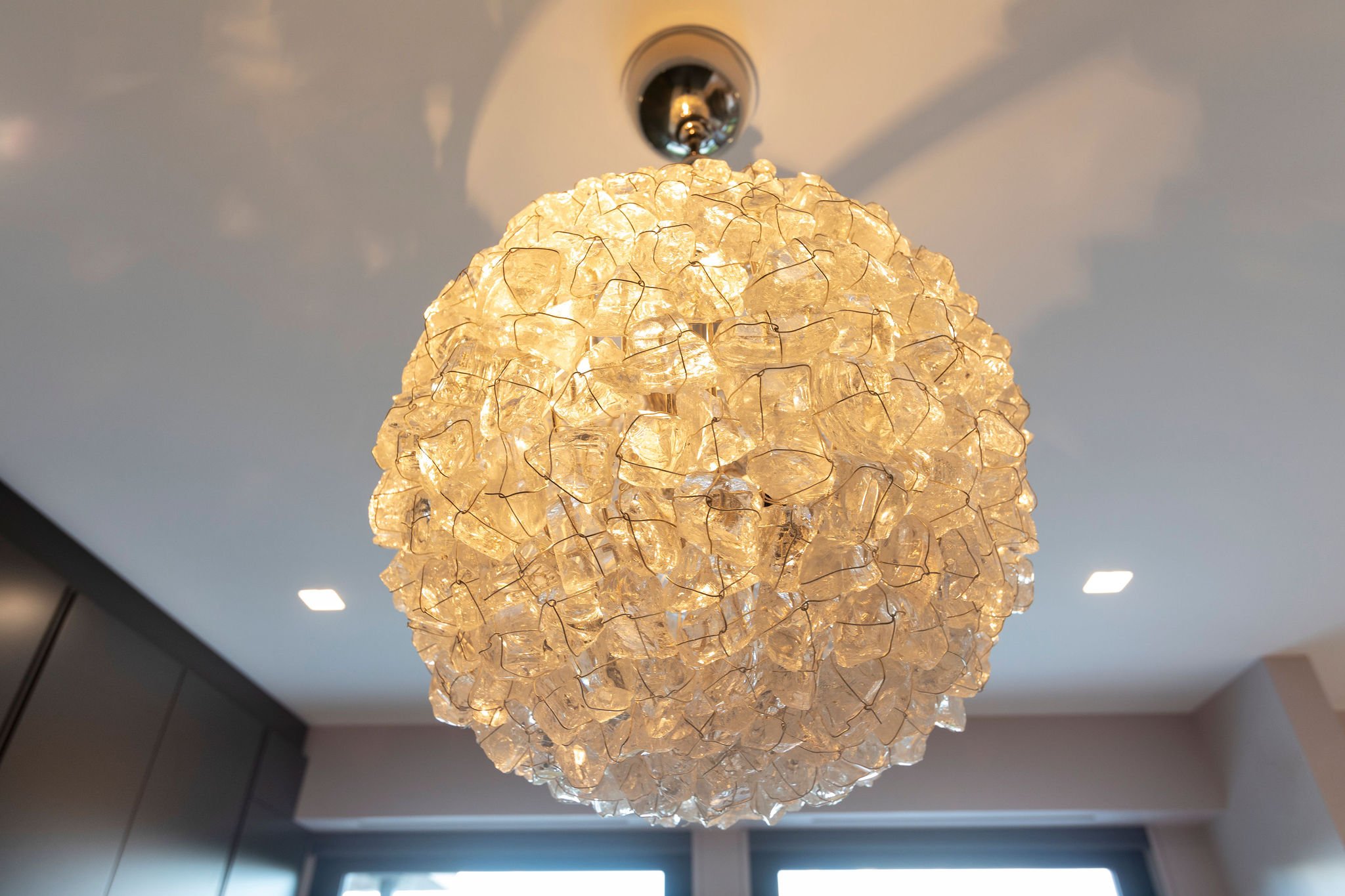
The centerpiece of the closet is this gorgeous rock crystal chandelier which will light up the space in the evenings.

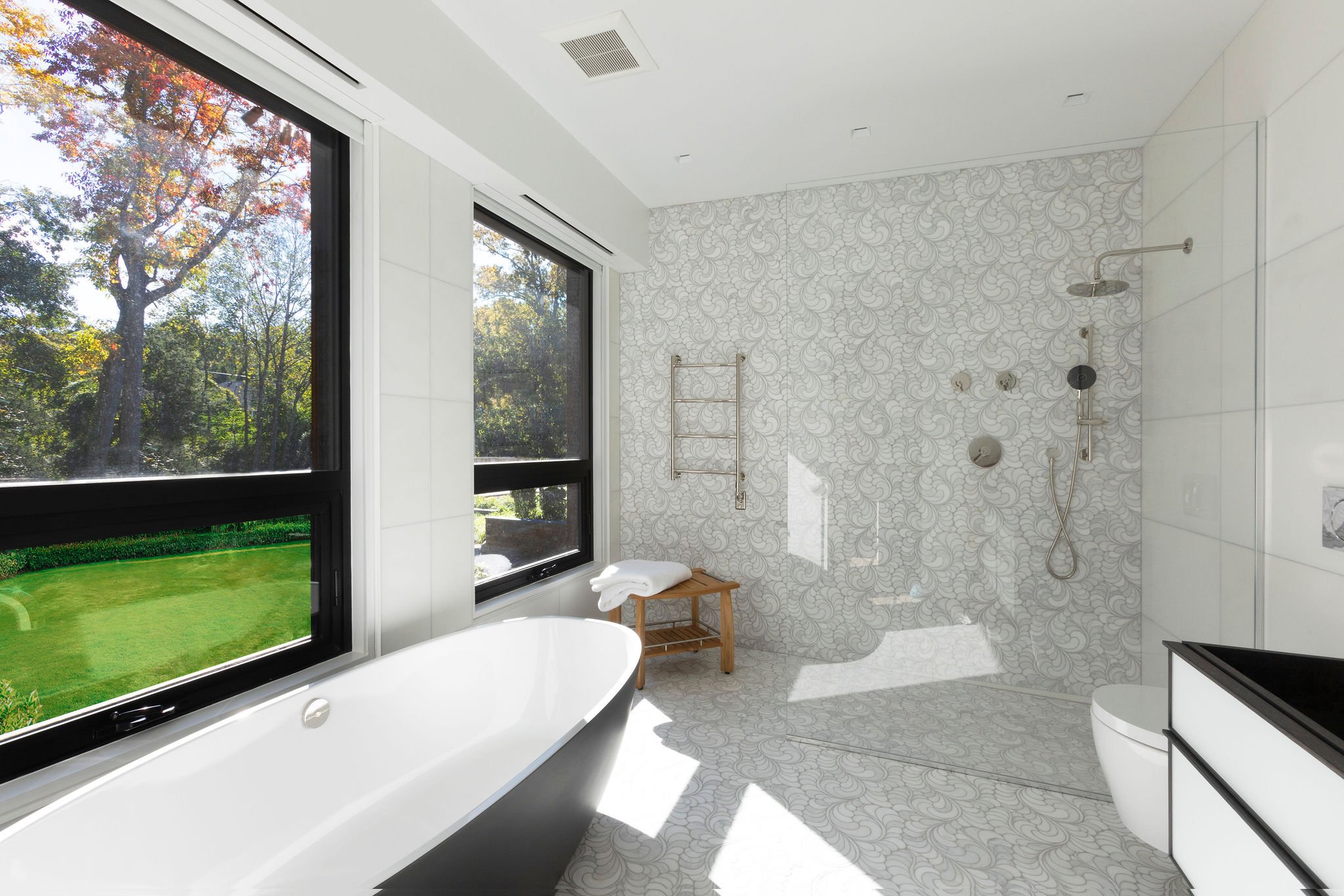
We designed the shower wall and floor with this incredible Thassos marble mosaic. The result is a peaceful luxurious oasis to dream in.

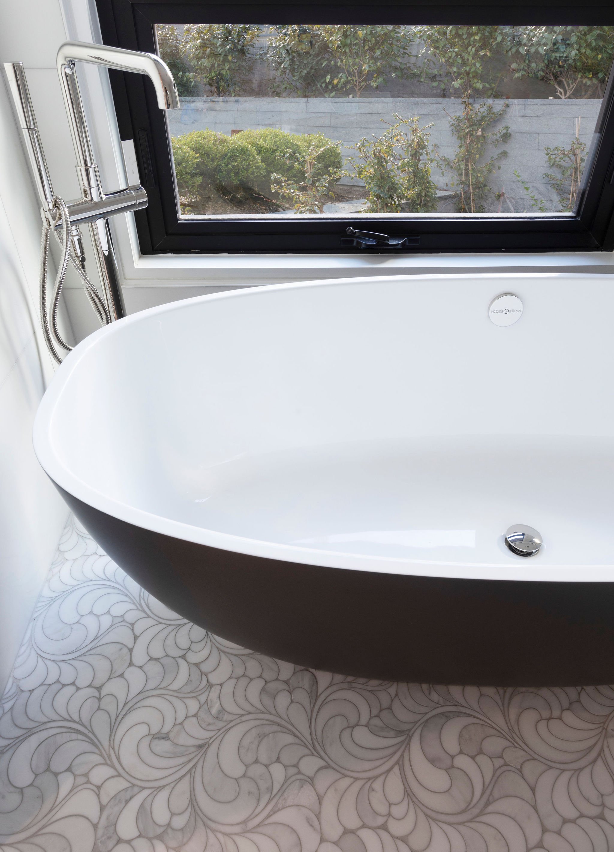
Closeup of the soaking tub and Thassos mosaic floors. The tub filler is floor mounted.

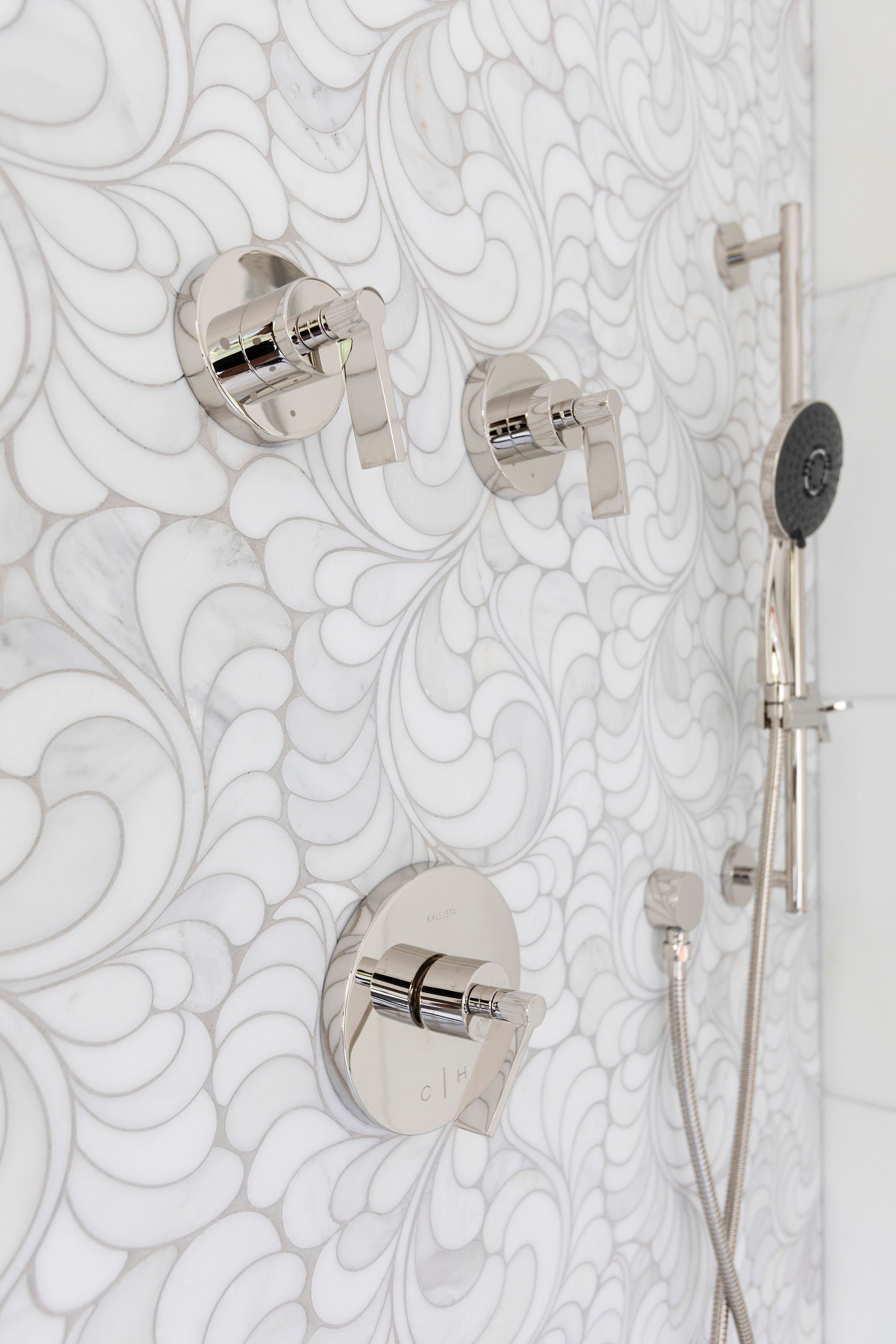
We wanted all of the fittings in this Primary bathroom to look like beautiful jewelry !

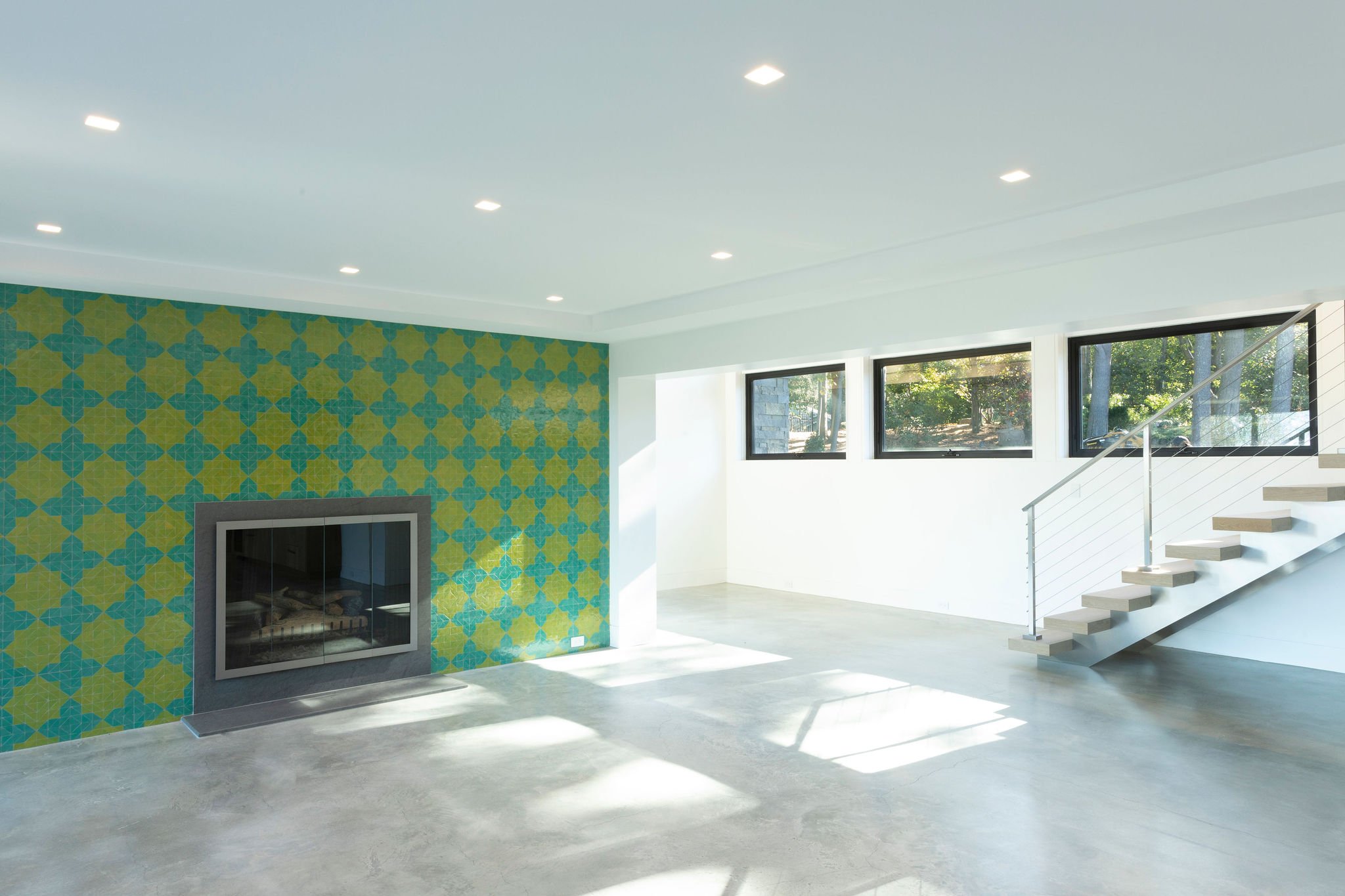
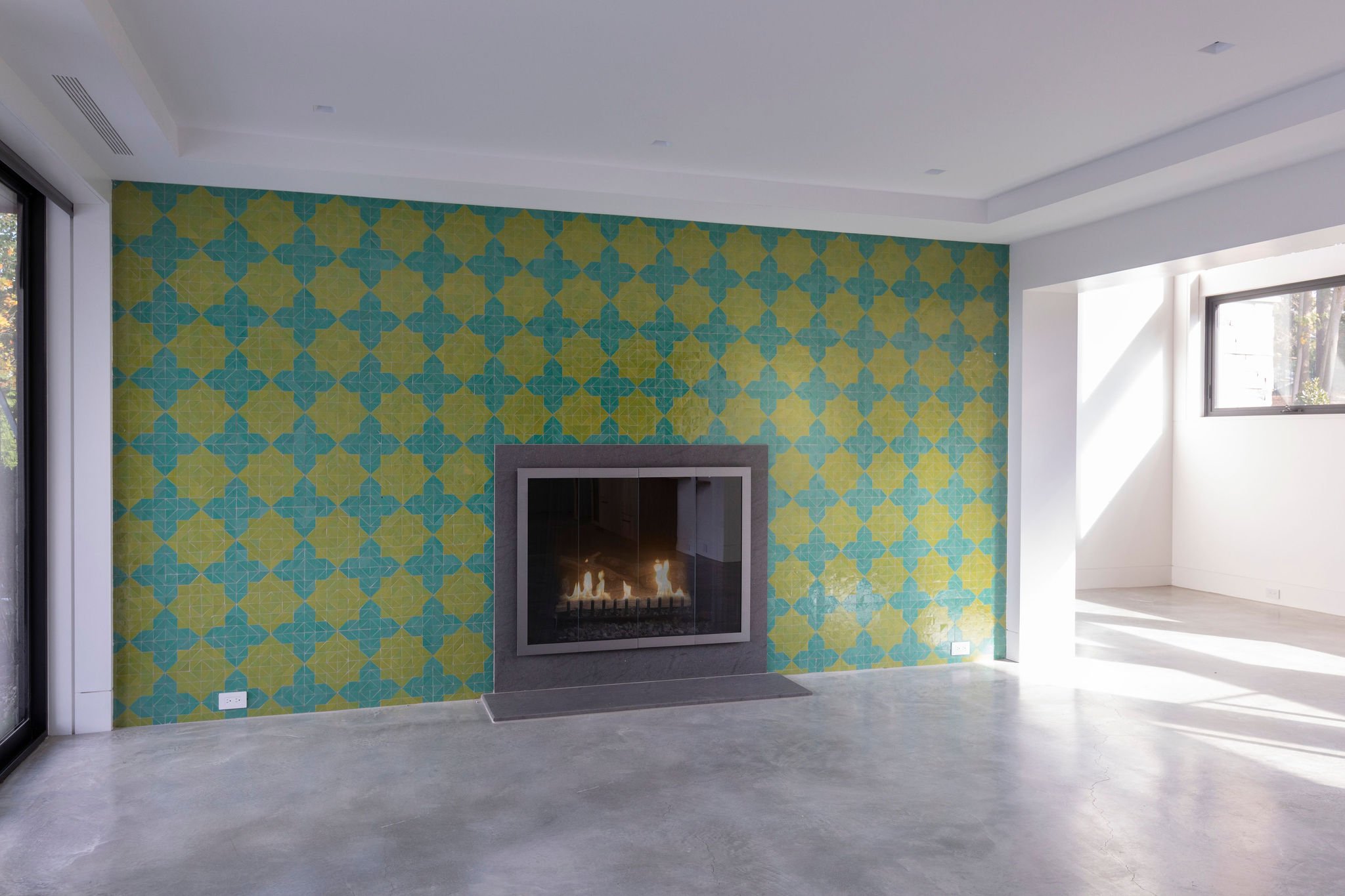
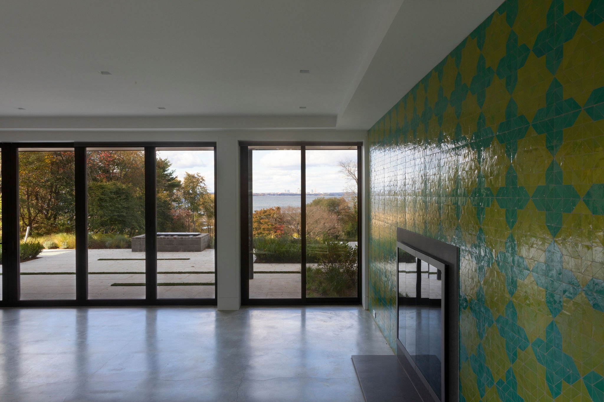
The fireplace wall was clad with handmade Moroccan tile. This downstairs game room will have a bar with a copper countertop and a copper-colored mirror.

This game room will have a Moroccan theme with a pool table and built- in bar.

This game room leads to the infinity pool and beautiful landscaped gardens.

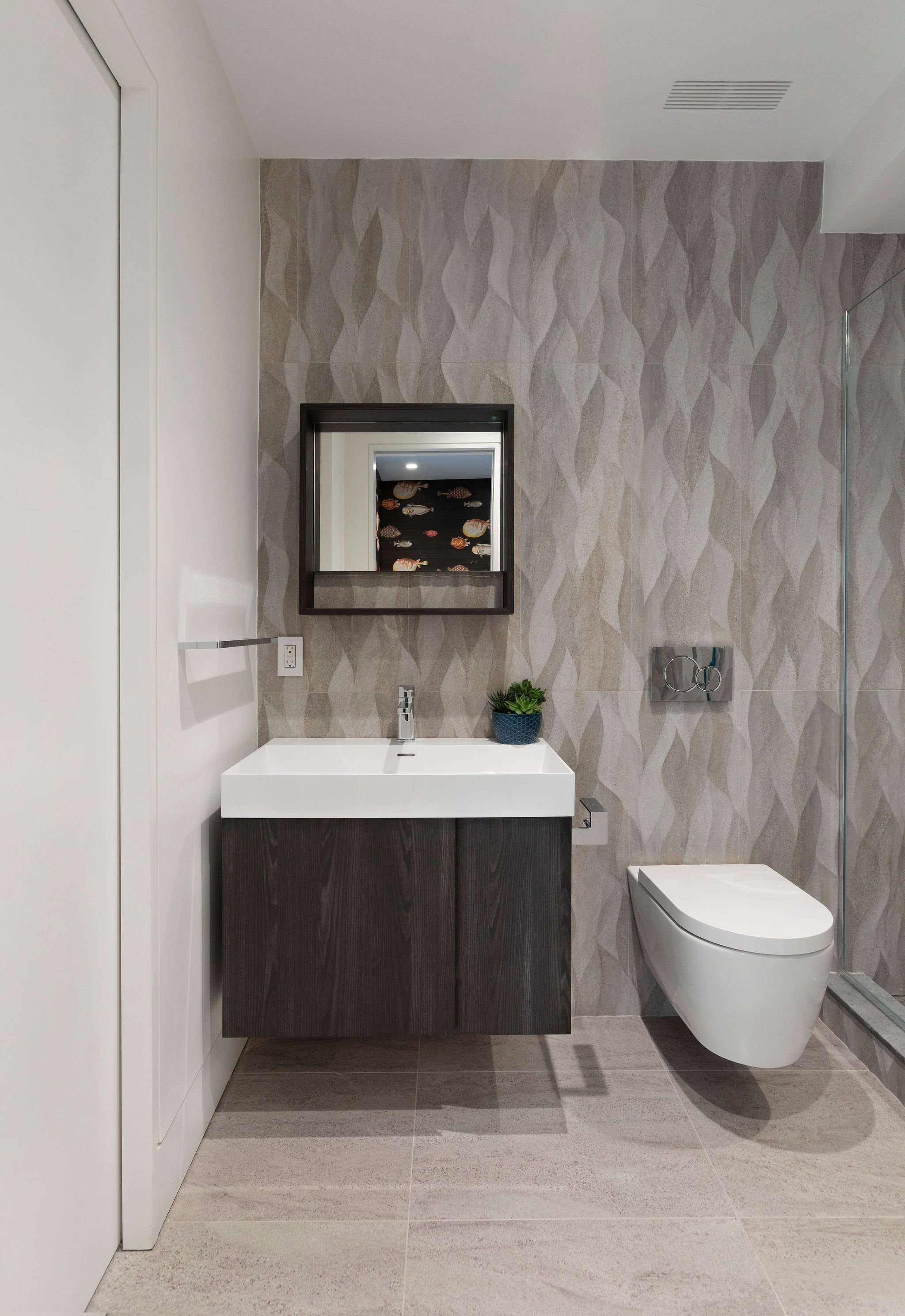
The cabana bath has porcelain tile that mimics the waves outside in the Long island Sound.

The cabana/mudroom sits just opposite this bathroom with a very detailed wallpaper depiction of fish. Everything here floats just like the water.

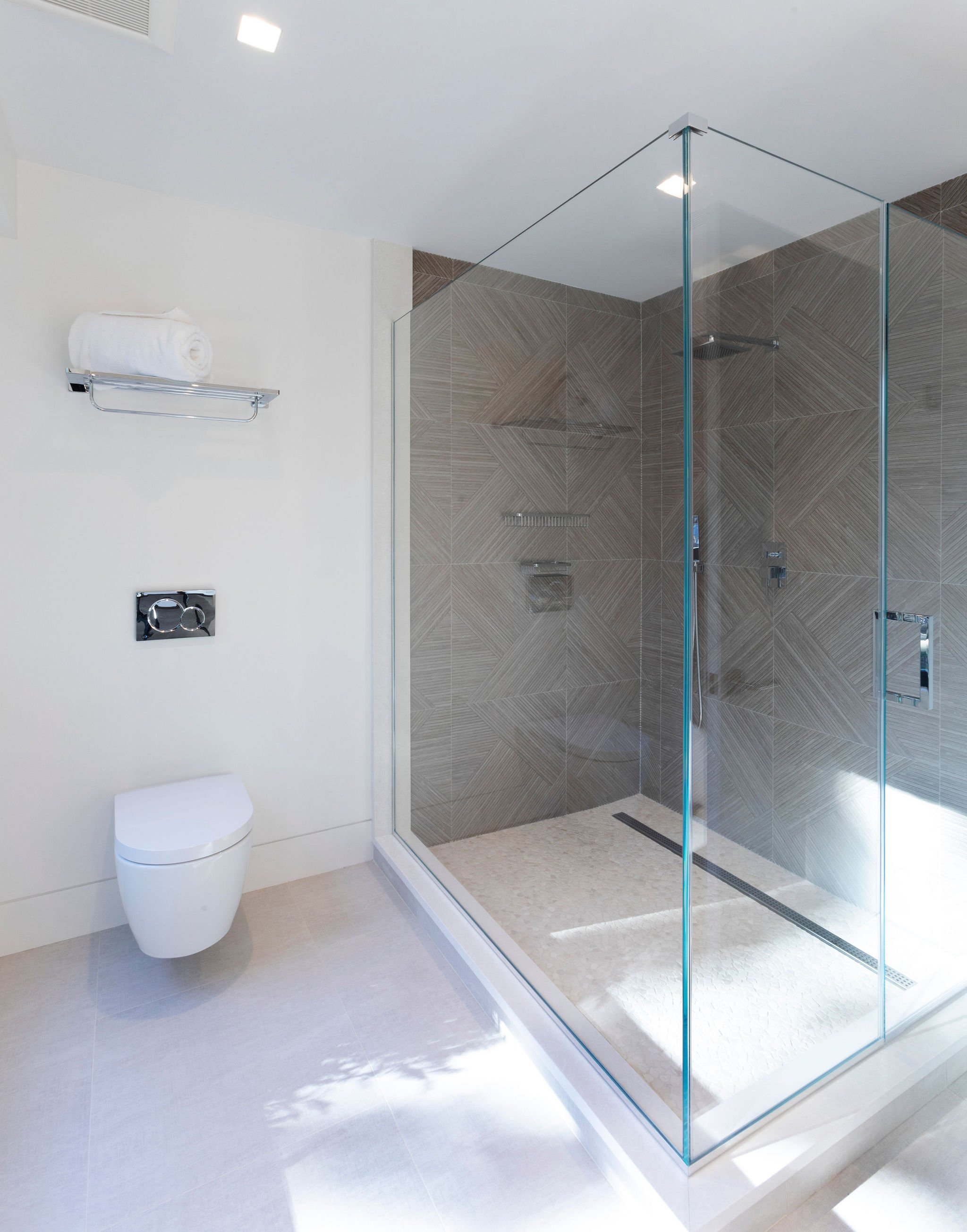
Another downstairs bathroom serves as the guest bath. The porcelain tile mimics a grasscloth wallpaper on the floating vanity wall.

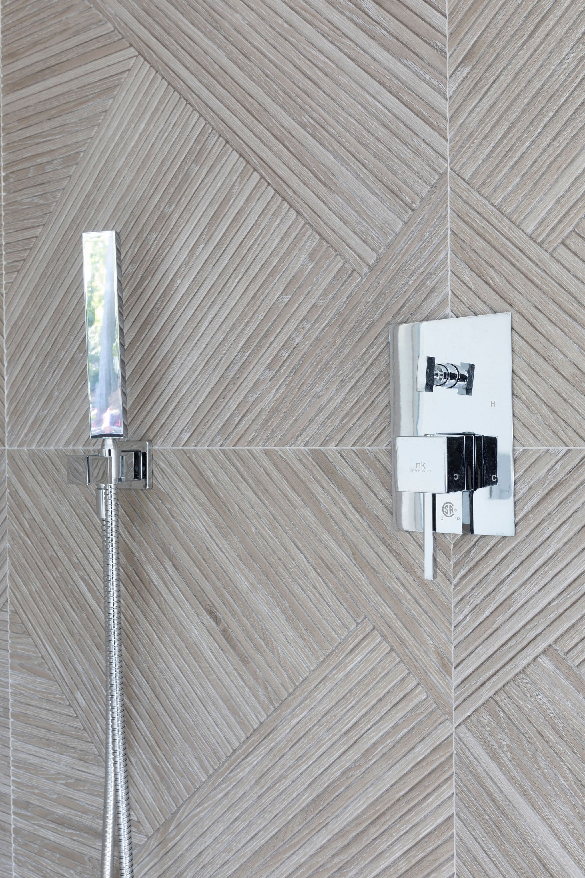
The shower walls are clad with a two dimensional tile that fit together like a puzzle.

Textured geometric tile surround this guest shower.

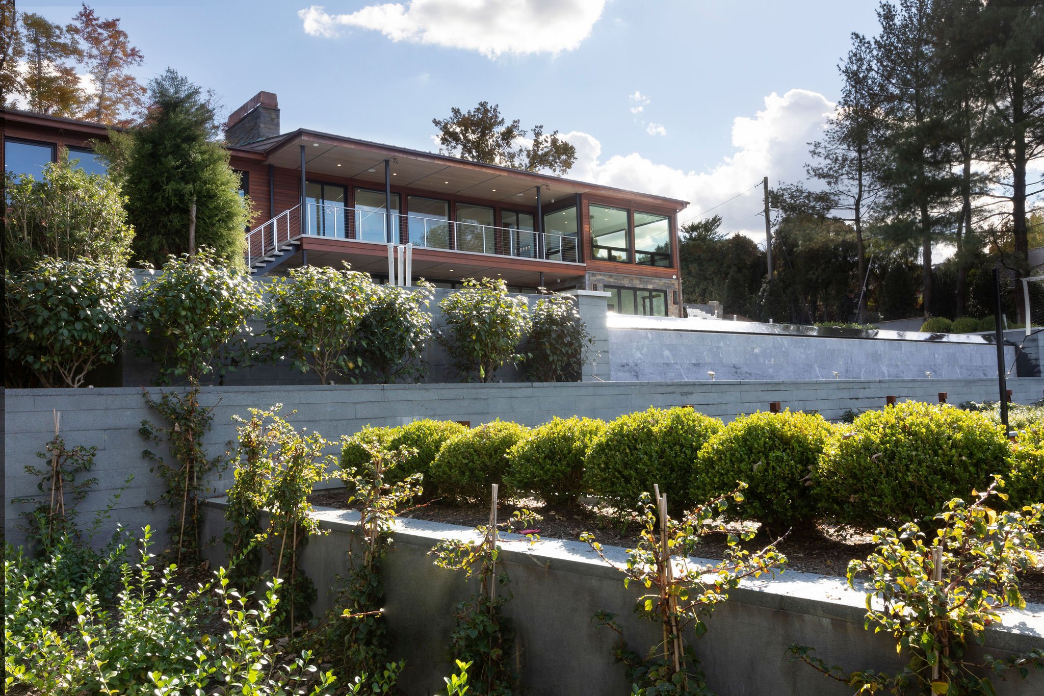
The new exterior of the house faces the infinity pool and the beautiful new landscaping.

The whole exterior was meant to harmonize with the incredible backyard which leads directly to the Long Island Sound. The pool was completely redesigned to flow into the Bacchi Court.

The backyard was designed with many outdoor lights strategically placed to light up the path to the water.

The balconies were designed with the same flooring, staircase and shiplap ceilings to bring the outdoors in . We wanted a continuance of product to make the spaces seamless .

Finally the view from the hill a top this Sands Point modern retreat!

A GLAMOROUS DINING ROOM FOR ENTERTAINING

We are finally at the point in this awful pandemic where we can see the light at the end of the tunnel. Most people are just dying to reconnect with friends and family in person, these lovely clients are no exception. Timing is everything! We started this renovation quite some time ago and then wound up jumping to other more pressing areas of the house. This dining room was designed to balance the Bar Lounge on the other side of this Center Hall Colonial in a very nice community in West Harrison, NY.

Finally, the formal Dining Room can be utilized! ! My very cool, friendly, popular, warm-hearted clients can now host the dinners they have been so anxiously dreaming about. They can finally socialize again in person as they always did in the past. Family and friends can come over again to eat and celebrate life!

Let the fun begin!

Photo Sep 11, 10 15 11 AM.jpg

First came the major renovation.

IMG_1756.jpeg

Next we sourced this beautiful handmade rug. Soft blues and silver shimmer.

IMG_2211.jpeg

We wanted a very dramatic wallpaper. These foil leaves did the trick.

IMG_2213.jpeg

Warm and inviting, it’s all about performance velvet.

unnamed-2.jpg

We needed a beautiful , yet functional dining table. This one did the trick!

Did I mention Glam? This crystal chandelier and sconces certainly fit the bill!

Completed Formal Dining Room

Completed Formal Dining Room

CONTEMPORARY TRADITIONAL CONDO

Once in a while I get to design a new project that I find really exciting. This was one of them. Usually I work with homeowners that want a very modern sleek approach to design, which is great. However, when I get to do something new and out of the ordinary, I find it exciting and refreshing. This lovely lady wanted a bright, colorful and more traditional space. I was able to implement some of my favorite things - color, pattern, texture, and layering. The result is a condo in the sky that I think turned out quite lovely! It is light filled, fun, airy and happy. And my client feels the same exact way!

Photography by Jonathan Beckerman

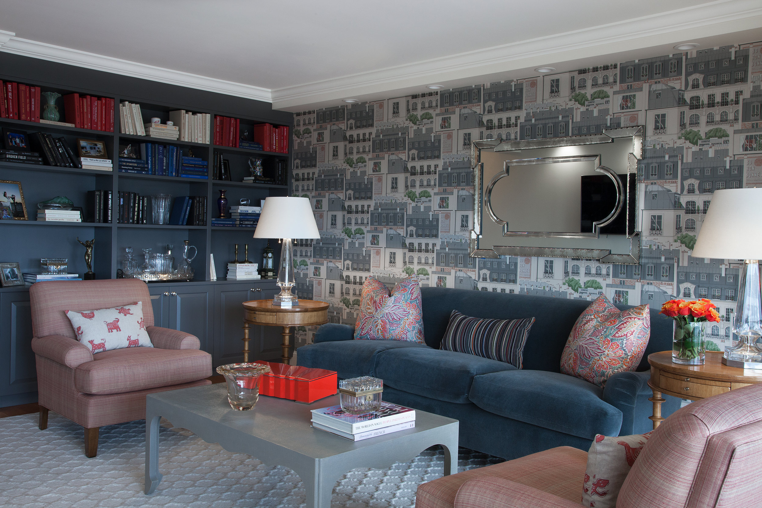
In the living room we utilized a fun Paris themed wallpaper, a custom mohair covered traditional sofa , and lots of layered patterns and color. We also incorporated many vintage and antique accessories.

In the living room we utilized a fun Paris themed wallpaper, a custom mohair covered traditional sofa , and lots of layered patterns and color. We also incorporated many vintage and antique accessories.

We filled the built-in bookcase with books, personal items and antiques, and styled the books according to color. The vintage mirror brings character and more light to the room.

We filled the built-in bookcase with books, personal items and antiques, and styled the books according to color. The vintage mirror brings character and more light to the room.

This rug was the starting point for the room. The geometric pattern plays off of the strie fabric on the club chairs and the linen wrapped parsons coffee table. The Mongolian wool stool brings a fun touch of contrasting texture to the room.

This rug was the starting point for the room. The geometric pattern plays off of the strie fabric on the club chairs and the linen wrapped parsons coffee table. The Mongolian wool stool brings a fun touch of contrasting texture to the room.

A playful Paris city scene wallpaper contrasts the colorful floral pillows. Crystal table lamps bring a sparkle to the room.

A playful Paris city scene wallpaper contrasts the colorful floral pillows. Crystal table lamps bring a sparkle to the room.

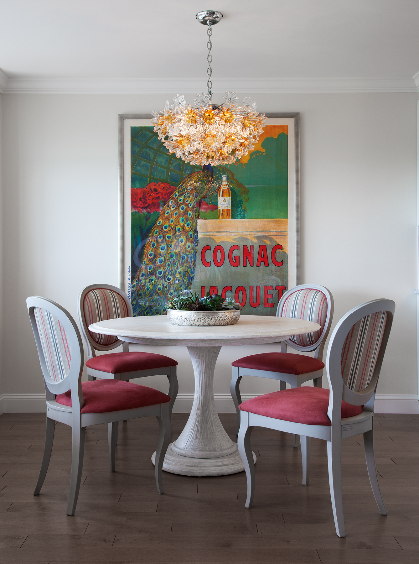
Pattern, stripes and bright color make the dining area sing!

Pattern, stripes and bright color make the dining area sing!

A mid-century modern chandelier casts a warm glow over this intimate dining area.

A mid-century modern chandelier casts a warm glow over this intimate dining area.

In the bedroom, the request was to make it light filled, happy and colorful.

In the bedroom, the request was to make it light filled, happy and colorful.

French flowers on the wallpaper play against the patterns on the rug, drapery and chair. It’s all about mixing color and pattern. Antique and vintage pieces always add character.

French flowers on the wallpaper play against the patterns on the rug, drapery and chair. It’s all about mixing color and pattern. Antique and vintage pieces always add character.

A pop of color draws the eye!

A pop of color draws the eye!

Flowers, flowers everywhere…

Flowers, flowers everywhere…

It’s all in the details.

It’s all in the details.

Designing In Stages For a Growing Family

 
F 252 7th Ave_Benatar_112217_-104.jpg

This NYC Penthouse apartment in the Chelsea Mercantile building was renovated and decorated over a few years time.  My clients wanted a beautiful space to raise their two small children.  The apartment had to be practical for this young family and their dog. The caveat? They still wanted a cool downtown vibe. 

F_WINDOW2527thAve_Benatar_112217_-134.jpg

THE OPEN LIVING + DINING AREA

The first order of business was redesigning the lighting scheme in the living room and updating and redecorating the existing open living room and dining area. We revamped the lighting by employing two lighting fixtures as the main focal points - a huge contemporary chandelier in the main living room and one simple, yet sophisticated, pendant over the dining table. Then we added cove lighting around the perimeter of the room. We sheathed the walls in a very textural metallic grasscloth. The fireplace mantle was custom designed by New York Interior Design and completely reconstructed utilizing a Carrara marble. The drapery panels add a finishing touch to the space,  rich color and pattern, and a frame around the incredible view.

The dining area came next. We custom made the marble slab dining table. Then we added visual dimension and reflection of the view with an asymmetrical mirror.

F_LIVINGV_2527thAve_Benatar_112217_-217.jpg

THE MASTER BEDROOM

The most challenging aspect of this project came when the new baby was on its way, and we reconfigured a tiny nursery out of a pretty large master bedroom closet. The master bedroom itself was redesigned to be an urban sanctuary that's just a bit sexy. Mixing lush textiles, contemporary patterns, and a soothing palette created the perfect vibe - playful and inviting, yet all grown up. Carefully designed built-ins lining the master bedroom maximized space and gave my clients back their closet. Keeping with the glamorous feel, the floor to ceiling built-ins were topped with dramatic crown moulding and jewelry-like hardware.

F_11X14_MASTER2527thAve_Benatar_112217_-16.jpg
F_HEADBOARD22527thAve_Benatar_112217_-126.jpg
FN_HEADBOARD2527thAve_Benatar_112217_-180.jpg

THE BATH

The following year it was time for a gut renovation of the bathroom. This bathroom is for both the kids and guests. The bathtub was banished in favor of a custom shower. The huge faux carrara marble tiles (a dream to maintain) coordinate and lend continuity with the other marbles in the apartment. We gave the clients a flexible, family-friendly bath with a clean modern look and the luxe glam sensibility they wanted. 

F_BATHROOM2527thAve_Benatar_112217_-145.jpg

THE KITCHEN

Lastly, it was time for the major gut renovation of the kitchen. This new eat-in kitchen design was all about the gorgeous Arabescato Vagli marble, as well as the new tufted custom banquette. The cabinets were custom designed in a charcoal gray color to both enhance and compliment the marble. The crystal lighting on the banquette wall was meant to give the room a little bling. Beyond the beauty, optimizing storage and work space is always a must in NYC kitchens, and this one was designed for the challenges of a busy urban family. Now both children and parents are comfortable and happy in their newly redesigned apartment in the sky! 

F_2527thAve_Benatar_112217_-199-2.jpg
F_2527thAve_Benatar_112217_-23.jpg

Photo Credit: Beckerman Photography

A DAY IN THE FLATIRON DISTRICT

In case you are not from NYC, or you haven't been down to the FlatIron District in NYC, this is truly an Interior Design destination. Below are some of my favorite (secret) shopping showrooms, and restaurants.  Some of the showrooms are To The Trade Only, others are retail shops... Enjoy!! 


CITY BAKERY

CITY BAKERY

IMG_0243.JPG

HOMENATURE

CLASSIC FLATIRON ARCHITECTURE 

CLASSIC FLATIRON ARCHITECTURE 

HIGH STYLE DECO

HIGH STYLE DECO

HIGH STYLE DECO

HIGH STYLE DECO

DESIGN COLECTIVE OF NEW YORK

DESIGN COLECTIVE OF NEW YORK

DESIGN COLLECTIVE OF NEW YORK

DESIGN COLLECTIVE OF NEW YORK

DESIGN COLLECTIVE OF NEW YORK

DESIGN COLLECTIVE OF NEW YORK

RALPH PUCCI

RALPH PUCCI

RALPH PUCCI

RALPH PUCCI

RALPH PUCCI

RALPH PUCCI

PATRICK NAGGAR AT RALPH PUCCI

PATRICK NAGGAR AT RALPH PUCCI

RALPH PUCCI 

RALPH PUCCI 

PATRICK NAGGAR AT RALPH PUCCI 

PATRICK NAGGAR AT RALPH PUCCI 

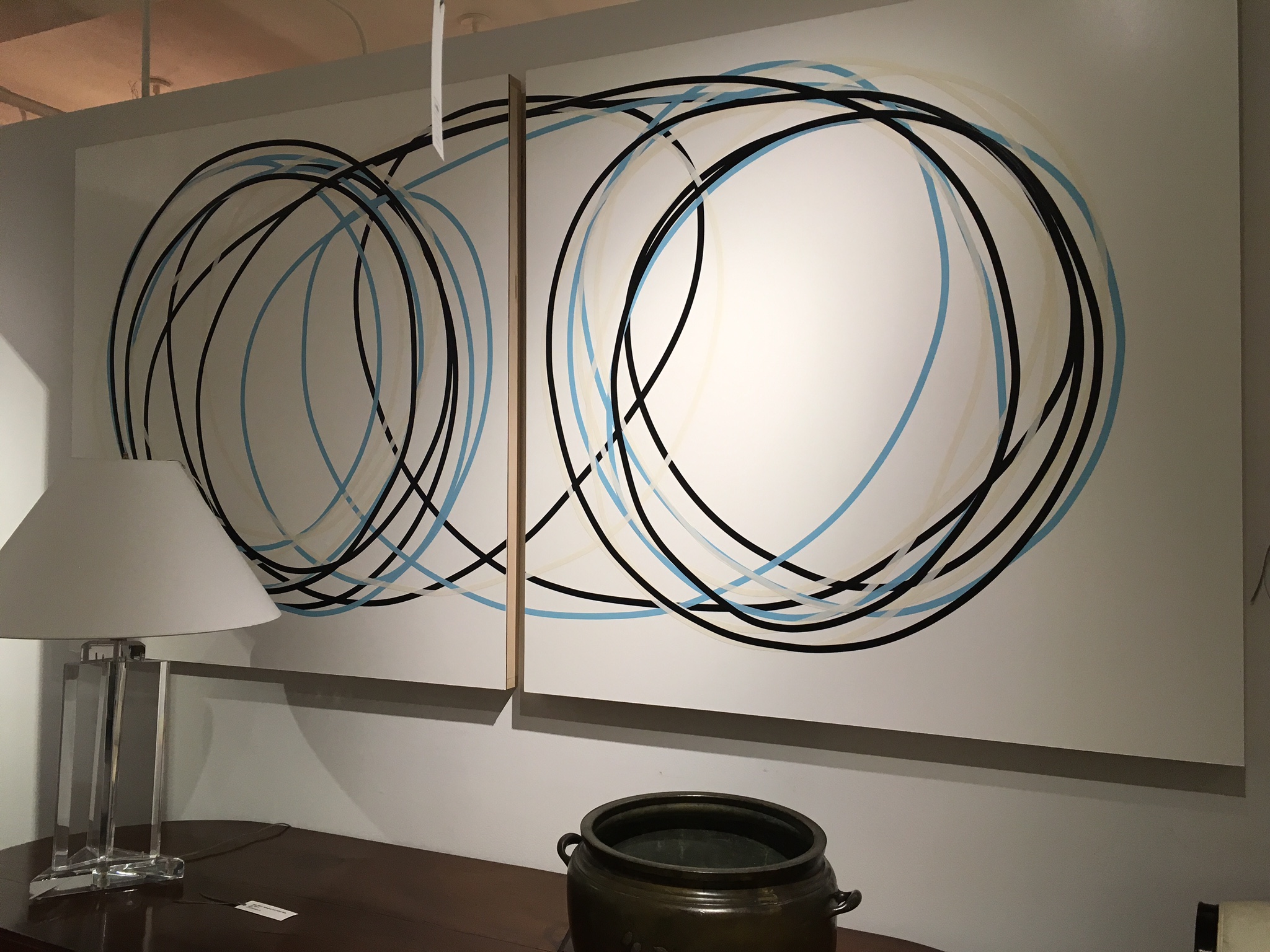
ART AT RALPH PUCCI 

ART AT RALPH PUCCI 

ABC HOME

ABC HOME

ABC HOME

ABC HOME

AKDO TILE

AKDO TILE

A HOME ...THREE YEARS IN THE MAKING

Once in awhile I am lucky enough to have the opportunity to get in on the ground floor when it comes to constructing a brand new home for a lovely family. This amazing project was my ideal. 

We started planning this light-filled, 6,100-square-foot dream home in Roslyn New York, three years ago. This was a team effort. From the drawings by esteemed architect Michael Wallin to the actual building by Robert Beer everything was a collaboration.

My clients basically knew what they wanted ... a forever home that was luxurious yet suitable for their two young children and two loving dogs. They wanted a unique one-of -a- kind modern home that was equally sophisticated yet young and fun. My job was to make sure they were happy, comfortable & excited by the design. 

The following are a few of the rooms completed so far... 

Photo Credit : Beckerman Photography 


FRONT VIEW

FRONT VIEW

THE BREAKFAST ROOM 

THE BREAKFAST ROOM 

THE KITCHEN

THE KITCHEN

THE MUD POWDER ROOM

THE MUD POWDER ROOM

THE FAMILY ROOM 

THE FAMILY ROOM 

THE POWDER ROOM

THE POWDER ROOM

THE MASTER BATH

THE MASTER BATH

THE MASTER BATHROOM

THE MASTER BATHROOM

THE MASTER SHOWER

THE MASTER SHOWER

COOL GIRL"S ROOM

COOL GIRL"S ROOM

GIRL'S BATHROOM

GIRL'S BATHROOM

BOY'S BATHROOM 

BOY'S BATHROOM 


NEW PROJECT IN NOMAD, HUYS BUILDING

Located in the heart of NoMad , on Park Ave South, Huys is a neoclassical building dating from 1917, with neighboring stately mansions from NYC's Gilded Age. This building underwent a huge conversion from commercial offices to 58 luxurious and elegantly detailed condominiums . Developed by the prestigious Dutch Kroonenberg Groep, designed by the world-renowned Piet Boon and renovated by the well-established construction management firm Sciame. Huys is one of the my favorite buildings. This is one of the incredible apartments I was asked to design. The amazing iron windows and light brushed oak floors were already in place.  Photo Credit: Beckerman Photograpy


Color filled Living Room

Color filled Living Room

Master Bedroom with Grasscloth headboard wall 

Master Bedroom with Grasscloth headboard wall 

Close up of Master Bedroom 

Close up of Master Bedroom 

Sumptuous bedding is everything!  

Sumptuous bedding is everything!  

It's all in the details 

It's all in the details 

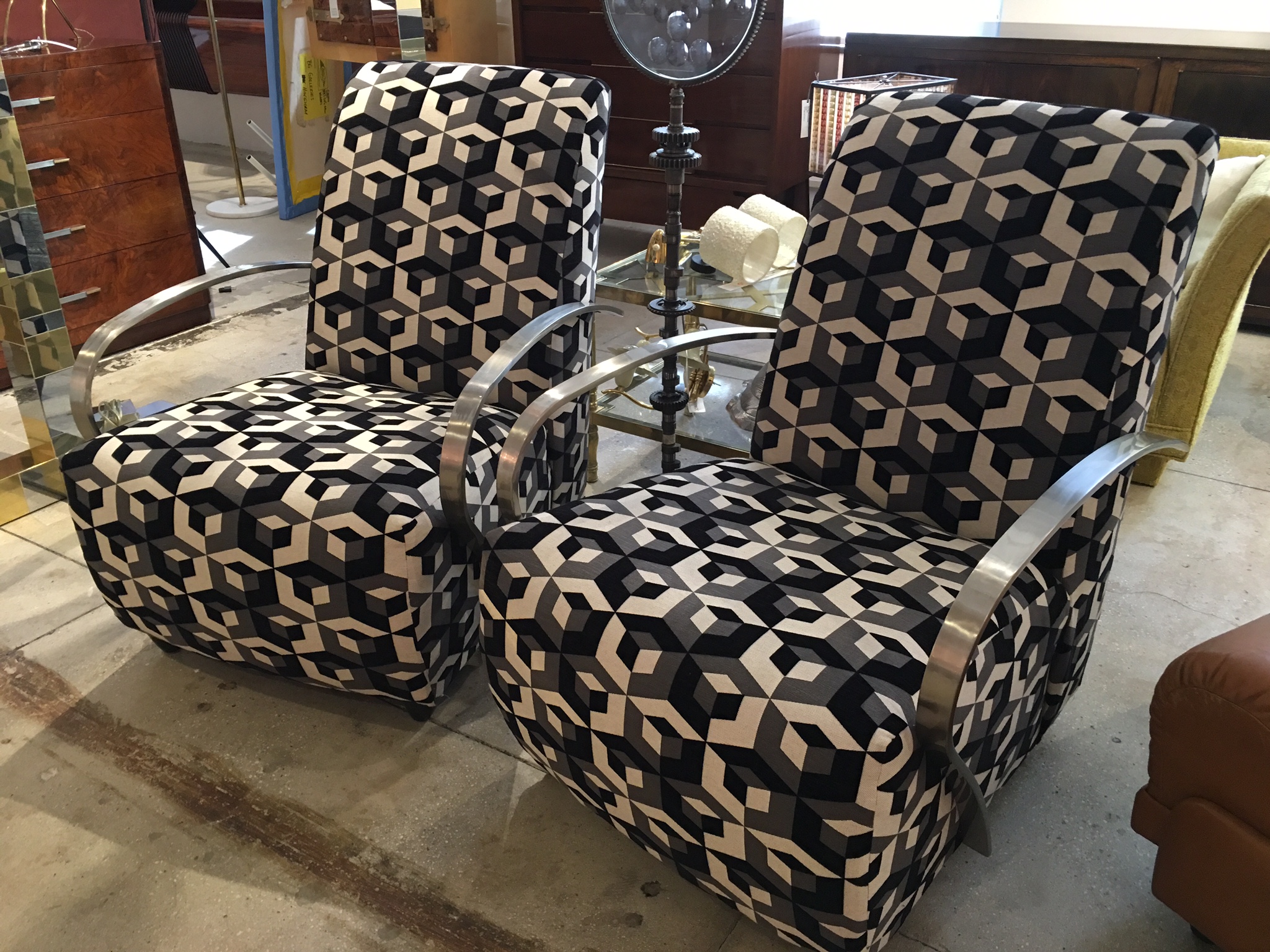
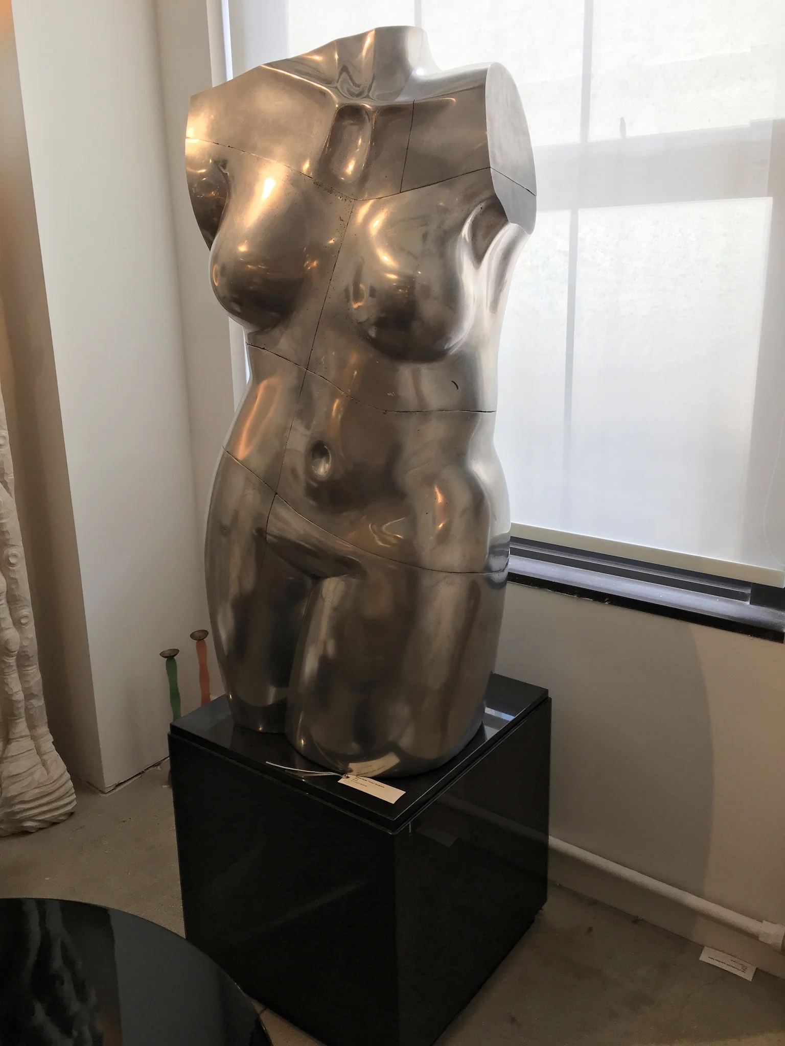
RAVISHING ANTIQUE / VINTAGE EYE CANDY

One of the real bonuses of working in this field is watching the clever, creative, gifted  people (I happen to know) come up with incredible new ideas. One such idea was the first brick and mortar space for the online giant 1stdibs. Jim Druckman was the genius behind it! 

This all took place years ago. 1stdibs is now a destination for many designers and collectors alike. It is an eclectic mix of over 54 different dealers from around the country and world that occupy the entire 10th floor of 200 Lex  in 33,000 sq feet of space. It is one of my special,  wonderful secrets. There is ALWAYS something new and exciting here!!!!  The following are just a few of my latest favorite things....

IMG_6059.JPG
IMG_6054.JPG

RENOVATION, MODERNIZATION, RESTORATION...

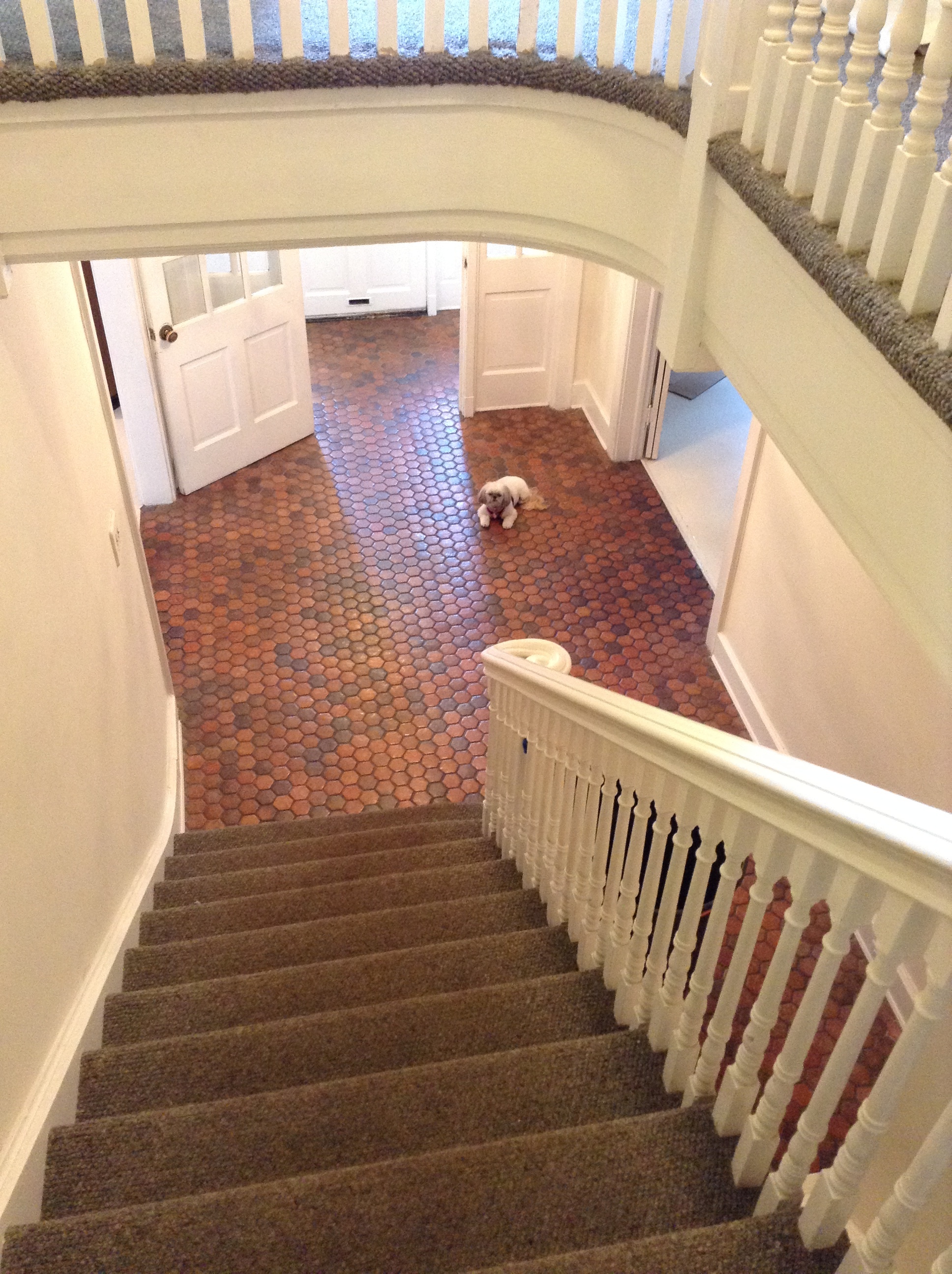
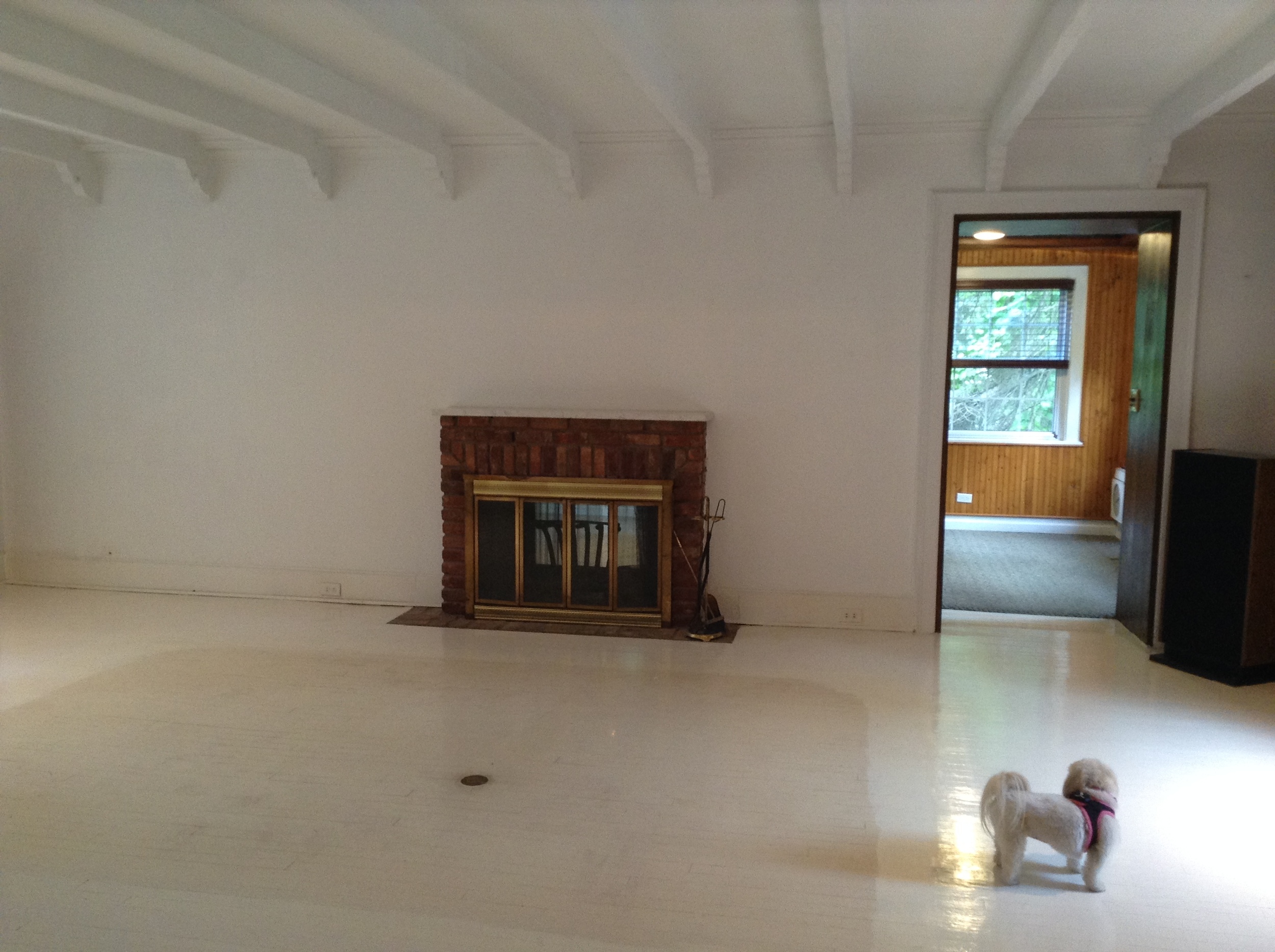
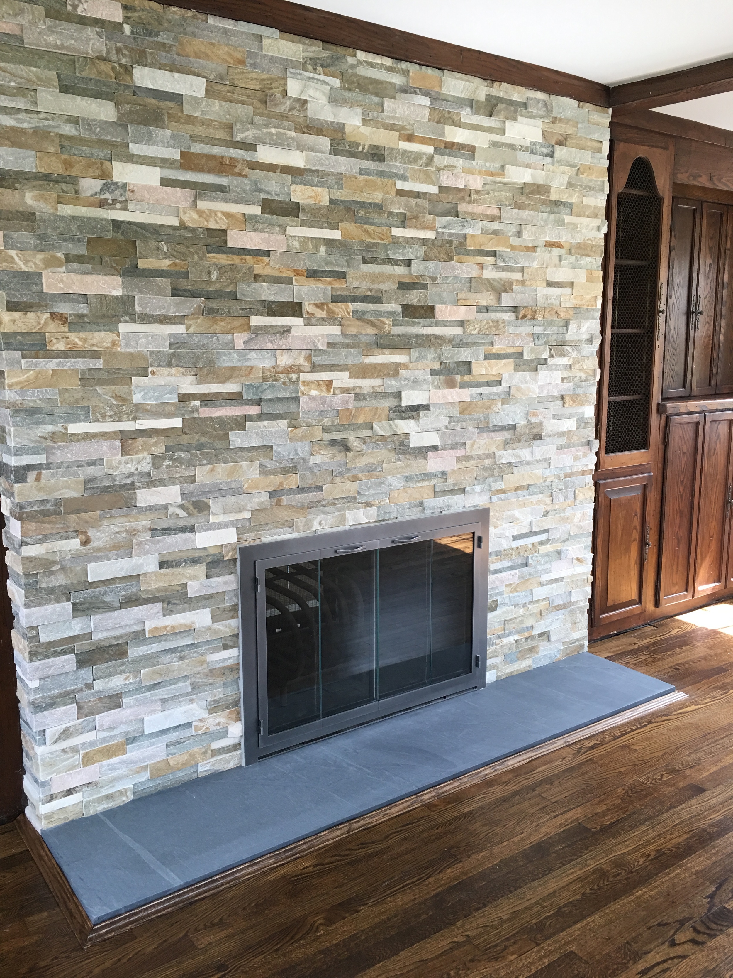
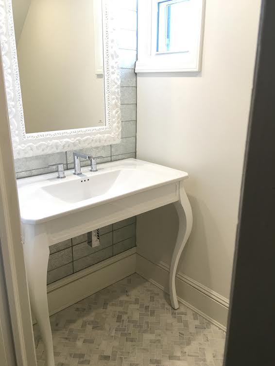
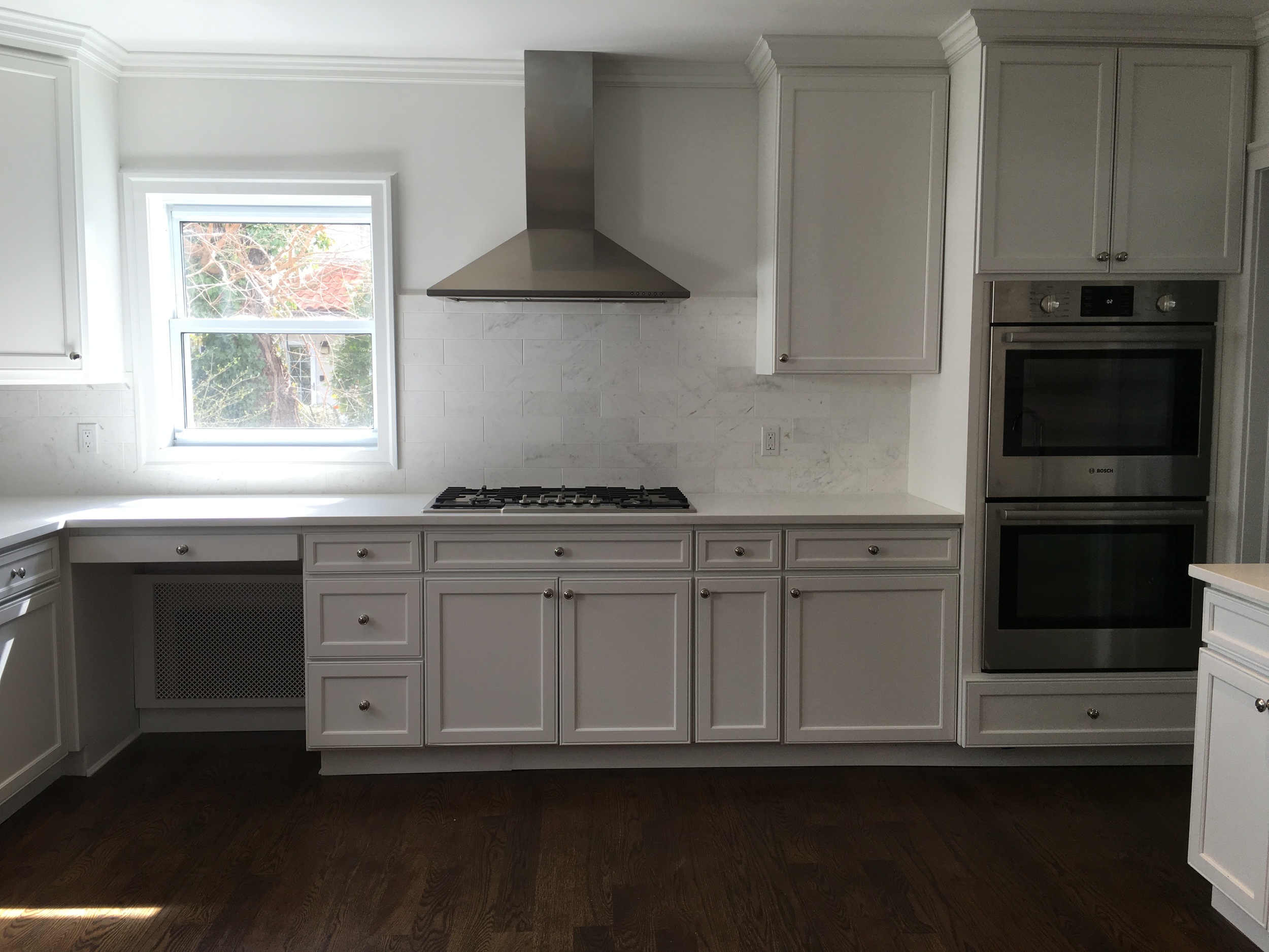
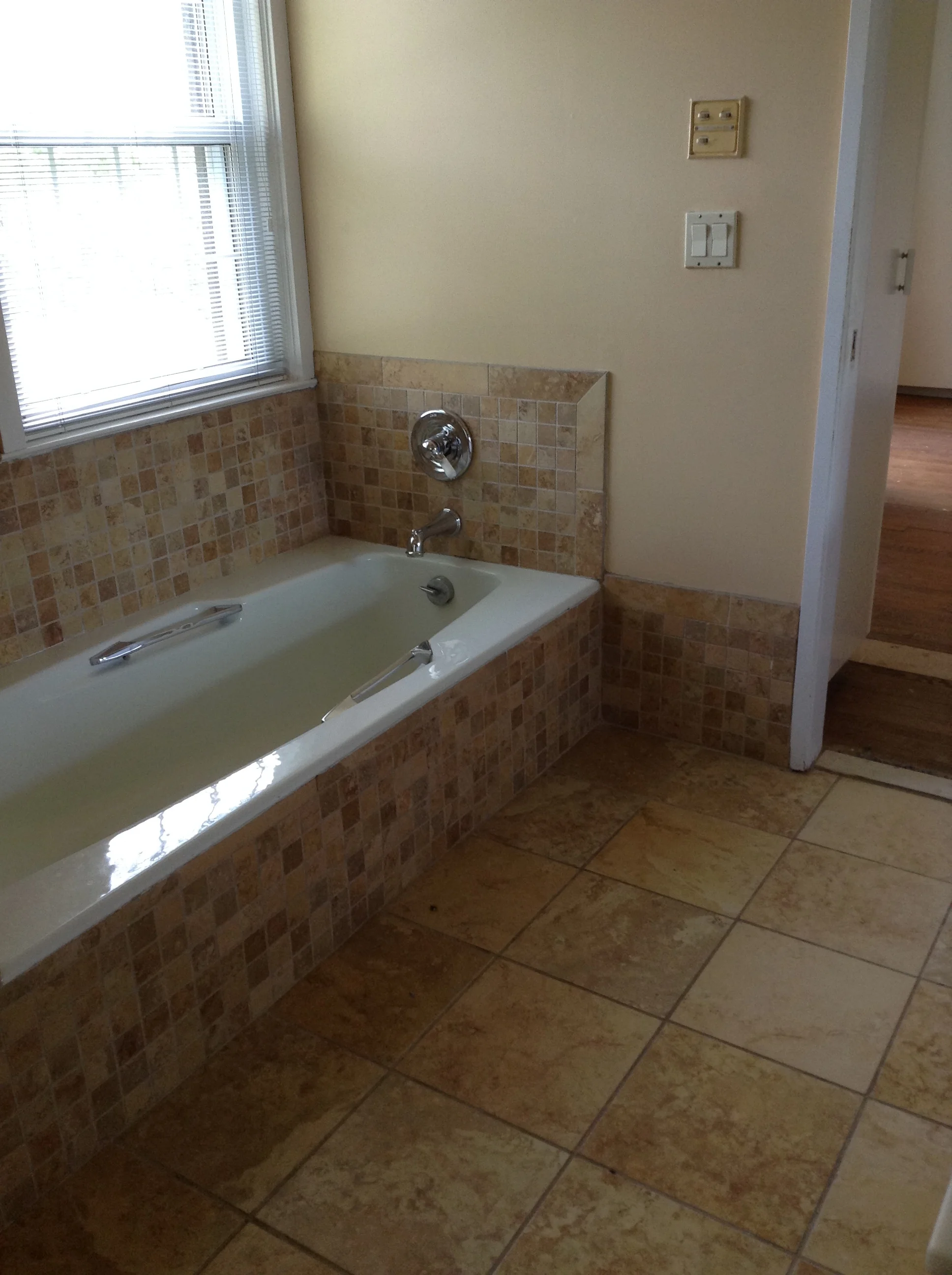
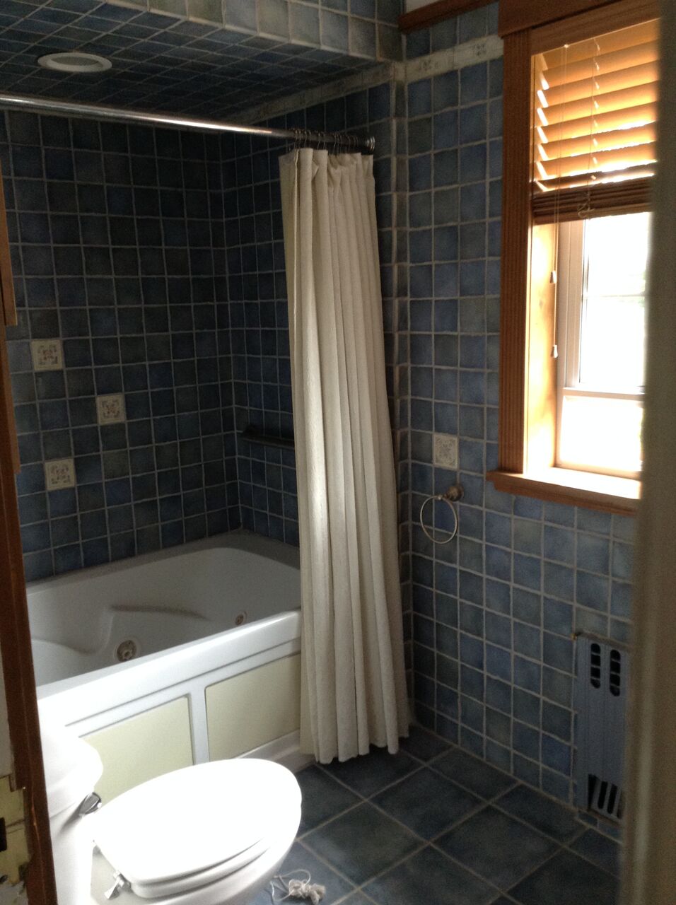
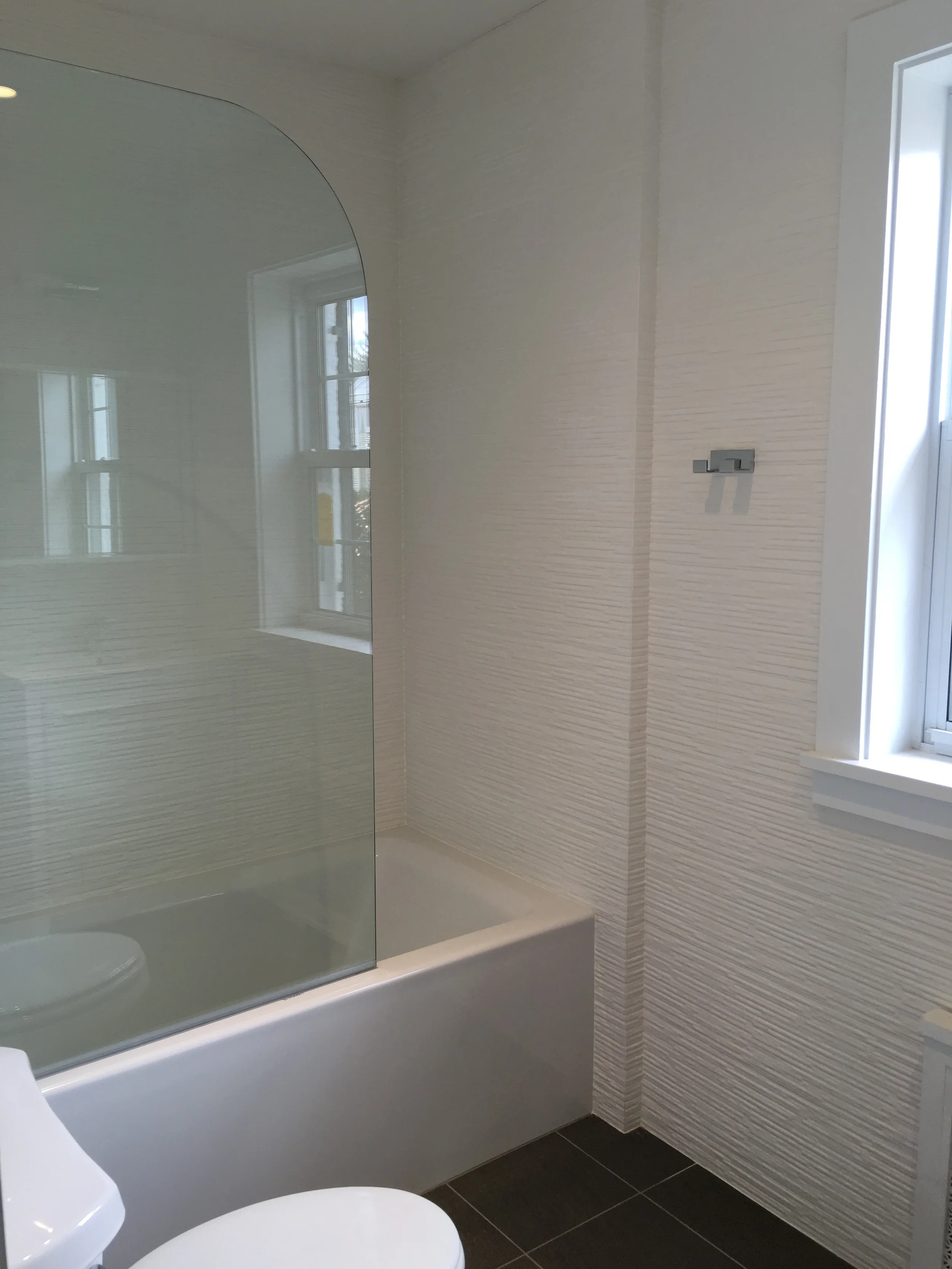
 I recently was lucky enough to be asked to help renovate a house built 100 years ago in the town of Kensington, Great Neck, NY. The complete renovation consisted of 2 fireplaces, all wood floors, the powder room, main staircase, kitchen , master bath, a kids bathroom and an attic bath.  This project took 8 months to complete. I am happy to report that the homeowner is over joyed with the finished product ! Please see some amazing before and after photos... 

BEFORE

BEFORE

AFTER

AFTER

BEFORE

BEFORE

AFTER

AFTER

BEFORE

BEFORE

AFTER

AFTER

BEFORE

BEFORE

AFTER

AFTER

BEFORE

BEFORE

AFTER

AFTER

BEFORE

BEFORE

AFTER

AFTER

BEFORE

BEFORE

BEFORE

BEFORE

AFTER

AFTER

BEFORE

BEFORE

AFTER

AFTER

BEFORE

BEFORE

AFTER

AFTER

BEFORE

BEFORE

AFTER

AFTER