CONTEMPORARY TRADITIONAL CONDO

Once in a while I get to design a new project that I find really exciting. This was one of them. Usually I work with homeowners that want a very modern sleek approach to design, which is great. However, when I get to do something new and out of the ordinary, I find it exciting and refreshing. This lovely lady wanted a bright, colorful and more traditional space. I was able to implement some of my favorite things - color, pattern, texture, and layering. The result is a condo in the sky that I think turned out quite lovely! It is light filled, fun, airy and happy. And my client feels the same exact way!

Photography by Jonathan Beckerman

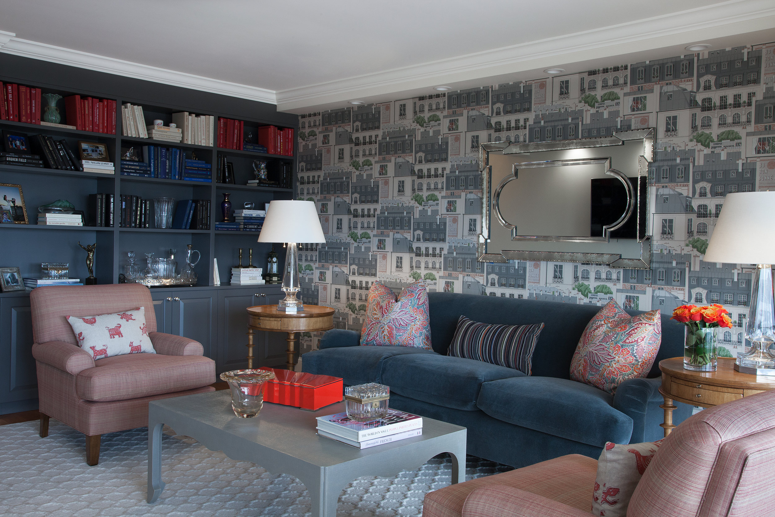
In the living room we utilized a fun Paris themed wallpaper, a custom mohair covered traditional sofa , and lots of layered patterns and color. We also incorporated many vintage and antique accessories.

In the living room we utilized a fun Paris themed wallpaper, a custom mohair covered traditional sofa , and lots of layered patterns and color. We also incorporated many vintage and antique accessories.

We filled the built-in bookcase with books, personal items and antiques, and styled the books according to color. The vintage mirror brings character and more light to the room.

We filled the built-in bookcase with books, personal items and antiques, and styled the books according to color. The vintage mirror brings character and more light to the room.

This rug was the starting point for the room. The geometric pattern plays off of the strie fabric on the club chairs and the linen wrapped parsons coffee table. The Mongolian wool stool brings a fun touch of contrasting texture to the room.

This rug was the starting point for the room. The geometric pattern plays off of the strie fabric on the club chairs and the linen wrapped parsons coffee table. The Mongolian wool stool brings a fun touch of contrasting texture to the room.

A playful Paris city scene wallpaper contrasts the colorful floral pillows. Crystal table lamps bring a sparkle to the room.

A playful Paris city scene wallpaper contrasts the colorful floral pillows. Crystal table lamps bring a sparkle to the room.

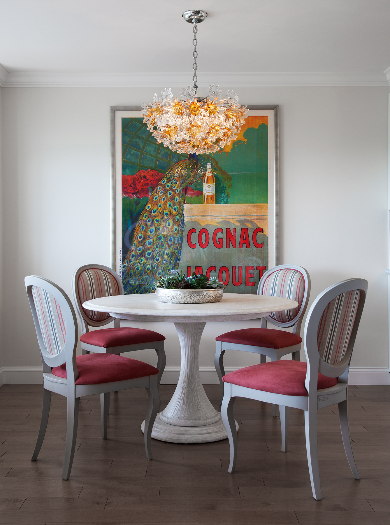
Pattern, stripes and bright color make the dining area sing!

Pattern, stripes and bright color make the dining area sing!

A mid-century modern chandelier casts a warm glow over this intimate dining area.

A mid-century modern chandelier casts a warm glow over this intimate dining area.

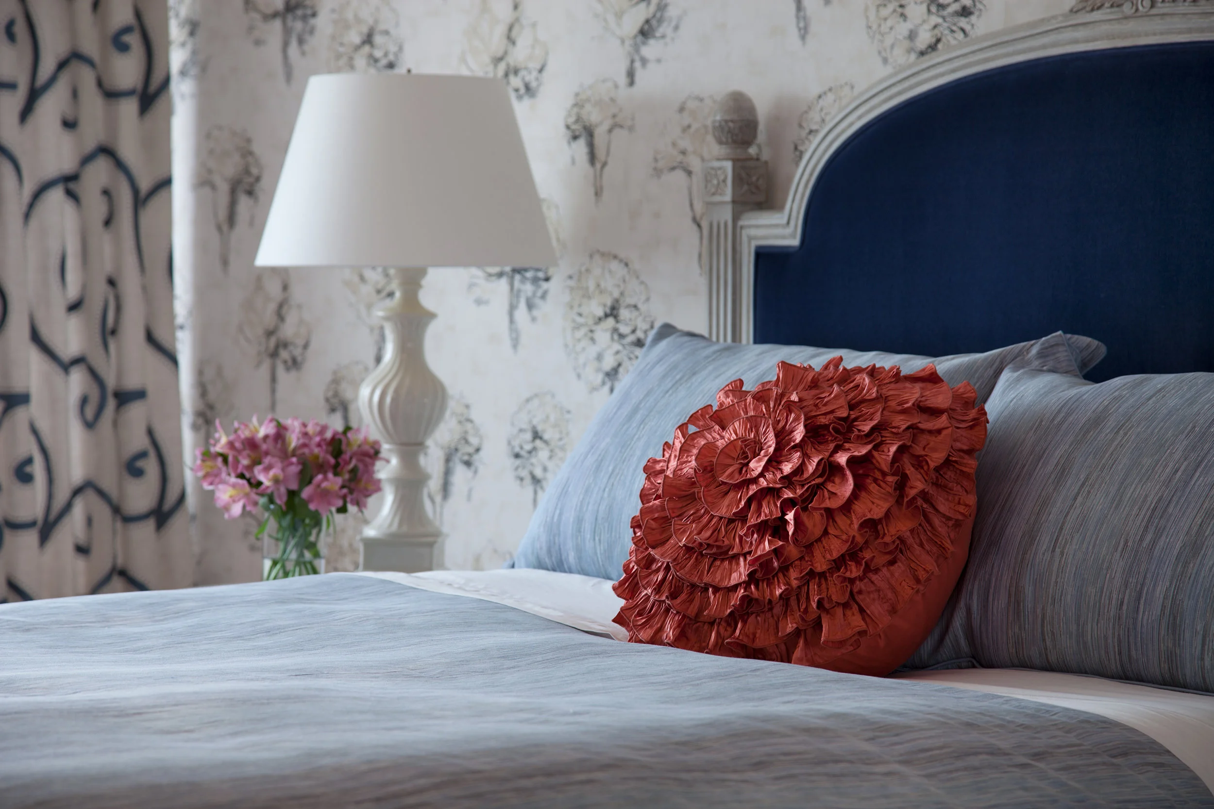
In the bedroom, the request was to make it light filled, happy and colorful.

In the bedroom, the request was to make it light filled, happy and colorful.

French flowers on the wallpaper play against the patterns on the rug, drapery and chair. It’s all about mixing color and pattern. Antique and vintage pieces always add character.

French flowers on the wallpaper play against the patterns on the rug, drapery and chair. It’s all about mixing color and pattern. Antique and vintage pieces always add character.

A pop of color draws the eye!

A pop of color draws the eye!

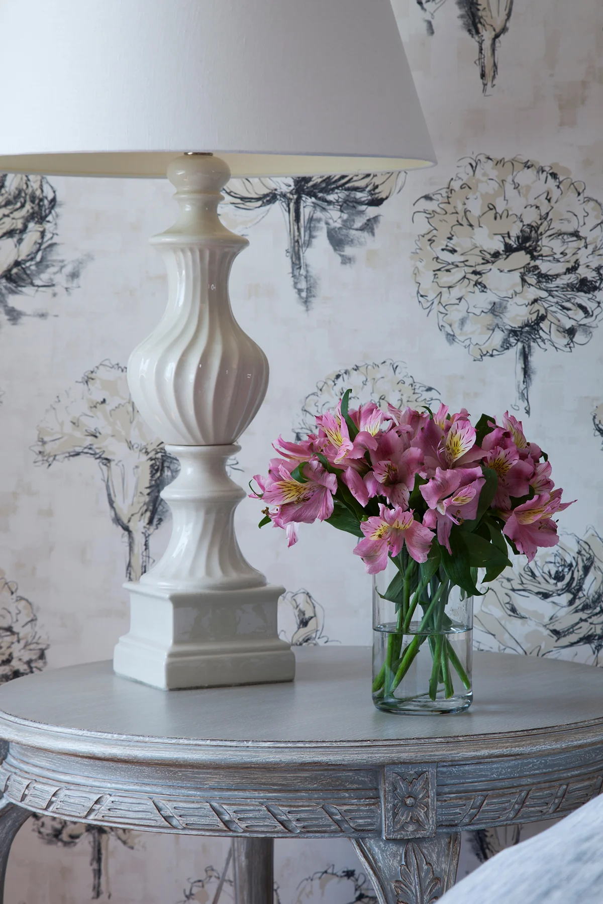
Flowers, flowers everywhere…

Flowers, flowers everywhere…

It’s all in the details.

It’s all in the details.

Designing In Stages For a Growing Family

 
F 252 7th Ave_Benatar_112217_-104.jpg

This NYC Penthouse apartment in the Chelsea Mercantile building was renovated and decorated over a few years time.  My clients wanted a beautiful space to raise their two small children.  The apartment had to be practical for this young family and their dog. The caveat? They still wanted a cool downtown vibe. 

F_WINDOW2527thAve_Benatar_112217_-134.jpg

THE OPEN LIVING + DINING AREA

The first order of business was redesigning the lighting scheme in the living room and updating and redecorating the existing open living room and dining area. We revamped the lighting by employing two lighting fixtures as the main focal points - a huge contemporary chandelier in the main living room and one simple, yet sophisticated, pendant over the dining table. Then we added cove lighting around the perimeter of the room. We sheathed the walls in a very textural metallic grasscloth. The fireplace mantle was custom designed by New York Interior Design and completely reconstructed utilizing a Carrara marble. The drapery panels add a finishing touch to the space,  rich color and pattern, and a frame around the incredible view.

The dining area came next. We custom made the marble slab dining table. Then we added visual dimension and reflection of the view with an asymmetrical mirror.

F_LIVINGV_2527thAve_Benatar_112217_-217.jpg

THE MASTER BEDROOM

The most challenging aspect of this project came when the new baby was on its way, and we reconfigured a tiny nursery out of a pretty large master bedroom closet. The master bedroom itself was redesigned to be an urban sanctuary that's just a bit sexy. Mixing lush textiles, contemporary patterns, and a soothing palette created the perfect vibe - playful and inviting, yet all grown up. Carefully designed built-ins lining the master bedroom maximized space and gave my clients back their closet. Keeping with the glamorous feel, the floor to ceiling built-ins were topped with dramatic crown moulding and jewelry-like hardware.

F_11X14_MASTER2527thAve_Benatar_112217_-16.jpg
F_HEADBOARD22527thAve_Benatar_112217_-126.jpg
FN_HEADBOARD2527thAve_Benatar_112217_-180.jpg

THE BATH

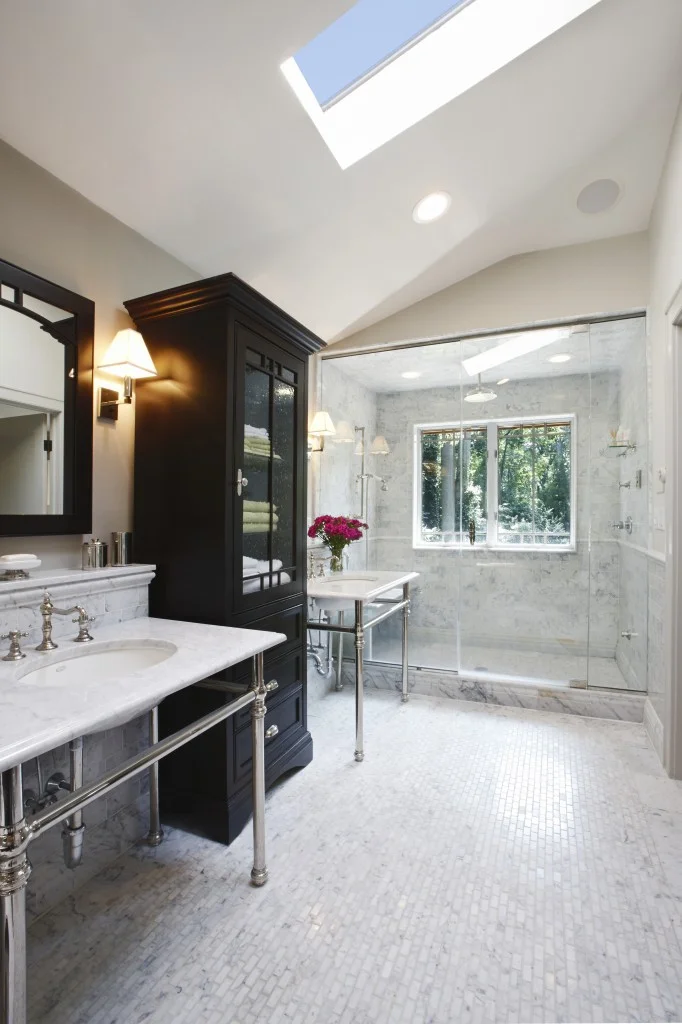
The following year it was time for a gut renovation of the bathroom. This bathroom is for both the kids and guests. The bathtub was banished in favor of a custom shower. The huge faux carrara marble tiles (a dream to maintain) coordinate and lend continuity with the other marbles in the apartment. We gave the clients a flexible, family-friendly bath with a clean modern look and the luxe glam sensibility they wanted. 

F_BATHROOM2527thAve_Benatar_112217_-145.jpg

THE KITCHEN

Lastly, it was time for the major gut renovation of the kitchen. This new eat-in kitchen design was all about the gorgeous Arabescato Vagli marble, as well as the new tufted custom banquette. The cabinets were custom designed in a charcoal gray color to both enhance and compliment the marble. The crystal lighting on the banquette wall was meant to give the room a little bling. Beyond the beauty, optimizing storage and work space is always a must in NYC kitchens, and this one was designed for the challenges of a busy urban family. Now both children and parents are comfortable and happy in their newly redesigned apartment in the sky! 

F_2527thAve_Benatar_112217_-199-2.jpg
F_2527thAve_Benatar_112217_-23.jpg

Photo Credit: Beckerman Photography

A DAY IN THE FLATIRON DISTRICT

In case you are not from NYC, or you haven't been down to the FlatIron District in NYC, this is truly an Interior Design destination. Below are some of my favorite (secret) shopping showrooms, and restaurants.  Some of the showrooms are To The Trade Only, others are retail shops... Enjoy!! 


CITY BAKERY

CITY BAKERY

IMG_0243.JPG

HOMENATURE

CLASSIC FLATIRON ARCHITECTURE 

CLASSIC FLATIRON ARCHITECTURE 

HIGH STYLE DECO

HIGH STYLE DECO

HIGH STYLE DECO

HIGH STYLE DECO

DESIGN COLECTIVE OF NEW YORK

DESIGN COLECTIVE OF NEW YORK

DESIGN COLLECTIVE OF NEW YORK

DESIGN COLLECTIVE OF NEW YORK

DESIGN COLLECTIVE OF NEW YORK

DESIGN COLLECTIVE OF NEW YORK

RALPH PUCCI

RALPH PUCCI

RALPH PUCCI

RALPH PUCCI

RALPH PUCCI

RALPH PUCCI

PATRICK NAGGAR AT RALPH PUCCI

PATRICK NAGGAR AT RALPH PUCCI

RALPH PUCCI 

RALPH PUCCI 

PATRICK NAGGAR AT RALPH PUCCI 

PATRICK NAGGAR AT RALPH PUCCI 

ART AT RALPH PUCCI 

ART AT RALPH PUCCI 

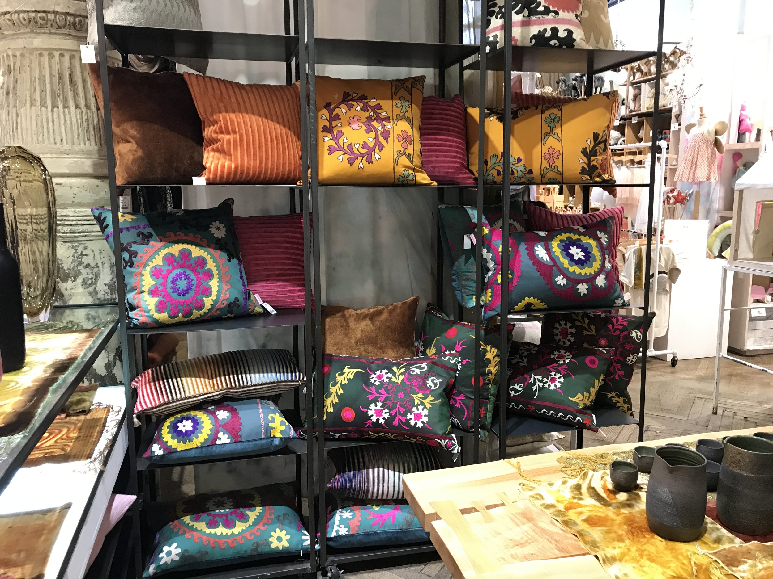
ABC HOME

ABC HOME

ABC HOME

ABC HOME

AKDO TILE

AKDO TILE

NEW PROJECT FOR A NEW SEASON

Once in awhile, I am lucky enough to be asked to design a space in a NYC building that I adore. Huys is just such a building.  Located in the heart of NoMad , on Park Ave South, Huys is a neoclassical building dating from 1917.  This building underwent a huge conversion from commercial offices to 58 luxurious and elegantly detailed condominiums .  It was designed by the world-renowned Piet Boon . This charming apartment is a pied a terre for a lovely couple that actually live upstate NY. I am very proud of how it turned out. I very much enjoyed designing the interiors, I hope you enjoy seeing the results! 

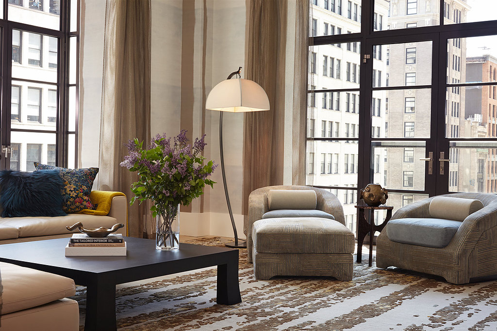
Soft tones in this  comfy living room accentuate the view 

Soft tones in this  comfy living room accentuate the view 

The walls of the dining room are covered in  textured squares..

The walls of the dining room are covered in  textured squares..

Drama in the powder room is evoked with this wallcovering that seems almost 3D 

Drama in the powder room is evoked with this wallcovering that seems almost 3D 

A Master Bedroom Dream 

A Master Bedroom Dream 

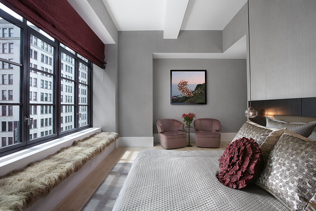
A soft serene place to relax 

A soft serene place to relax 

It's all in the details, soft gray suede walls envelope the master bedroom like a cocoon... 

It's all in the details, soft gray suede walls envelope the master bedroom like a cocoon... 

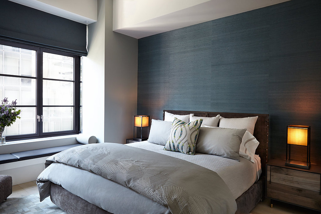
 Grasscloth walls , leather headboard  hide rug and distressed night stands all mix for high drama in this relaxing guest room..

 Grasscloth walls , leather headboard  hide rug and distressed night stands all mix for high drama in this relaxing guest room..

NEW PROJECT IN NOMAD, HUYS BUILDING

Located in the heart of NoMad , on Park Ave South, Huys is a neoclassical building dating from 1917, with neighboring stately mansions from NYC's Gilded Age. This building underwent a huge conversion from commercial offices to 58 luxurious and elegantly detailed condominiums . Developed by the prestigious Dutch Kroonenberg Groep, designed by the world-renowned Piet Boon and renovated by the well-established construction management firm Sciame. Huys is one of the my favorite buildings. This is one of the incredible apartments I was asked to design. The amazing iron windows and light brushed oak floors were already in place.  Photo Credit: Beckerman Photograpy


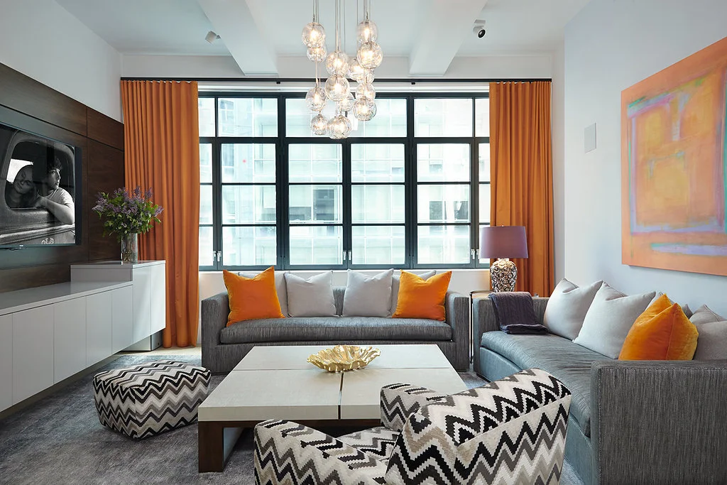
Color filled Living Room

Color filled Living Room

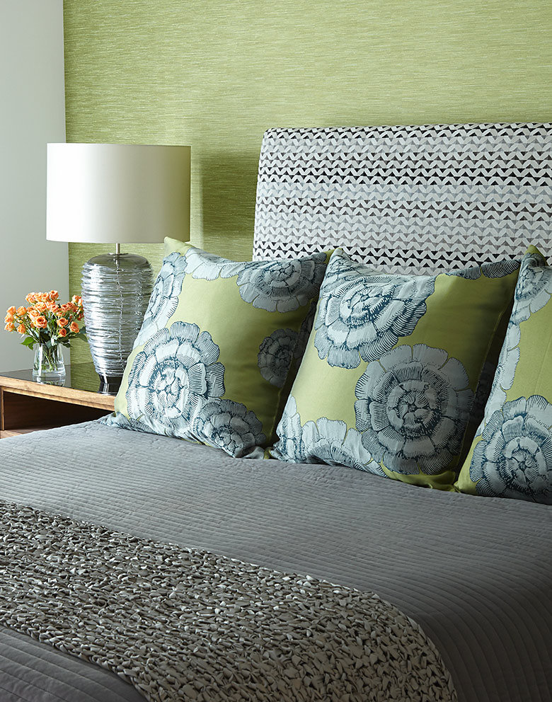
Master Bedroom with Grasscloth headboard wall 

Master Bedroom with Grasscloth headboard wall 

Close up of Master Bedroom 

Close up of Master Bedroom 

Sumptuous bedding is everything!  

Sumptuous bedding is everything!  

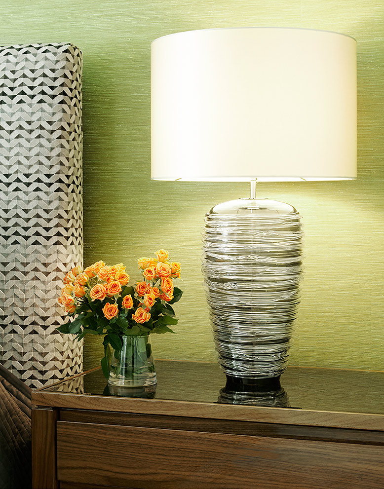
It's all in the details 

It's all in the details 

ANN GISH IN THE FLATIRON DISTRICT

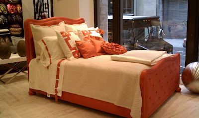
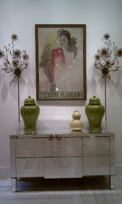
      I was lucky enough to know about Ann Gish bedding for a long time. I always introduced my clients to Ann's exceptional bedding line. In the past I had to drag my clients all the way up to her warehouse  or just show them the website. Now Ann Gish has opened a retail store at 4 West 20th Street, in the Flatiron District. Ann is a very talented lady with a super incredible eye for style and quality. She has stocked the store with the most gorgeous bedding, pillows, lingerie and even some furniture and lighting... All ARE TO DIE FOR.....

Images by New York Interior Design