FEATUREED IN NYC COTTAGES & GARDENS/ TRIBECA PIED-A-TERRE

As we celebrate our 25th year in business, I'm thrilled to reflect on one of our favorite projects. To me, the key to success is establishing a great rapport with clients. When there's mutual trust and positive energy, everything falls into place beautifully.

This project was a true testament to the power of joyful collaboration. The clients, a happy couple who had just become empty nesters after marrying off their children, were looking for a pied-a-terre that would serve as a peaceful retreat in the heart of Tribeca. Since both of their newlywed children lived nearby, they wanted a cozy space where they could all come together, visit and unwind.

The challenge was to create a design that combined bold, exuberant colors with a sophisticated style that conveyed a sense of understated luxury and comfort. The result was a space that radiated joy, happiness, and tranquility, perfectly suited to the client's needs and personalities.

The foyer reflects the owner’s love of color and gives you a glimpse of what’s to come.

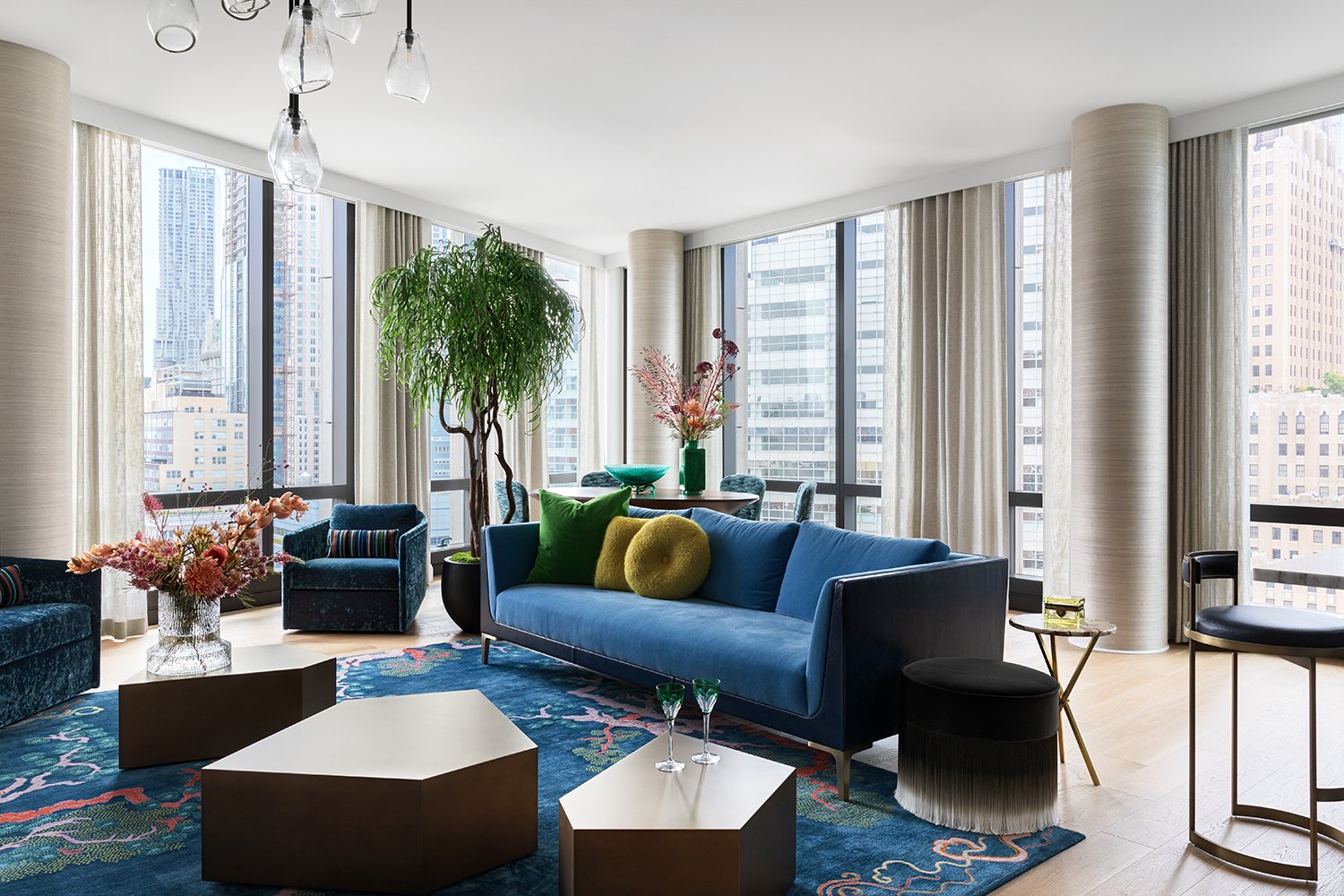
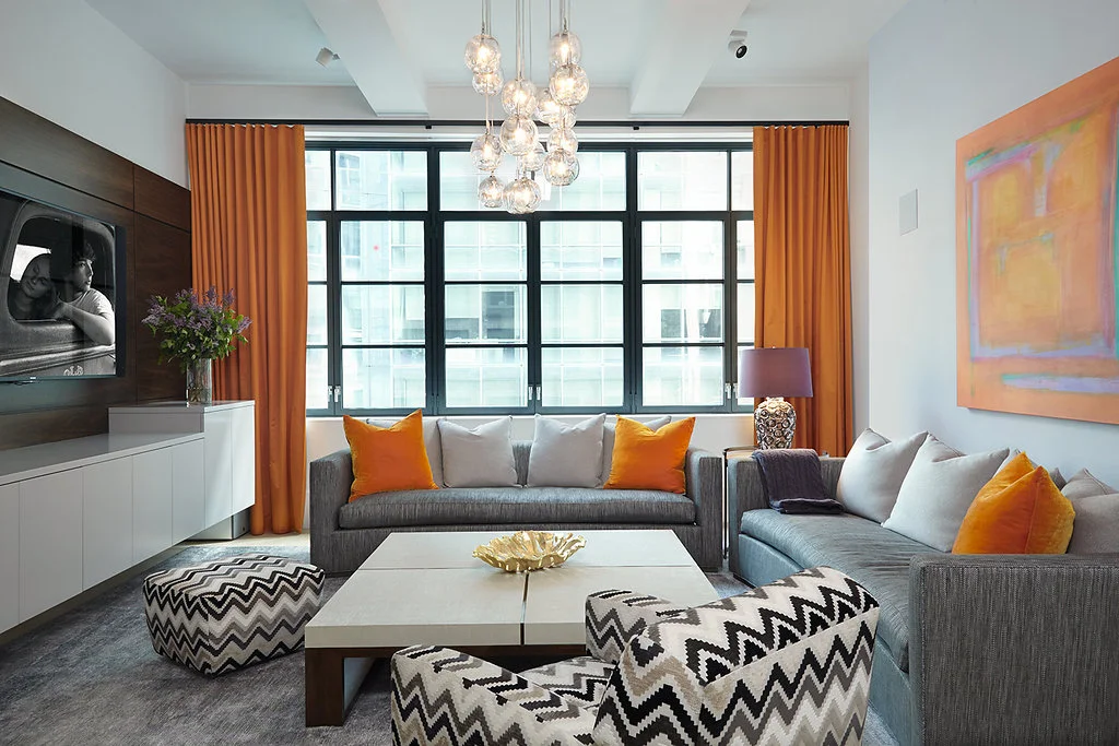
This exuberant, colorful living room was designed with the wonderful personalities of the clients in mind.

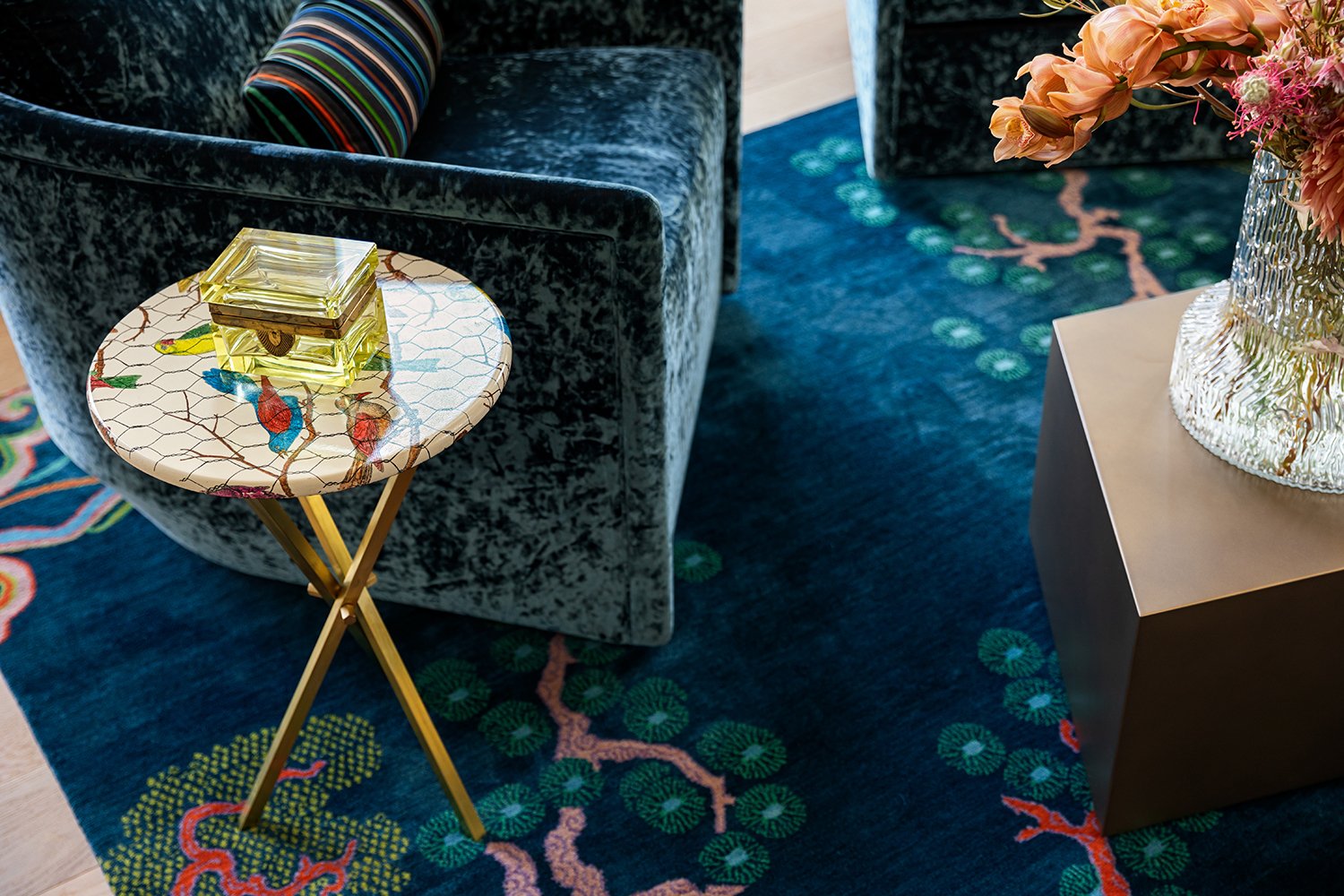
The living room shines like a jewel. The starting point of the design started with this gorgeous Tibetan Rug! Bold, colorful , fun and alive!

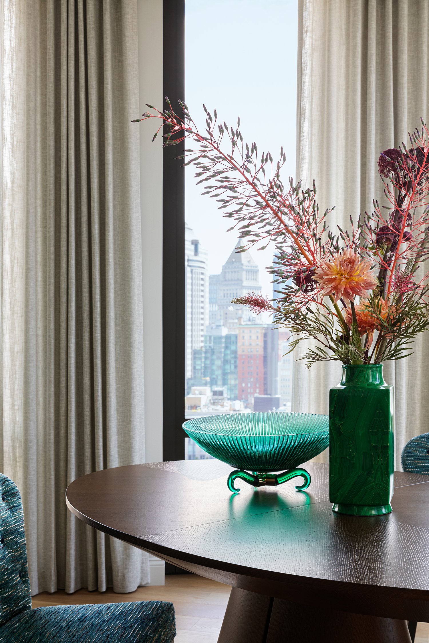
Blues and greens with a splash of exotic Spring flowers add to the drama.

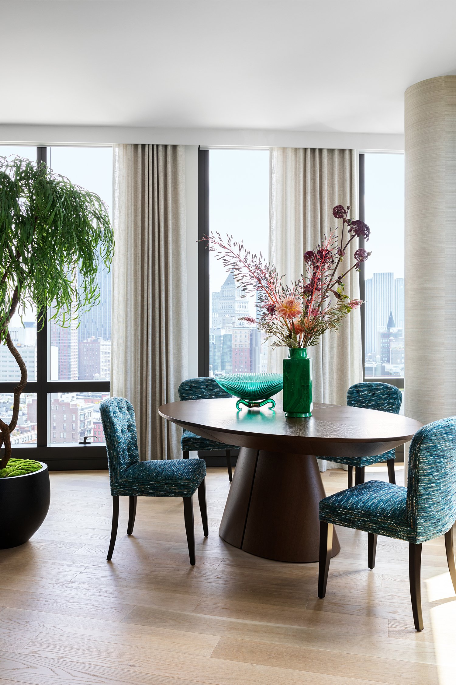
Vintage vessels and vases add soul and character to the space. The linen drapery lets the soft light filter through and defines the space..

Vintage finds and antiques mix with wonderful bold patterns and color, bringing a sense of of harmony to the living room.

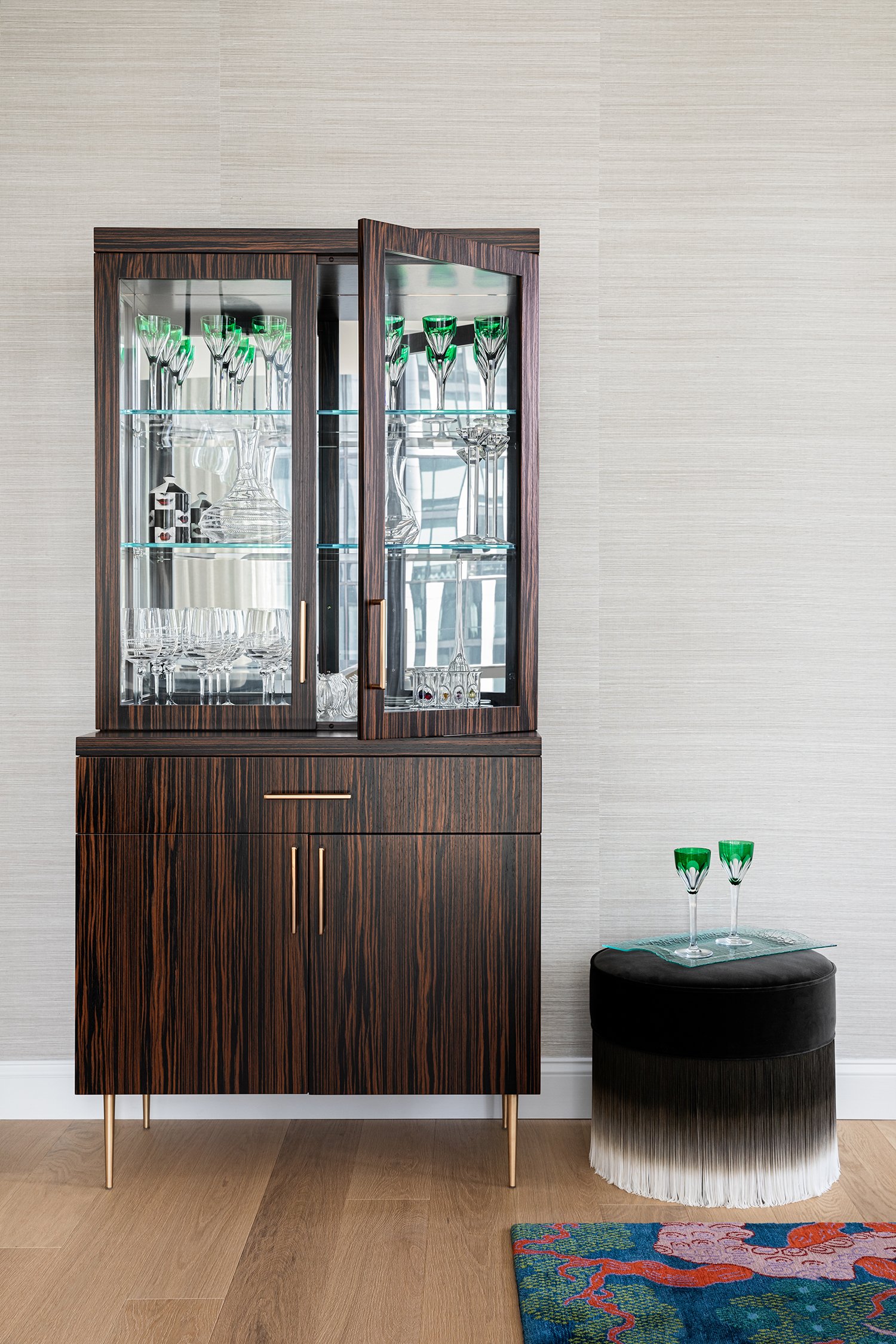
Soft grasscloth , a custom bar reflecting light with antique mirror and an ombre ottoman are all married together to form an intimate space.

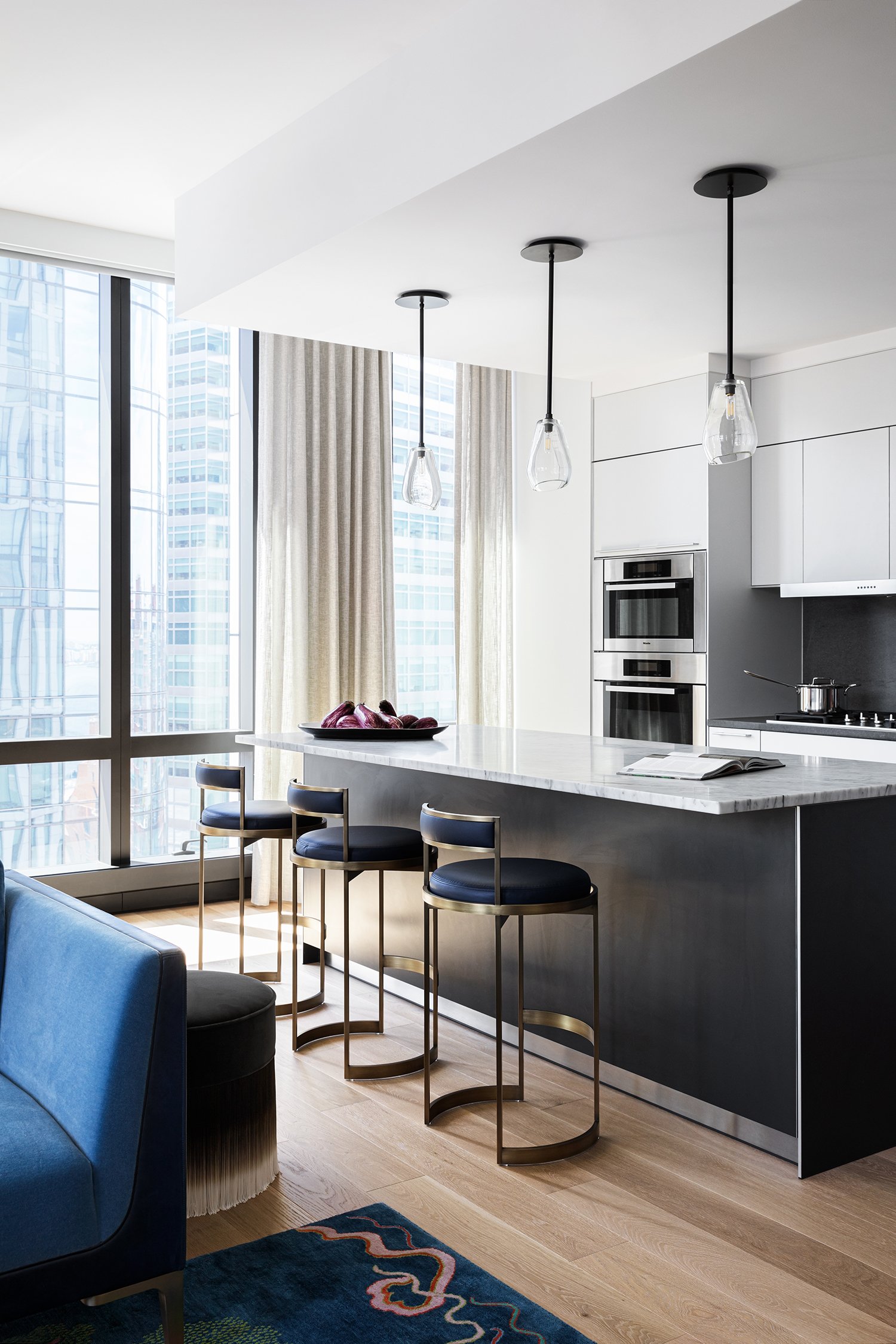
The kitchen is wide open and serves as a gathering spot for both family and friends.

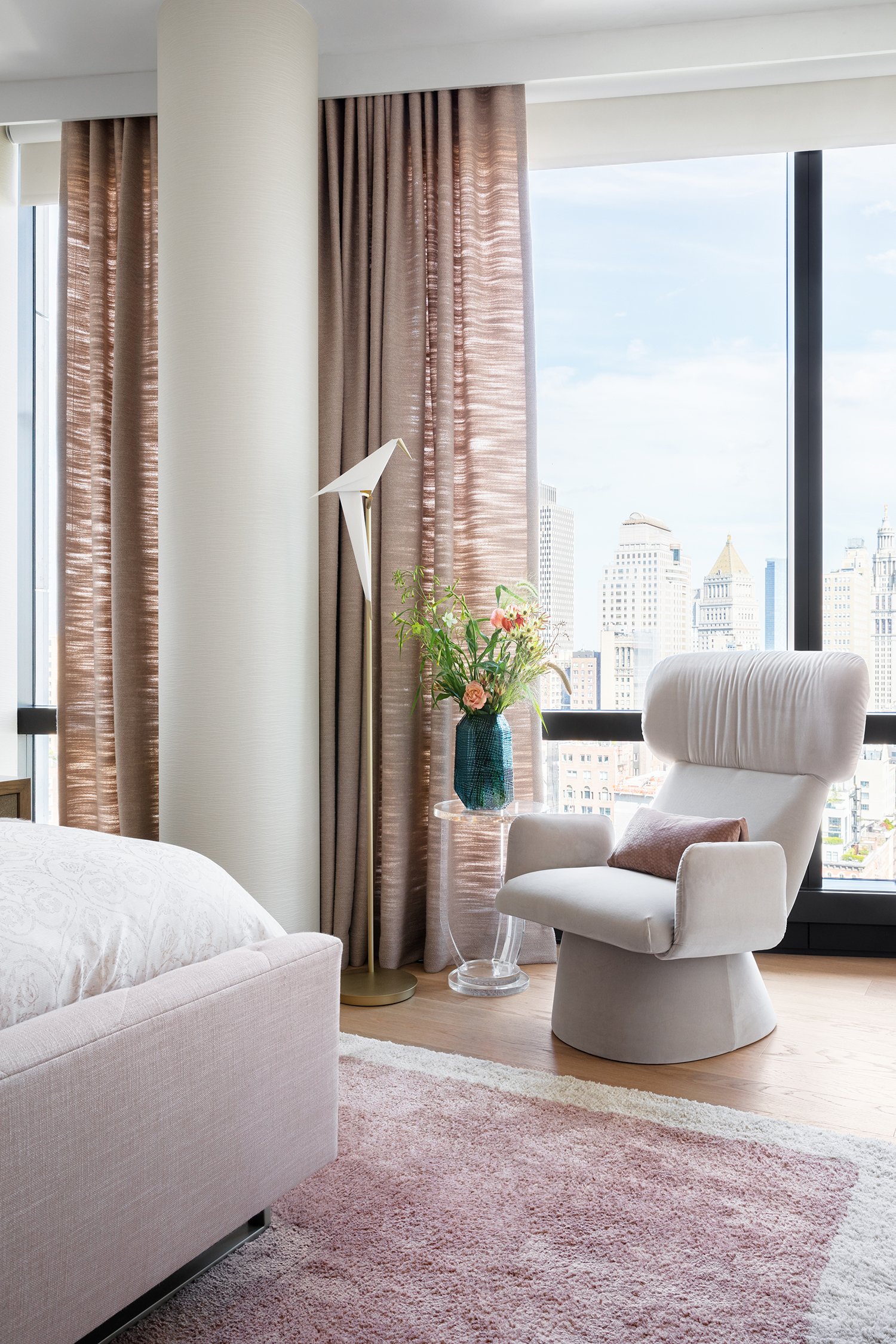
We kept the textured wall covering, handmade cashmere rug, and drapery soft and soothing to set a tone of utter tranquility.

We added touches of whimsy to keep the mood lighthearted…

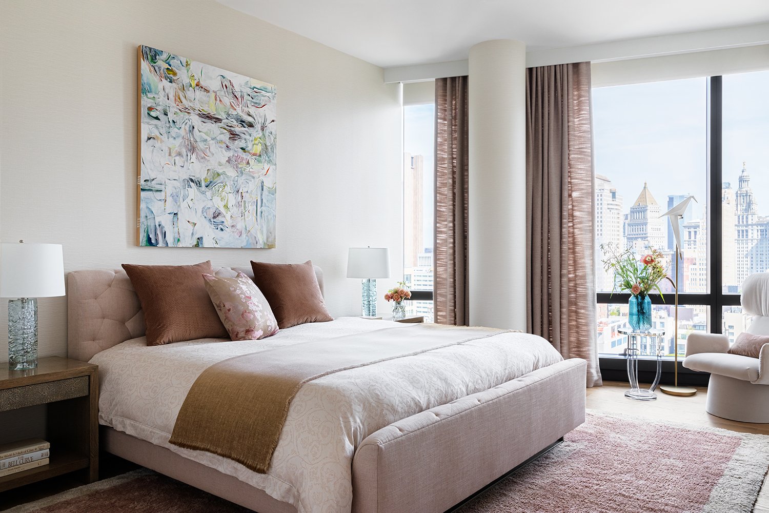
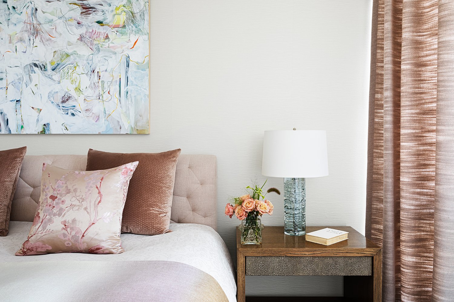
Art, soft textures and beautiful patterns all come together to form a sexy oasis in the primary bedroom.

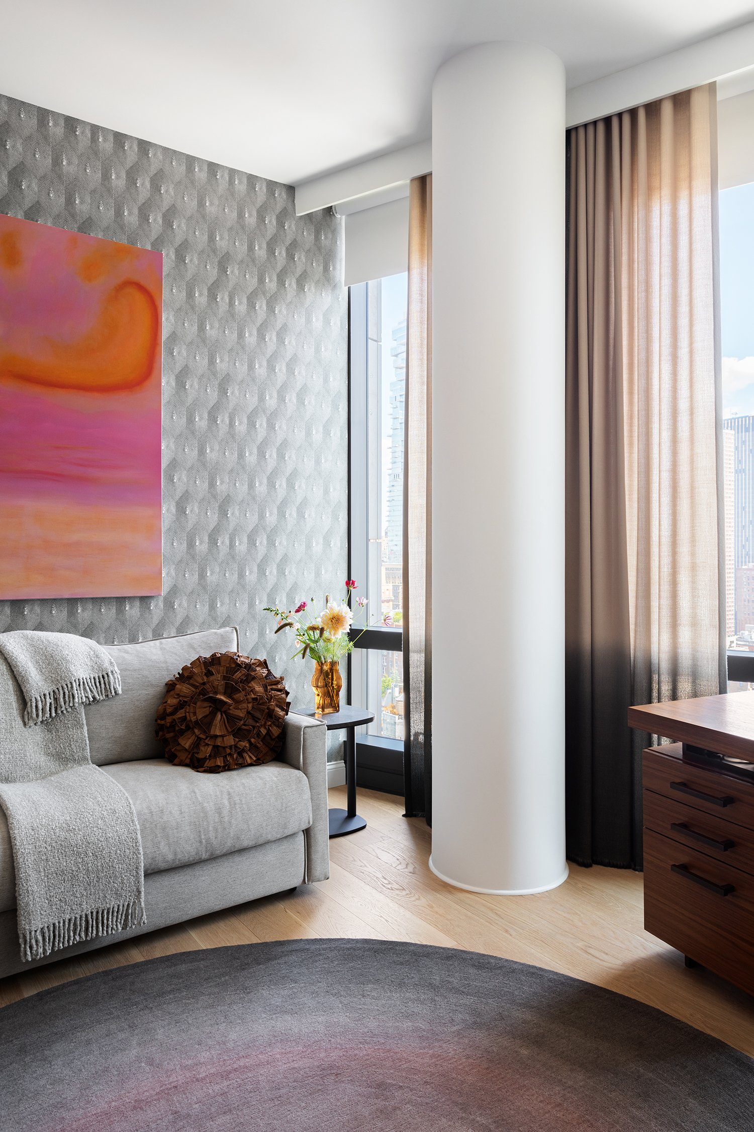
The home office was designed for a sophisticated lady who loves soft muted ombre tones giving this space a dreamlike ambience.

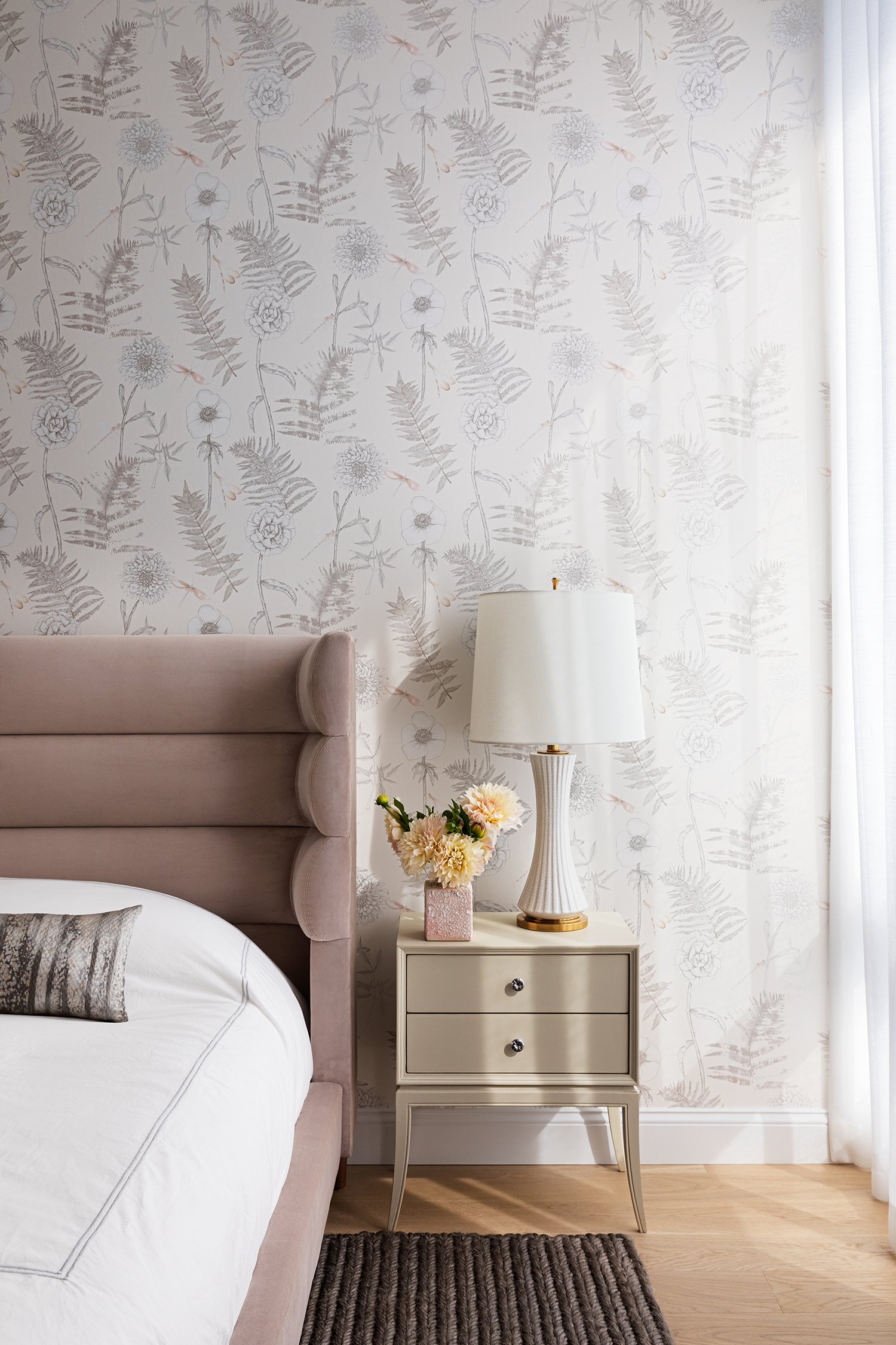
The guest room is sheathed in a soft floral wallpaper where tension is created with the rough texture of this sea grass rug against both the wall covering and the soft velvet of the bed.

CONTEMPORARY TRADITIONAL CONDO

Once in a while I get to design a new project that I find really exciting. This was one of them. Usually I work with homeowners that want a very modern sleek approach to design, which is great. However, when I get to do something new and out of the ordinary, I find it exciting and refreshing. This lovely lady wanted a bright, colorful and more traditional space. I was able to implement some of my favorite things - color, pattern, texture, and layering. The result is a condo in the sky that I think turned out quite lovely! It is light filled, fun, airy and happy. And my client feels the same exact way!

Photography by Jonathan Beckerman

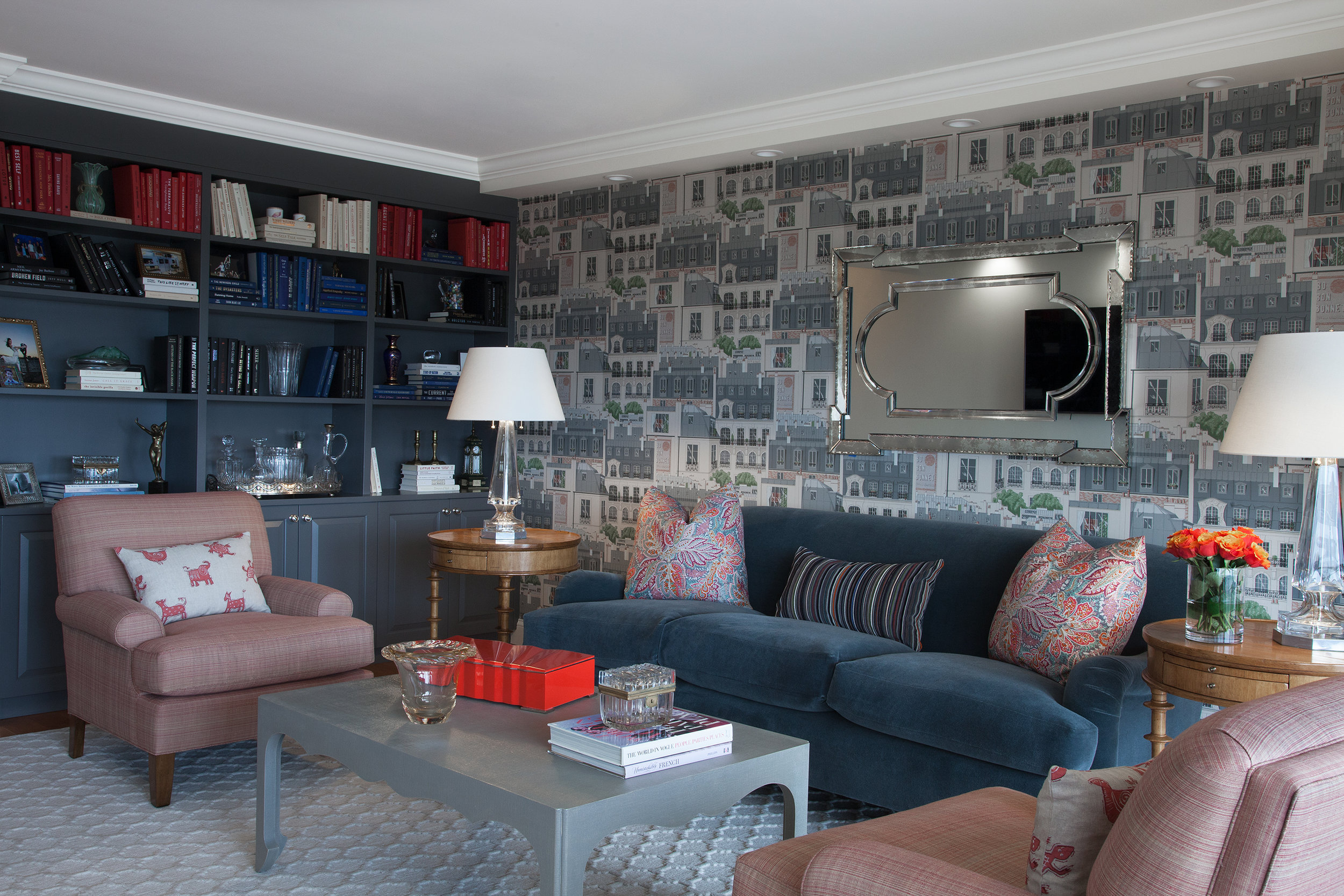
In the living room we utilized a fun Paris themed wallpaper, a custom mohair covered traditional sofa , and lots of layered patterns and color. We also incorporated many vintage and antique accessories.

In the living room we utilized a fun Paris themed wallpaper, a custom mohair covered traditional sofa , and lots of layered patterns and color. We also incorporated many vintage and antique accessories.

We filled the built-in bookcase with books, personal items and antiques, and styled the books according to color. The vintage mirror brings character and more light to the room.

We filled the built-in bookcase with books, personal items and antiques, and styled the books according to color. The vintage mirror brings character and more light to the room.

This rug was the starting point for the room. The geometric pattern plays off of the strie fabric on the club chairs and the linen wrapped parsons coffee table. The Mongolian wool stool brings a fun touch of contrasting texture to the room.

This rug was the starting point for the room. The geometric pattern plays off of the strie fabric on the club chairs and the linen wrapped parsons coffee table. The Mongolian wool stool brings a fun touch of contrasting texture to the room.

A playful Paris city scene wallpaper contrasts the colorful floral pillows. Crystal table lamps bring a sparkle to the room.

A playful Paris city scene wallpaper contrasts the colorful floral pillows. Crystal table lamps bring a sparkle to the room.

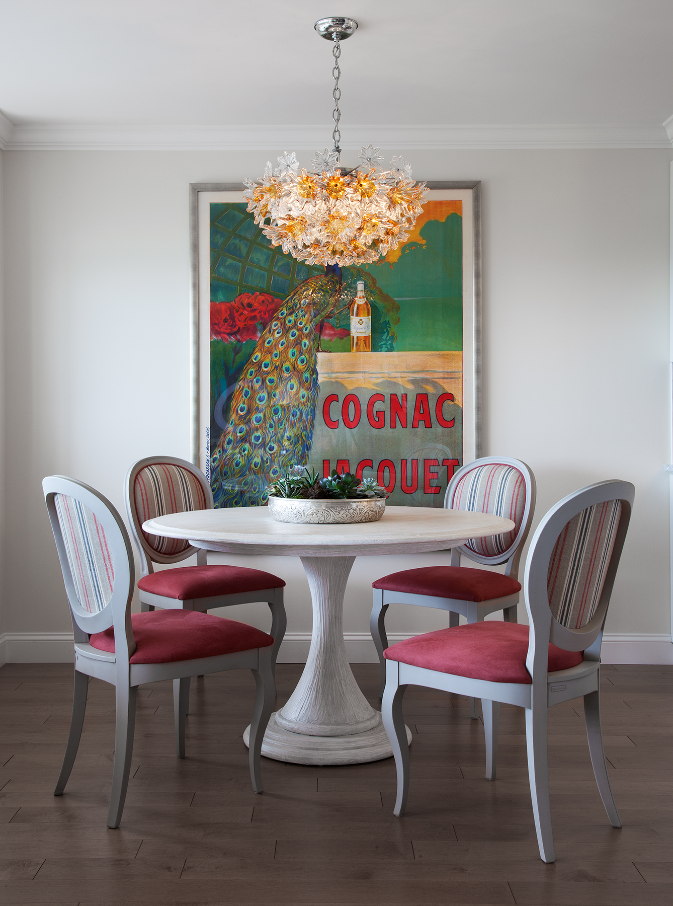
Pattern, stripes and bright color make the dining area sing!

Pattern, stripes and bright color make the dining area sing!

A mid-century modern chandelier casts a warm glow over this intimate dining area.

A mid-century modern chandelier casts a warm glow over this intimate dining area.

In the bedroom, the request was to make it light filled, happy and colorful.

In the bedroom, the request was to make it light filled, happy and colorful.

French flowers on the wallpaper play against the patterns on the rug, drapery and chair. It’s all about mixing color and pattern. Antique and vintage pieces always add character.

French flowers on the wallpaper play against the patterns on the rug, drapery and chair. It’s all about mixing color and pattern. Antique and vintage pieces always add character.

A pop of color draws the eye!

A pop of color draws the eye!

Flowers, flowers everywhere…

Flowers, flowers everywhere…

It’s all in the details.

It’s all in the details.

A FASHION FORWARD NEW INTERIOR DESIGN PROJECT IN CHELSEA FOR THE NEW FALL SEASON

I love talking about some of my favorite interior design projects.  I just completed a new one in Chelsea, a lovely,  storied NYC neighborhood with a decent amount of newly constructed or adapted modern residences, like this one. What makes this one different from most is that the elevator opens right into the apartment. This fun project for a fantastic client took about a year from start to finish.

This space was conceived for a family with two young children. The only initial directives were to design a welcoming entry with a "wow factor" to set the tone and to transform what was a somewhat boring living / dining room into a cool, colorful, and comfortable space for the whole family and guests to enjoy. 

There are a lot of musicians in this family, the custom wall unit was built to house 5 guitars in addition to a television and bar. In the end, the piano was the only piece left over from the old space. I'm thrilled that this charming musical family is as happy as I am with the outcome of their new open living area! 

The elevator entrance opens to a warm welcome. Lush, textural eggplant hued suede wallcovering was applied to the main entry wall to make the sconces and painting pop. An impossibly soft faux fur covered custom New York Interior Design bench provide…

The elevator entrance opens to a warm welcome. Lush, textural eggplant hued suede wallcovering was applied to the main entry wall to make the sconces and painting pop. An impossibly soft faux fur covered custom New York Interior Design bench provides the posh perch to take off snow boots or put on a pair of perfect pumps. 

A custom designed glass tile mosaic at the end of the hallway makes this entry sparkle and feel visually larger.

A custom designed glass tile mosaic at the end of the hallway makes this entry sparkle and feel visually larger.

Everything in this living/dining area was designed with the clients in mind. From the bold floral wallpaper (which inspired the entire space) to soft mohair seating and inviting ombre stripes, color & geometric shapes abound. 

Everything in this living/dining area was designed with the clients in mind. From the bold floral wallpaper (which inspired the entire space) to soft mohair seating and inviting ombre stripes, color & geometric shapes abound. 

With an iridescent pendant chandelier lighting the way with bold pattern and color , dinners will never be boring! 

With an iridescent pendant chandelier lighting the way with bold pattern and color , dinners will never be boring! 

This wall unit was custom built to fit some amazing musical instruments. We included a mirrored bar to house family heirloom glassware and some antiques from travels around the globe. 

This wall unit was custom built to fit some amazing musical instruments. We included a mirrored bar to house family heirloom glassware and some antiques from travels around the globe. 

Precious Heirlooms and favorite drinks sparkle against these glass shelves. Hammered metal pulls add the finishing touch .

Precious Heirlooms and favorite drinks sparkle against these glass shelves. Hammered metal pulls add the finishing touch .

Color, pattern and metal tones are repeated around the room. Different shapes and scale are used to keep the visual momentum going. 

Color, pattern and metal tones are repeated around the room. Different shapes and scale are used to keep the visual momentum going. 

This snake skin and metal vintage glass side table along with fresh crabtree branches add color and texture.  

This snake skin and metal vintage glass side table along with fresh crabtree branches add color and texture.  

There is nothing like fresh Dahlias to bring color and life to a room. These beauties pull in tones from the floral wallpaper.

There is nothing like fresh Dahlias to bring color and life to a room. These beauties pull in tones from the floral wallpaper.


FALL INTO FASHION 2017

Fall is slowly but surely creeping up on us! Even though we are sad to see the summer go, I must admit, the excitement for fall fashion has taken over... The fashion world and Interior design world are always connected. They come hand in hand, season by season. Take a look at our two shopping days, one in the fashion market and the other in the interior design market, for early fall trends.. same styles...same trends...Fall 2017!!!
 

Neiman Marcus- Fall 2017

Neiman Marcus- Fall 2017

Jiun Ho Showroom - 200 Lex - Fall 2017

Jiun Ho Showroom - 200 Lex - Fall 2017

Neiman Marcus - Fall 2017

Neiman Marcus - Fall 2017

Juin Ho Showroom - 200 Lex- Fall 2017

Juin Ho Showroom - 200 Lex- Fall 2017

Profiles Showroom - 200 Lex - Fall 2017

Profiles Showroom - 200 Lex - Fall 2017

Neiman Marcus - Fall 2017

Neiman Marcus - Fall 2017

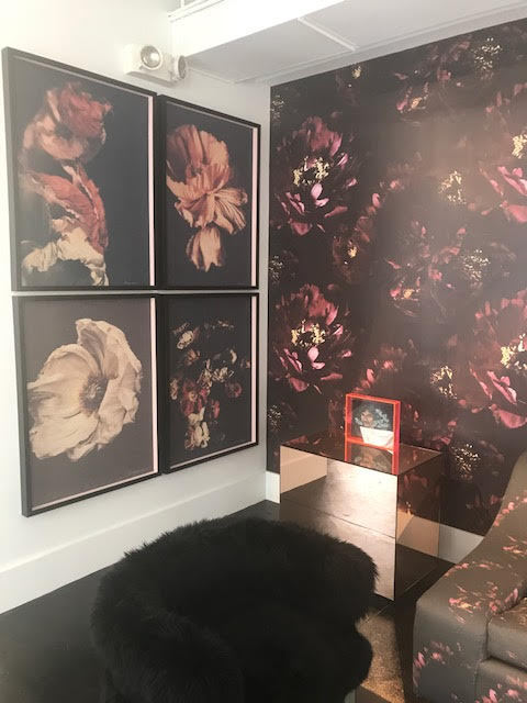
Brett Design Wallpaper @ Bradley Showroom - 200 Lex

Brett Design Wallpaper @ Bradley Showroom - 200 Lex

Neiman Marcus - Fall 2017

Neiman Marcus - Fall 2017

Kelly Wearstler Showroom - 200 Lex - fall 2017

Kelly Wearstler Showroom - 200 Lex - fall 2017

Neiman Marcus - Fall 2017

Neiman Marcus - Fall 2017

Brett Fabric @ Bradley Showroom - 200 Lex - Fall 2017

Brett Fabric @ Bradley Showroom - 200 Lex - Fall 2017

A HOME ...THREE YEARS IN THE MAKING

Once in awhile I am lucky enough to have the opportunity to get in on the ground floor when it comes to constructing a brand new home for a lovely family. This amazing project was my ideal. 

We started planning this light-filled, 6,100-square-foot dream home in Roslyn New York, three years ago. This was a team effort. From the drawings by esteemed architect Michael Wallin to the actual building by Robert Beer everything was a collaboration.

My clients basically knew what they wanted ... a forever home that was luxurious yet suitable for their two young children and two loving dogs. They wanted a unique one-of -a- kind modern home that was equally sophisticated yet young and fun. My job was to make sure they were happy, comfortable & excited by the design. 

The following are a few of the rooms completed so far... 

Photo Credit : Beckerman Photography 


FRONT VIEW

FRONT VIEW

THE BREAKFAST ROOM 

THE BREAKFAST ROOM 

THE KITCHEN

THE KITCHEN

THE MUD POWDER ROOM

THE MUD POWDER ROOM

THE FAMILY ROOM 

THE FAMILY ROOM 

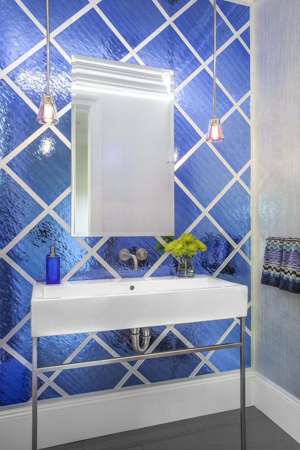
THE POWDER ROOM

THE POWDER ROOM

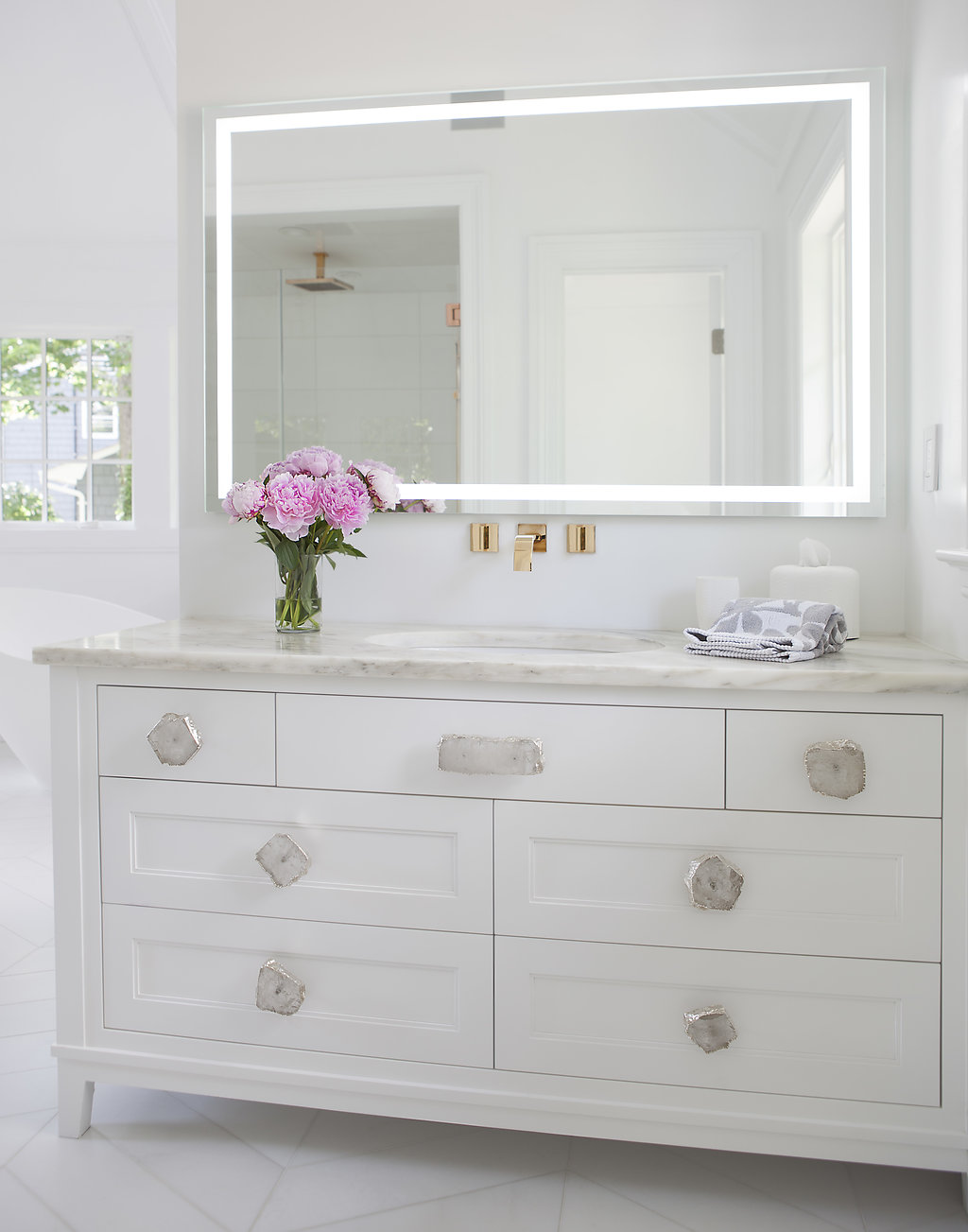
THE MASTER BATH

THE MASTER BATH

THE MASTER BATHROOM

THE MASTER BATHROOM

THE MASTER SHOWER

THE MASTER SHOWER

COOL GIRL"S ROOM

COOL GIRL"S ROOM

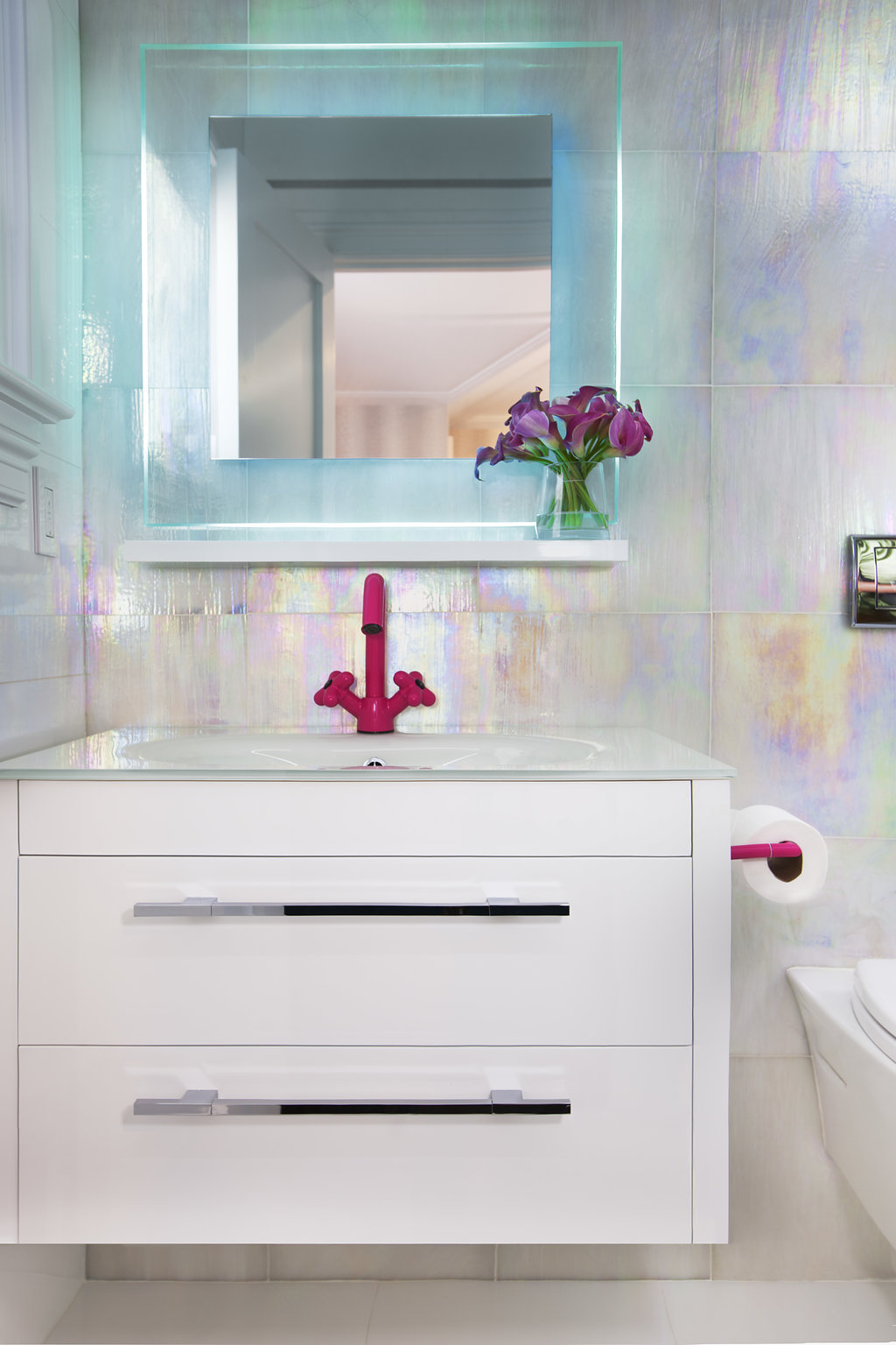
GIRL'S BATHROOM

GIRL'S BATHROOM

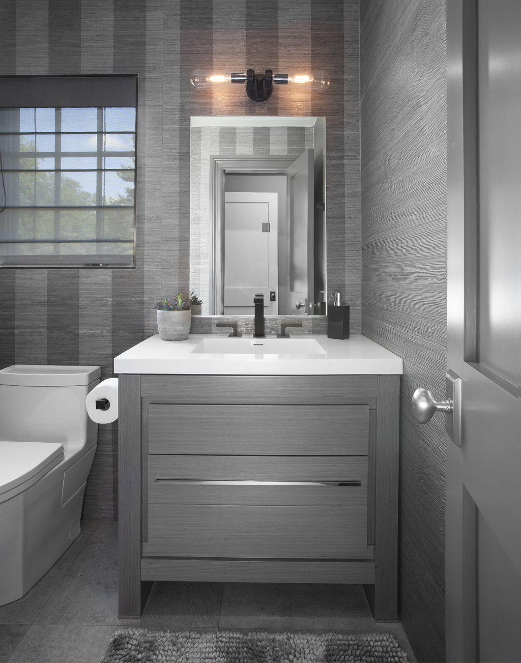
BOY'S BATHROOM 

BOY'S BATHROOM 


A TASTE OF SUMMER....

Finally, summer is here!!!  Every New Yorker seems happier! Not only are we feeling it on this beautiful day in New York but we are feeling it in the New York Design Center too #nydc . Vibrant fabric colors filling the showrooms on sofas and chairs, new combinations are here to stay.. Colors are HOT and sultry or pastel and soft... Let's all have a fun and exciting summer ....

Color is an essential aspect of Interior Design

PINK CURVED SOFA AT BRADLEY SHOWROOM - 200 LEX

PINK CURVED SOFA AT BRADLEY SHOWROOM - 200 LEX

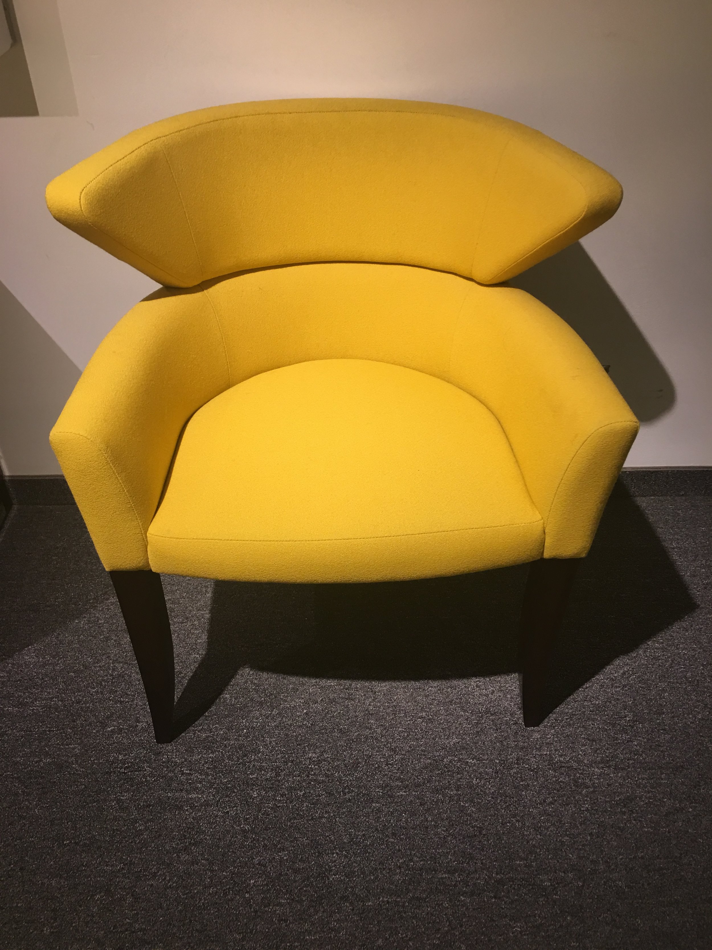
BRIGHT YELLOW CHAIR AT BRUETON SHOWROOM  - 200 LEX

BRIGHT YELLOW CHAIR AT BRUETON SHOWROOM  - 200 LEX

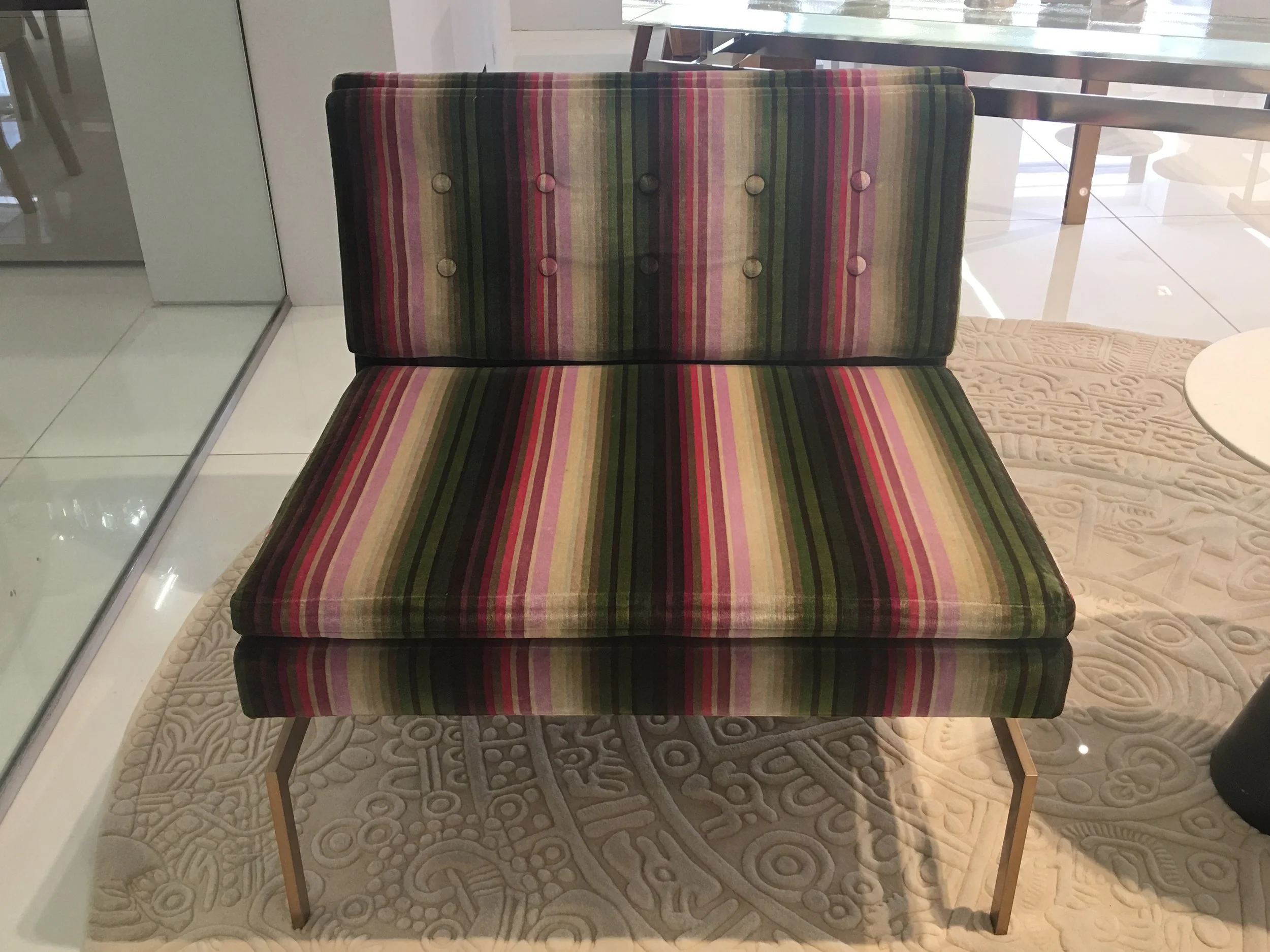
STRIPED CHAIR AT KGBL SHOWROOM - 200 LEX

STRIPED CHAIR AT KGBL SHOWROOM - 200 LEX

FUSCHIA CHAISE AT KGBL SHOWROOM- 200 LEX

FUSCHIA CHAISE AT KGBL SHOWROOM- 200 LEX

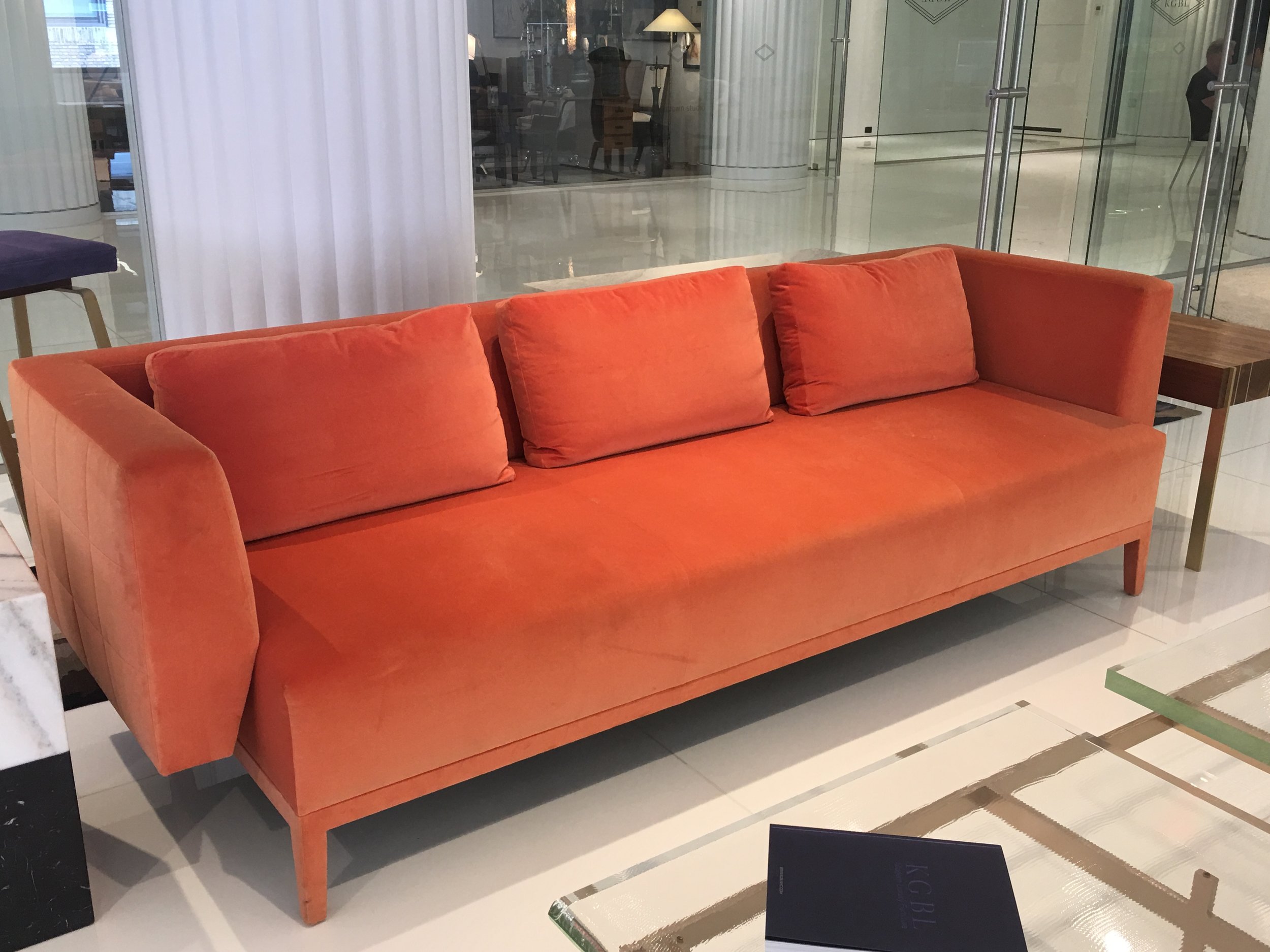
CORAL SOFA AT KGBL SHOWROOM- 200 LEX

CORAL SOFA AT KGBL SHOWROOM- 200 LEX

PURPLE STOOL AT KGBL SHOWROOM - 200 LEX

PURPLE STOOL AT KGBL SHOWROOM - 200 LEX

GREEN SOFA AT KGBL SHOWROOM - 200 LEX

GREEN SOFA AT KGBL SHOWROOM - 200 LEX

NEW PROJECT IN NOMAD, HUYS BUILDING

Located in the heart of NoMad , on Park Ave South, Huys is a neoclassical building dating from 1917, with neighboring stately mansions from NYC's Gilded Age. This building underwent a huge conversion from commercial offices to 58 luxurious and elegantly detailed condominiums . Developed by the prestigious Dutch Kroonenberg Groep, designed by the world-renowned Piet Boon and renovated by the well-established construction management firm Sciame. Huys is one of the my favorite buildings. This is one of the incredible apartments I was asked to design. The amazing iron windows and light brushed oak floors were already in place.  Photo Credit: Beckerman Photograpy


Color filled Living Room

Color filled Living Room

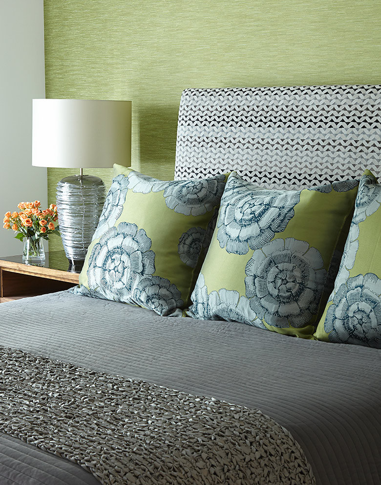
Master Bedroom with Grasscloth headboard wall 

Master Bedroom with Grasscloth headboard wall 

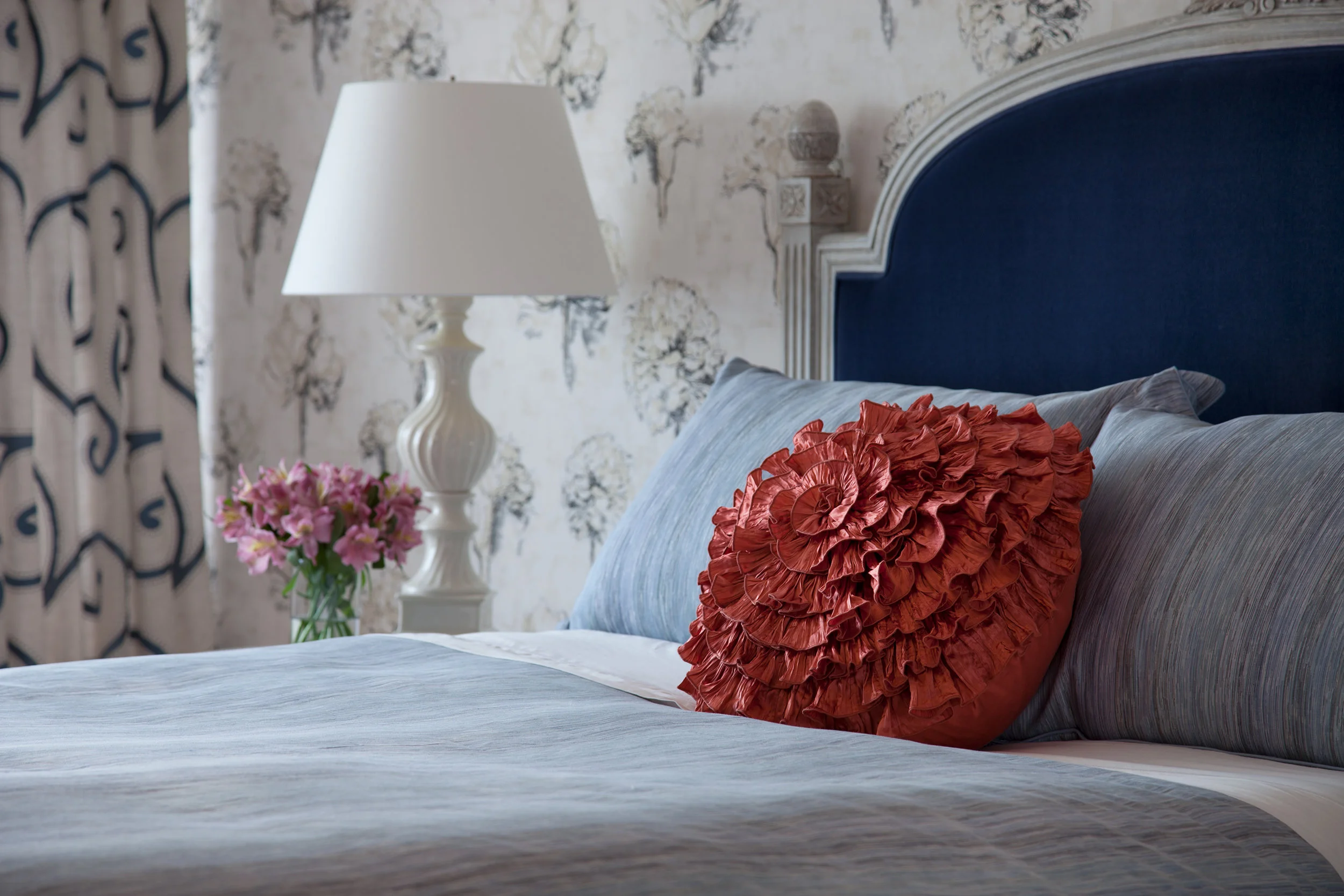
Close up of Master Bedroom 

Close up of Master Bedroom 

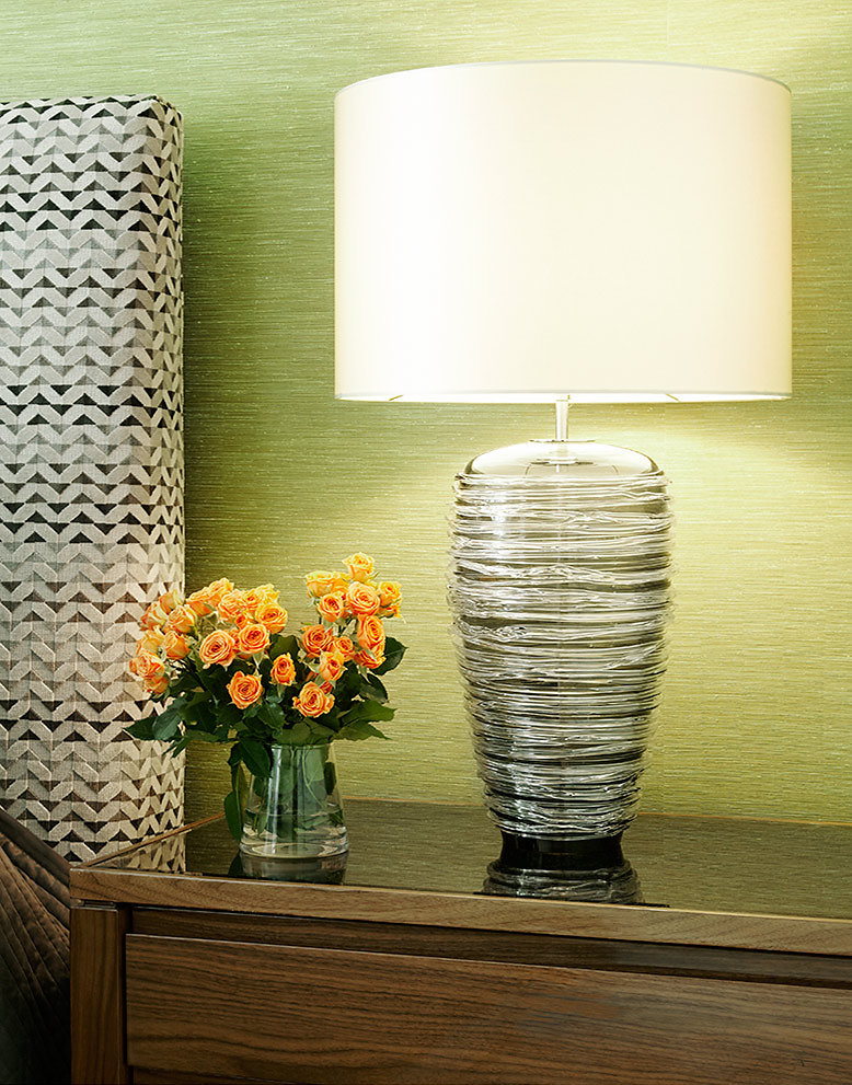
Sumptuous bedding is everything!  

Sumptuous bedding is everything!  

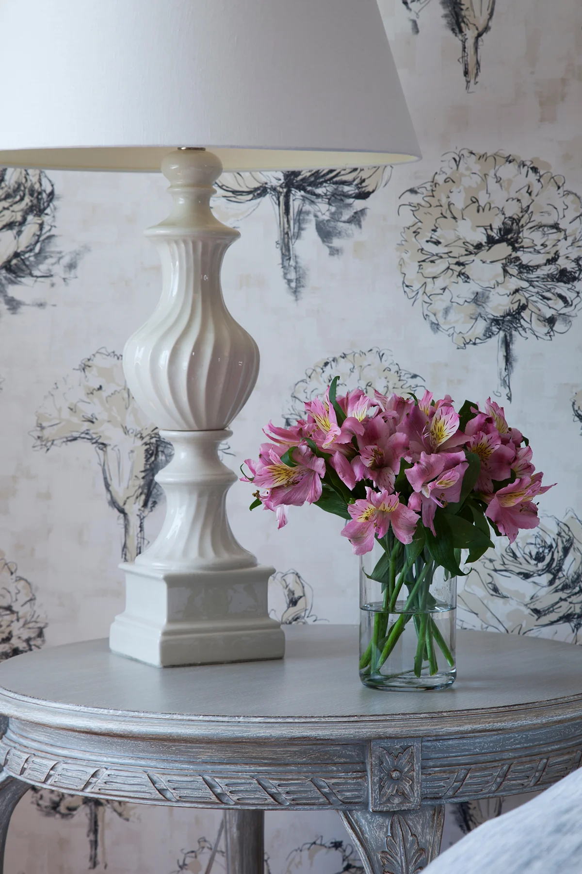
It's all in the details 

It's all in the details 

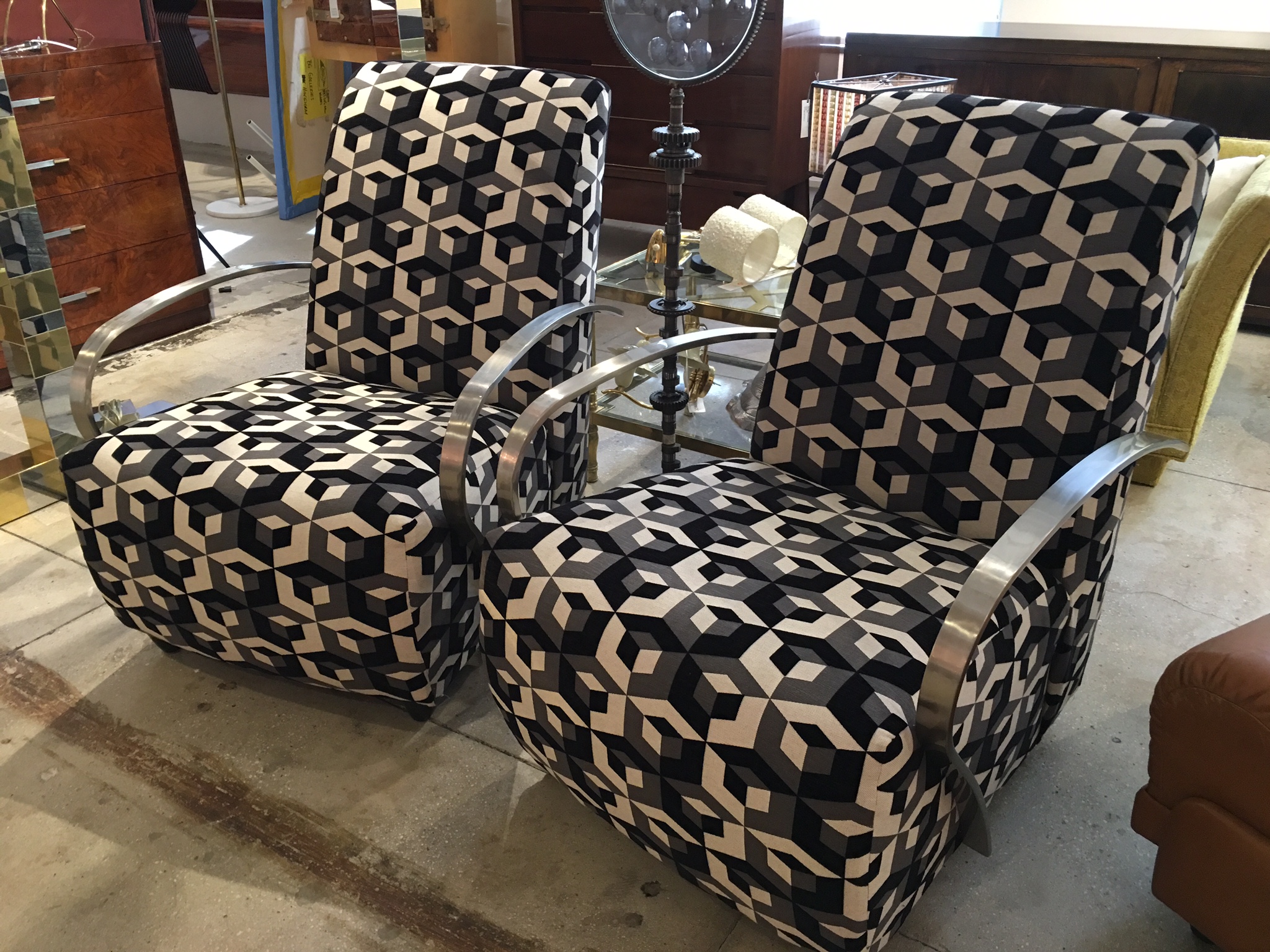
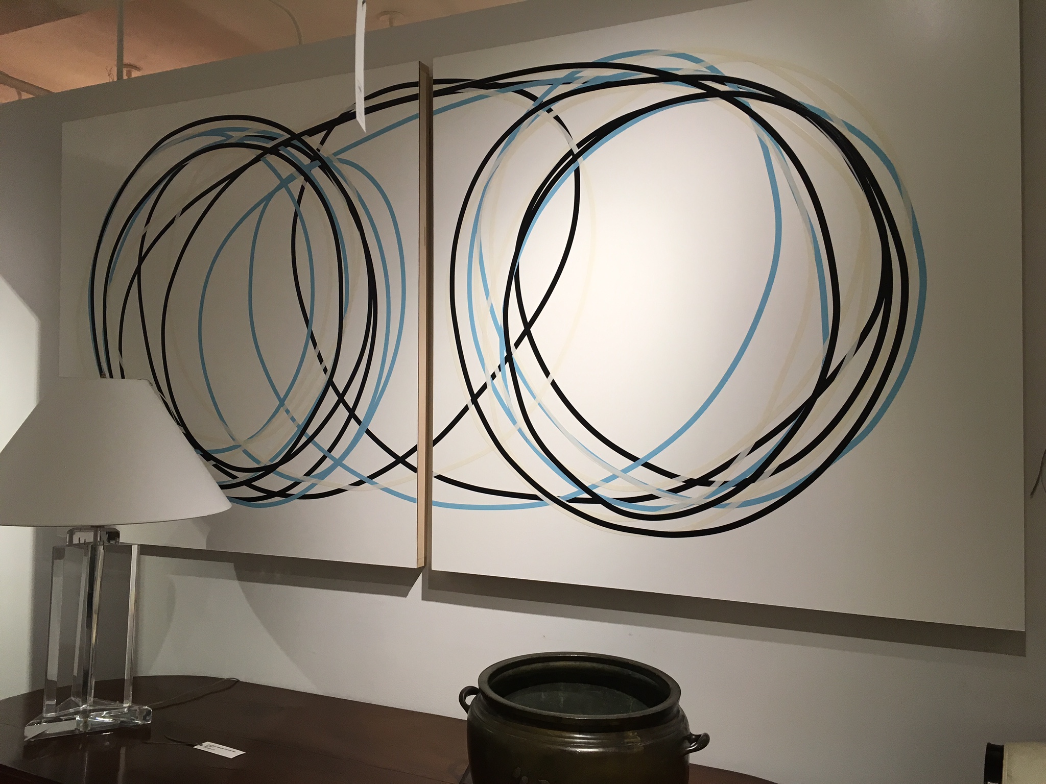
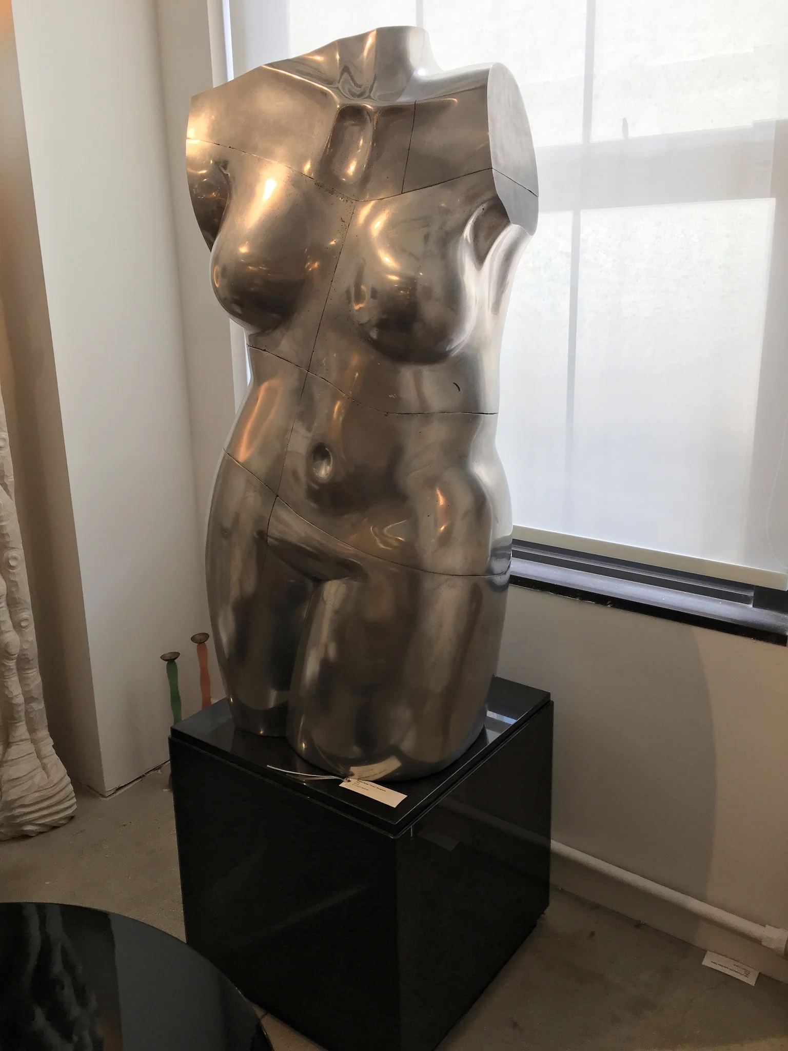
RAVISHING ANTIQUE / VINTAGE EYE CANDY

One of the real bonuses of working in this field is watching the clever, creative, gifted  people (I happen to know) come up with incredible new ideas. One such idea was the first brick and mortar space for the online giant 1stdibs. Jim Druckman was the genius behind it! 

This all took place years ago. 1stdibs is now a destination for many designers and collectors alike. It is an eclectic mix of over 54 different dealers from around the country and world that occupy the entire 10th floor of 200 Lex  in 33,000 sq feet of space. It is one of my special,  wonderful secrets. There is ALWAYS something new and exciting here!!!!  The following are just a few of my latest favorite things....

IMG_6059.JPG
IMG_6054.JPG

PAINT THE TOWN RED!

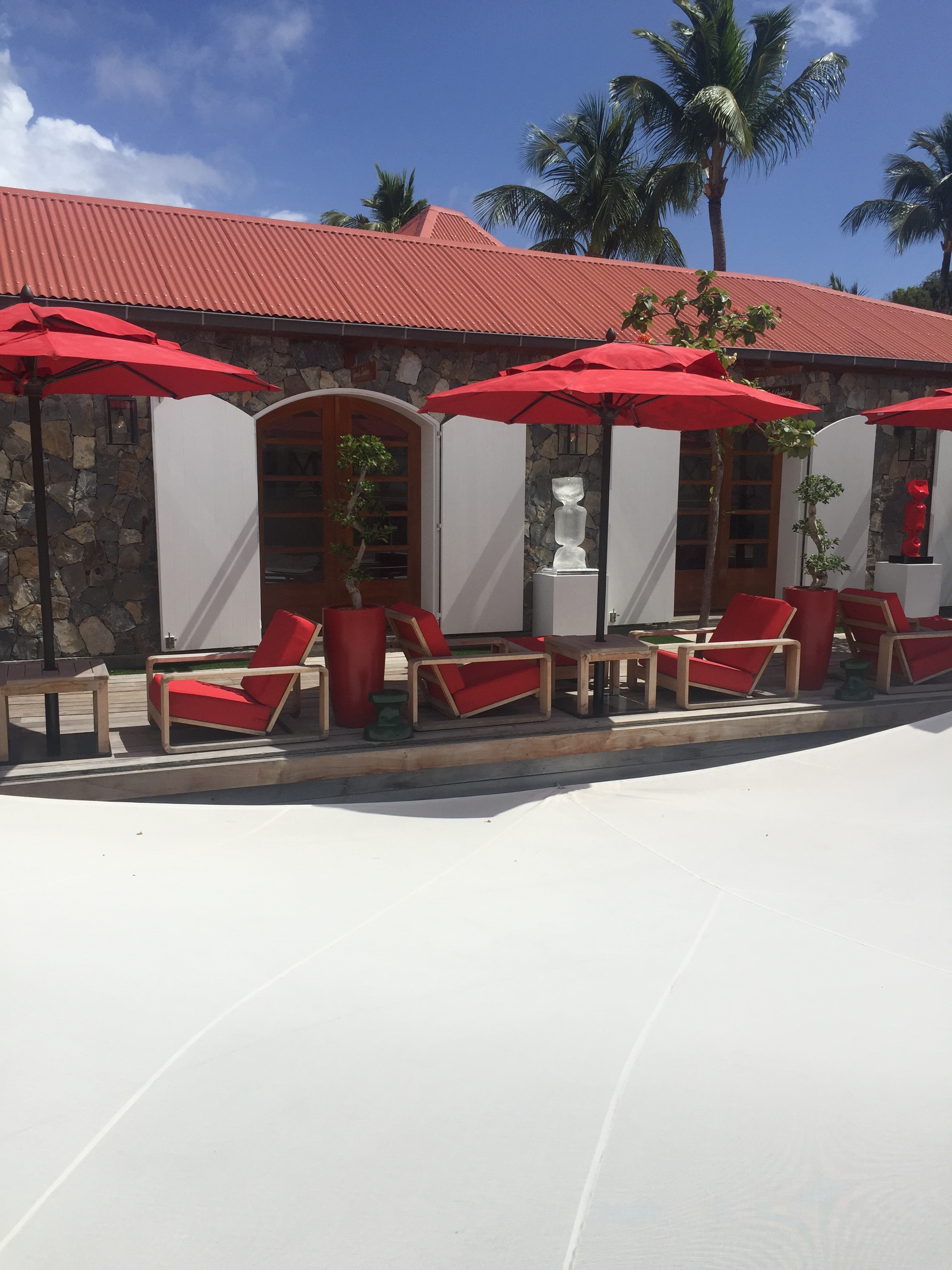
I am just back from a gorgeous Valentine's weekend in St. Barths and I just can't get the color red out of my mind! This incredible Island is covered in hints of red everywhere you go. From the rooftops to the flowers, this beautiful color made me giddy with joy. Red is a great color to bring into the home as well. Wether it is just a touch in a corner or covering a whole wall, this elegant, rich color will brighten up your day! 

St Barths

St Barths

Red Roofs in St Barths

Red Roofs in St Barths

Eden Rock Hotel

Front door to Eden Rock Villas

Front door to Eden Rock Villas

The Bright Group- Red Velvet Chair

The Bright Group- Red Velvet Chair

Global Views Tufted Bench

Global Views Tufted Bench

New Traditionalists Bar

New Traditionalists Bar

Access To Design Office- 200 Lex

Access To Design Office- 200 Lex

*Note: The images contained in this blog are not property nor work of New York Interior Design, Inc. They are strictly images acquired for inspiration and admiration of the industry's talent. New York Interior Design, Inc. does not claim rights to any of the works pictured above. All photos in the portfolio section of nyinteriordesign.com are the work and designs of New York Interior Design, Inc.

A SUCCESSFUL BATHROOM RENOVATION

People always ask me what goes into renovating a full bathroom, so I will explain in very simple terms the steps that are involved... First, hire an Interior Designer. Even if all the plumbing is staying in the same place you will need to select every surface, plus plumbing fixtures and hardware... Next hire a Contractor, most of the time your designer will recommend someone trustworthy and reliable . Make sure you have great photos of the "before" bathroom. You will also need a floor plan of what the bathroom looks like now, and if you are changing any square footage or moving plumbing you need a floor plan of the new intended space.  My personal inspiration comes from the trade market, there is always something new and cutting edge . Next, it is time to go shopping! I like to start with selecting the floor and wall tile first. There are wonderful new products out there, things that were unimaginable a few years back.  Texture is the newest trend! I usually do tile or marble all the way up to the ceiling in a master or kids bathroom. (tile half way up the wall is out of style) I also will use wallcovering in master baths, and powder rooms. If wallpaper is applied correctly in a bathroom it will not come down as some people believe...  If for example there is enough pattern on the floor with a gorgeous marble, sometimes only paint is needed on the walls. Just like with everything else in this industry, every bathroom has different parameters , design visions and budgets.

After you know what palette your floors and walls will be you need to shop for all of your plumbing supplies. Having your designer take you to reliable sources is key. Otherwise you could wait a LONG time for items that never ship... You need to select your shower body first, there are decisions to be made such as temperature control and pressure balanced  systems.. You need to select your bathtub, and your toilet. All these items have many details that your designer will explain. All the faucets in the bathroom will follow suit with the shower body. Are you selecting the new modern brass? (which is my favorite) Satin nickel ? or polished chrome? Remember that warranties are given in reliable showrooms with proven track records, the internet is NOT a good place to shop for these products.

Most important advice: PLAN AHEAD, HAVE ALL TILE, MARBLE, FIXTURES, VANITIES, MEDICINE CABINETS, FAUCETS, DRAINS, LIGHTING, ACCESSORIES (toilet paper holder, towel bars or hooks) DELIVERED TO YOUR HOME BEFORE the DEMOLITION BEGINS!!! This way your contractor can be in and out of your home quickly!!! If all products are there, and if your contractor shows up EVERY day as he or she should, all work should be complete in about three weeks... unless there are unforeseen complications.  USE Professionals!!!

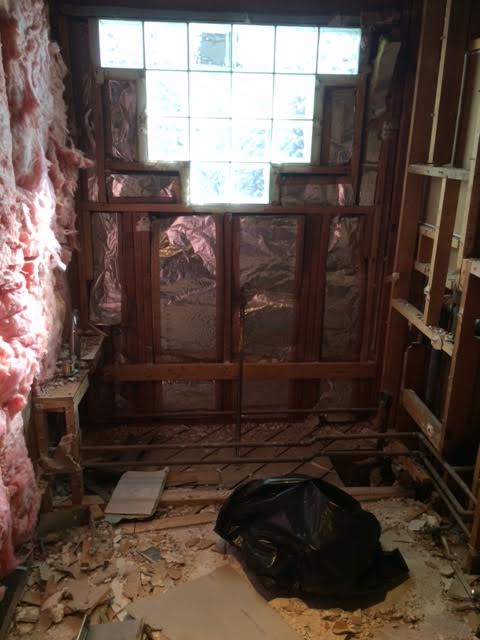
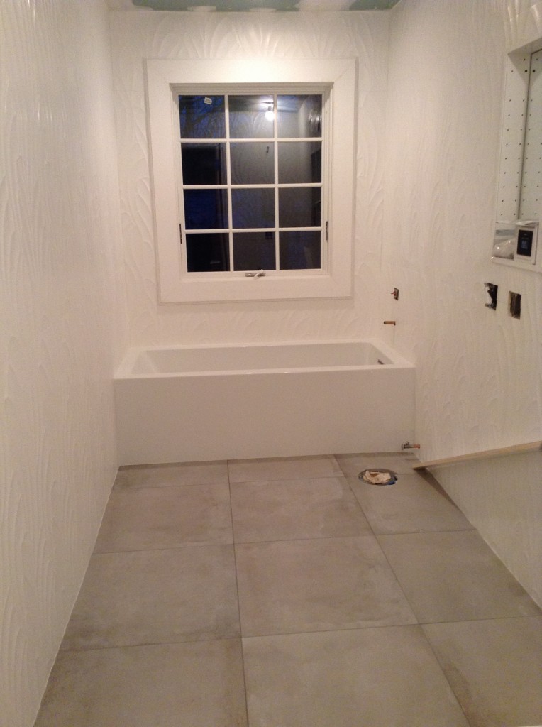
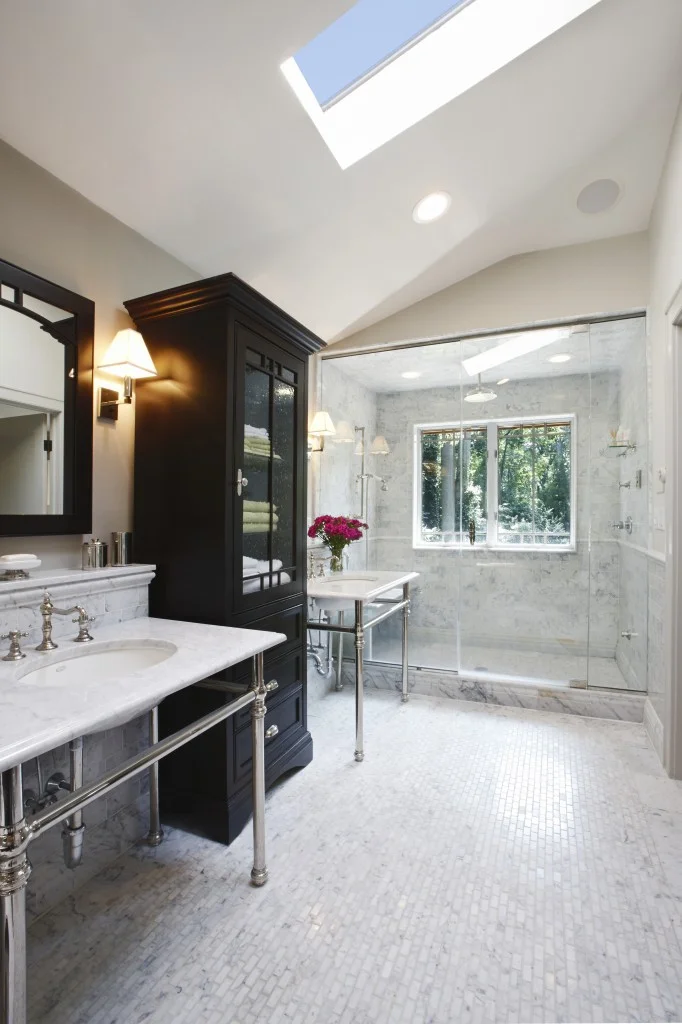
So plan that new spa, that place to relax and unwind in , that special oasis especially for YOU!  If you hire the right people everything should flow just like cascading water.. The following "Before"and "After" photos are of my latest bathroom project. ENJOY!

BEFORE PHOTOS

Photo-Jan-01-2-49-44-PM-e1426687145899-764x1024.jpg
Photo-Jan-01-2-50-00-PM-e1426687236162-764x1024.jpg
Photo-Jan-01-2-50-14-PM-e1426687315771-764x1024.jpg

                                                                                                                                                                                                                 DEMO

unnamed-2.jpg

 IN PROGRESS

2015-01-22-17.24.03-764x1024.jpg
2015-01-22-17.24.12-764x1024.jpg

AFTER PHOTOS

wFN-16-Ceder-Drive_Benatar_03191568.jpg
wFN-16-Ceder-Drive_Benatar_03191582-1.jpg
wF-16-Ceder-Drive_Benatar_03191588-900x600.jpg
w-FN16-Ceder-Drive_Benatar_031915102.jpg

Photo Credit: Beckerman Photography

BE MINE

Be Mine Design

presented byAccess to Design™

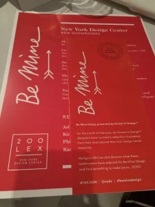
"For the month of February, the New York Design Center’s Access to Design™ designers have curated a collection of products from their most adored New York Design Center resources. Travel the 16 floors to discover what these tastemakers have selected for Be Mine Design and find something to make yours. Pick up a handout in the lobby to navigate Be Mine Design at 200 Lex and visit the Access to Design™ office in Suite 424 for more information on how to work with a designer." I am honored to have been selected to participate in this fun endeavour. I choose Profiles at the NYDC ( http://www.nydc.com/) as one of my favorite showrooms. I also was asked to select some of my favorite items. The following photos show some of them, for the real impact you must visit the showroom with a designer.  http://www.nydc.com/news/be-mine-design/Thank you so much Jim Druckman!  I truly enjoyed our beautiful breakfast in the Christopher Guy showroom. Come experience this wonderful building with 16 floors of new and cutting edge style, trends and fabulous merchandise and people. This is NYC at it's finest!

NYDC_BeMineDesign_WebGraphics_Homepage_01_012215-300x300.png
IMG_1330-225x300.jpg
IMG_1335-Version-3-135x300.jpg
IMG_1339-300x225.jpg
IMG_1332-225x300.jpg
IMG_1345-300x225.jpg
IMG_1344-225x300.jpg
IMG_1342-300x225.jpg
IMG_1341-300x225.jpg
IMG_1340-300x225.jpg
IMG_1351-300x300.jpg